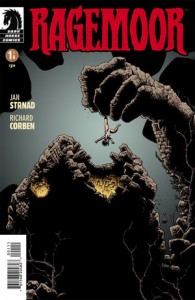
 Ragemoor #1
Publisher: Dark Horse
Writer: Jan Strnad
Artist: Richard Corben
After a long wait, Ragemoor #1 has finally hit the stands! It really hasn’t been that long, but it seems like forever to me. Back in December I found out that Dark Horse was releasing a book about a castle that is actually alive. This intrigued me and excited me at the same time. The story itself is rather simple. The castle has driven its previous owner completely mad, and the new owner doesn’t look to be in much better shape. After some guests arrive, the owner tells them the history of the castle, then begs them to leave, even though they believe the story to be rubbish. By book’s end, the guests have a different opinion. A very different opinion indeed.
In reference to the meat of the story, it was pretty good. The story of the castle’s origin was particularly enjoyable. It really takes you back to the early time of civilization, and then sweeps you through to present day. Other than that, it was just mostly surface content, but it did do a good job with the history and setting up the next issue with the presence of the previous owner lurking about. He’s a creepy dude that looks like something straight out of an asylum! The two characters that arrived at the castle were pretty good, too. A sleazy old guy that is not only greedy, but horny as a college football player, too! The girl was quite good also, and I loved the fact that she didn’t seem scared when the origin of the castle was told.
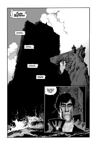
Now onto the artwork. I didn’t realize until I checked it out, that the book was black and white. Not that it’s a bad thing, because some books benefit immensely from it. This one was probably a coin toss, though. On one hand, the lack of color provided a bit of a spooky element and also helped with the older tone the story had. Honestly, though, the pencils just weren’t my thing. I’m sure Corben is a very talented guy (I’ve never read Heavy Metal), but his style just isn’t my thing. The castle was the biggest bright spot, and really looked cool. He did a great job with that.

If you love horror books, or anything by Corben, then snatch this up. If not, let it go, and you don’t have to worry about missing anything monumental. If the artist had been different, this would have been slightly better for me personally. I think they made the right call with keeping it black & white, though. Looking back at some of the scenes and characters, color wouldn’t have added anything, but possibly would have detracted from the feel of the book. This is a four issue limited series (I think); there isn’t a big margin for error. Rating 3/5
Billy Dunleavy
billy@comciattack.net


Ha, boy, Billy…you are gonna hear from the Corben purists out there! “I’m sure Corben is a very talented guy”? Watch out!
I haven’t seen the book and love Corben…considering his incredible coloring skills, it’s too bad it wasn’t in color, but I can also see the benefit of something like this being in black and white, possibly hearkening back to the days when horror films were in black and white and it worked perfectly.
Ken, are you saying the “Corben-ites” are coming to get me? Haha, I’ve of course heard of his following, but just never cared for hi style. Not that it’s bad or anything, just not for me.
I thought this book was decent, and I may check out #2, haven’t decided yet. I did enjoy the black and white.
Watch out for Beta Ray, Billy.
lol, I’ll be careful!