 Conan the Barbarian #2
Writer: Brian Wood
Artist: Becky Cloonan (cover by Massimo Carnevale)
Colors: Dave Stewart
The Queen of the Black Coast part 2 is here! Conan is usually not shaken by anything, but in this case, he’s more than shook up. He seems terrified, and if he’s in that bad of shape, imagine what the crew is thinking. Well, they don’t have much time to think, because the Queen’s ship is bearing down on them. Conan uses arrows first, but when things get up close and personal, he grabs some steel and starts to cut her men down like tall grass in a field. Slicing away flesh like there’s no tomorrow, even going as far as to use a grappling hook to drag a couple of dudes underwater, then stabs them, leaving them for shark food. This was a non-stop action packed issue, and ended with a slight twist.
Alright, well, part 2 of this arc was definitely full of the typical Conan action, and that’s OK with me. It was fairly light on the content side of things, but it didn’t really matter. Most Conan books are 75% action, 25% story, and for what the writer is trying to accomplish, that’s fine. Brian Wood has been mostly known for his Image and Vertigo work and other things that are much different than this, besides Northlanders. Considering that fact, I would definitely give him some slack before giving up on this book. Don’t get me wrong, I love me some Conan, but sometimes I just want something a little bit different than the normal stuff. Swords, axes, blood and guts is the regular, but I do like when there is a character or some back story about Conan himself to help get me through an issue.
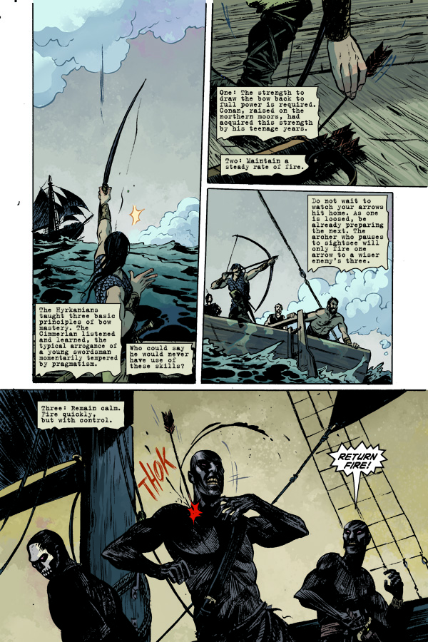
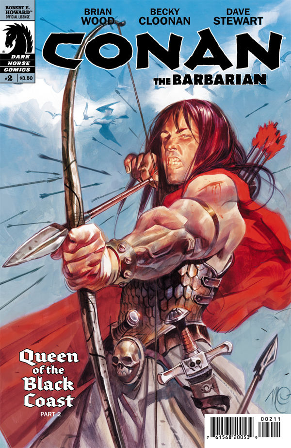
Becky Cloonan does a great job, as she did in the first issue. She has a style that is great for this kind of title. Cloonan makes the Queen seem sexy and scary all at the same time. My favorite panel is one when Conan is under water, though, killing a few of the crew from the other ship. Several sharks are swimming around looking to just tear something apart. The scene is super cool! Dave Stewart is on point with his colors, too. He has the right shading and colors for each scenario, character, and setting. Nothing more could be asked for from him. Both of the covers were good, but I chose to use the Massimo Carnevale cover because I like how Conan looks with his bow ready to pop somebody! Rating 3.5/5
Billy Dunleavy
billy@comicattack.net
This book is AWESOME!
It gets 5/5 in my opinion!
It was good, but not great. I’m still not sold on Cloonan’s art as far as Conan himself. He just looks slightly odd.