
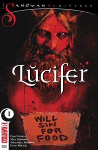
 Lucifer #1
Publisher: Vertigo
Story: Dan Watters
Pencils: Max Fiumura
Inks: Sebastian Fiumura
Colors: Dave McCaig
Letters: Steve Wands
Cover: Jock (variant cover by Kelley Jones and Michelle Madsen)
Lucifer presents the third of four series launching from the Sandman Universe special, and to date, it’s the one that’s most confusing and incoherent, but with layers of intrigue, mystery, and horror that draw a reader in and create a desire to learn more.
Oddly, in a book named after the title character, the scenes with an LAPD Detective named John Decker and his partner, Penny, who is slowly succumbing to a brain tumor while John can only stand by helplessly. He later tries to take matters into his own hands, with drastic consequences. These scenes with Decker, as well as the following scenes wherein he visits the Gately House, a “sober living facility,” are all colored with a bluish-green palette that creates a sense of calm even given the sad circumstances of Decker’s life.
The scenes stand in contrast to the much more contrasting, fiery palette used for scenes featuring Lucifer himself. While McCaig’s coloring does help the reader to easily shift between different scenes and characters, his colors are much more meaningful than that. Decker seems a bit removed from the world, more detached. His focus is Penny and what’s going to happen to her, and he’s drowning in his emotions and desire to care for her and make her comfortable. McCaig’s palette for the Decker scenes becomes an ocean, vast and almost incomprehensible, as Decker struggles to stay above water and keep himself from sinking into despair after he loses Penny.
In contrast, Lucifer is a character of action and fiery temper. Obviously it makes sense to use a variety of reds as the backdrop for the Hellish world Lucifer inhabits, but McCaig wisely lets the reds stand out by putting them with a sickly, pale yellow background that instantly creates a sense of unease, especially when coupled with the dark, shadowy creatures that are the stars of one particular scene involving a group of performers in front of a church.
McCaig’s thoughtful colorful schematics serve to tell the story as much as the art by brothers Max and Sebastian Fiumura. The layouts involve a lot of traditional panel layouts, but the action contained therein, and the character details, are anything but traditional. Details such as a pair of witches who have removed their eyes to be more like Lucifer (who begins the story blinded), to the hospital room where Penny slowly deteriorates as her tumor takes over, to action scenes in which Lucifer fights hordes of shadow creatures, all serve to create a sense of discomfort and mood that perfectly match the tone of this type of story.
Where Lucifer stumbles a little is in its storytelling cadence. The issue introducers a lot of characters in three main arcs, and clearly they are intended to be tied together, but little is done to do so. While this is a first issue and not everything needs to be spelled out directly, but it does make following the story, and the main message, a bit difficult to follow. Additionally, Decker’s scenes are much more relatable and have more emotional relevance than those of the title character, which creates a jarring sense of transitions between the different scenes. It seems as though the disparate stories will come together in future issues of the series, which should help.
All of the Sandman Universe titles are dark, but this is by far the darkest to date. Lucifer is less relatable than even Dream himself, but using a human anchor in Decker is a smart story-telling tool to keep the story intriguing and relevant to the average reader. Combined with the visuals and stunning coloring job, it makes Lucifer a great addition to the Sandman Universe.
Martin Thomas
martin@comicattack.net
