 Welcome to the 143rd edition of the Uncanny X-Piles, where we give you our thoughts on the week’s worth of X-Men books!
The X-Piles
Numbers next to each title are the cumulative ranking of the latest issue out of a total of 40. Numbers in parentheses indicate the previous issue’s rating. Blue indicates a raise in the chart from last issue; red indicates a drop; green indicates the book stayed put.
1. All-New X-Men: 37 (36)
2. Uncanny X-Men: 35 (31)
3. X-Men: 34 (21)
4. Cable & X-Force: 30 (29)
5. Wolverine and the X-Men: 30 (30)
6.Astonishing X-Men: 30 (10)
7. Uncanny Avengers: 28 (32)
8. Savage Wolverine: 23 (29)
9. Wolverine : 19 (17)
10. X-Factor: 18 (23)
11. Uncanny X-Force: 14 (19)
12. Gambit: 8 (25)
______________________________________________________
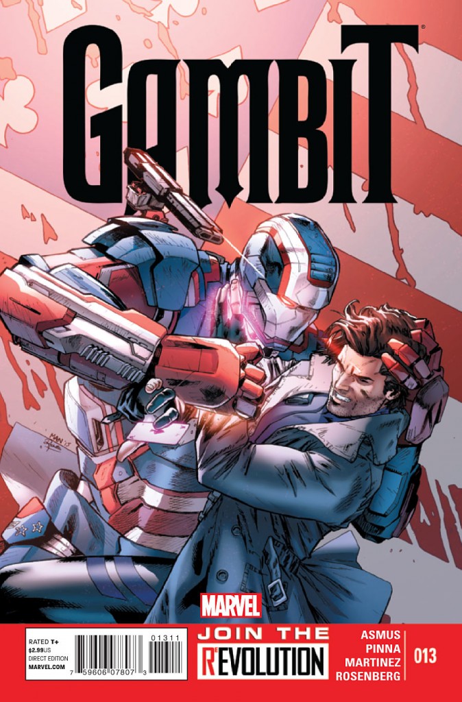 Gambit #13
Writer: James Asmus
Artist: Amilcar Pinna
Ok, they’re not even trying with this book anymore. With the recent announcement that there will only be 4 issues after this one, it seems Marvel has decided to go ahead and throw in the towel. With what was once a decent attempt on Gambit has now devolved into a poor attempt to make him seem the least bit relevant.
Asmus’ first mistake was dragging on the storyline with the Joelle character. Now that she’s out of the way, he turns his attention toward the other character introduced in this book, Gambit’s “handler,” the cybernetic Fence. Unfortunately, this guy has about as much character as my grandmother’s flowered wall paper, so making us care about Gambit’s attempt to break into Tony Stark’s corporation in order to find stuff to mend Fence (see what I did there?) is a lost cause.
What’s worse than the lackluster story here is the incredibly C-list artwork of Amicar Pinna. He’s obviously trying to ape the style of Clay Mann, who has been barely hanging on this book the last few issues but with disastrous results. He has trouble translating Asmus’ script and it seems like he’s simply drawing basic panels instead of taking risks to tell the story. The faces are unappealing and the contorted figures are rudimentary. The color of the book has a washed out tone to it which has been consistent since issue #1, but doesn’t fit a potentially dynamic character like Gambit.
I think this issue makes it obvious why no one is bothering to pick it up. –JJ
Cover: 2/10 Writing: 3/10 Art: 1/10 Relevance: 2/10 TOTAL: 8/40
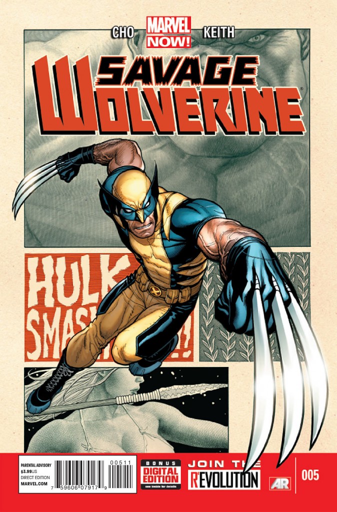
Savage Wolverine #5
Writer & Artist: Frank Cho
And suddenly, a wild Hulk appears! Just when you thought Amadeus Cho and Shanna the She-Devil reached Wolverine in time to stop him from unknowingly releasing an imprisoned alien, the proverbial bull shows up in the china shop to spoil the sigh of relief.
Let’s put it out there, Frank Cho’s story isn’t out to have you contemplate the meaning of life. There’s nothing deep about Savage Wolverine. I get the feeling that Marvel just asked Cho what he’d like to draw and then just told him to write a story around that. This issue here is really light on dialogue, so it’s a quick read that doesn’t even require your full attention until the very last couple of pages.
We have the Hulk fighting a giant mutated ape. We have Wolverine effectively taking down the Hulk. We have Shanna standing there, looking pretty and we have Amadeus Cho not doing much of anything. The point is we all know what will happen. That ancient alien that they discovered, yeah it’s gonna wake up and be grumpy as hell. Do you think it will be strong & powerful? Uhh.. why else would you have Hulk randomly show up? Hulk is there to get bitch-slapped and give the reader a sense of how powerful this alien threat is. That point would have come across a lot better if you didn’t have Hulk struggling to actually take down an ape (which got knocked out by Shanna) and then have Wolverine put the big guy down in one move. Hulk came off as a complete pansy in this issue and that’s a real shame. Although the page of him attempting to deliver a bomb and failing miserably was the comedic highlight of this issue, it also made the entire thing feel a bit silly. And then we finish the issue off by finding it out that there’s some sort of weird insect version of Galactus waking up from his nap and feeling a tad peckish.
Frank Cho’s art is awesome for the most part. There are a few panels where Wolverine’s face looked a little off and the panel where Shanna takes down the ape just didn’t look right at all. Next to Hulk and the giant ape, Shanna looked like she was suddenly 8 feet tall and 500 pounds. The ancient alien dude looked good and I liked the resemblance to Man-Thing which reveals the red herring of the latter’s involvement in Shanna’s resurrection. My main gripe about the art work is the panel layouts for this issue. They were very traditional (i.e.: boring) and I didn’t appreciate so many full page splashes. I’m sure they were fun to draw, but the lack of background details coupled with the frequent use of the full pagers just seemed a little lazy to me and gave me the impression that most of issue #5 was just filler so that the alien’s escape would fall into the final pages and act as a cliff-hanger.-SG
Cover: 6/10 Writing: 6/10 Art: 7/10 Relevance: 4/10 TOTAL: 23/40
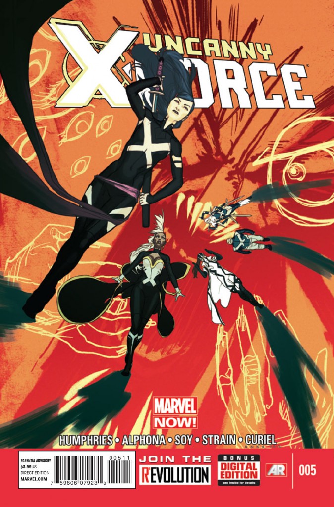 Uncanny X-Force #5
Writer: Sam Humphries
Artist: Adrian Alphona
Oh, how the mighty have fallen. Where once this title was consistently a pick of the week for us in the X-Piles, this book is now a shadow of what it once was.
We’re on issue #5 and still Humphries hasn’t landed on a legible status quo for this book. We have no real motivations for any of the characters as to why they are on this team. Storm, for instance, makes no sense in this book. Why are these characters together? What are they supposed to be doing? Humphries continues to meander through psychic planes trying to make this book seem interesting, but failing miserably. Even Puck and Spiral have no real place in this book. They are there for laughs, I guess, only there aren’t any to be had. Then, you have Fantomex, who is so fractured as a character literally and figuratively. Toss in Bishop, who has only ever been interesting when he shot Xavier, and all he is here is a screaming mess.
This is an example of how a writer drags down an artist rather than the other way around. If they were really going to push Alphona on this book, they should have let him design the actual book. Instead, he’s working with Ron Garney’s leftovers from the first arc. I like Garney, but paired with Alphona, neither artist shines. Humphries script has shoe-horned Alphona into a dreamscape which doesn’t suit him. His best work on Runaways wasn’t in surreal sequences, but in quiet, character interactions. This issue offers no such thing for Alphona to draw.
This book just makes me sad because there’s so much wasted potential here. –JJ
Cover: 4/10 Writing: 2/10 Art: 4/10 Relevance: 4/10 TOTAL: 14/40
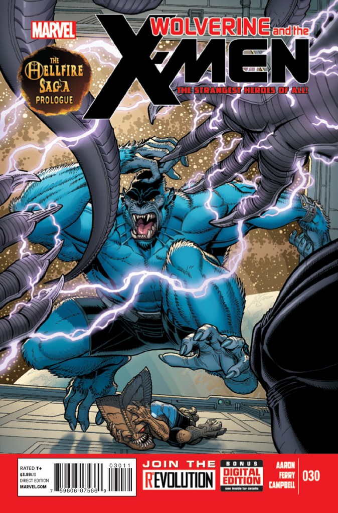 Wolverine & the X-Men #30
Writer: Jason Aaron
Artist: Pasqual Ferry, Pepe Larraz, & Salva Espin
Finally, we’re back to having some fun in this series as Aaron prepares us for The Hellfire Saga! In this issue several events are being laid out but what we see is that not only is the Hellfire Club recruiting but they are several steps ahead of Wolverine and his team. Whether on the S.W.O.R.D. space station or in the hallways of the Jean Grey school our heroes are trumped at every turn and losing students in the process.
Aaron has been preparing readers for some time now with what the Hellfire Club has in store for Wolverine and his school. Now that he’s bringing things full circle I can definitely say that this has become a better read. From the revelation of the traitor to Quire’s seemingly selfless decision it’s nice to see that Aaron is moving things along. There’s also the fact that the little Hellfire kids are developing into better villains. Though the true test will be in how far he takes them and if they can maintain being a serious threat. His dialogue for the little Hellfire brats is always enjoyable as we get a deeper look at these sadistic little children. The other high point of the issue is definitely Beast’s efforts to help Broo and the lengths he’ll go to for positive results. The only downside would be the display of incompetence of Kitty, Storm, and Iceman as they seem to be taking things a bit lightly for now.
The art is pretty solid in this issue though the main problem seems to be drawing Beast consistently. This is beginning to be quite annoying in any title he’s in but it’s more obvious here since we have a team of artists on this issue. Other than that the story moves well and the sequence with Quire is probably the best in the book.
If you were put off by the last couple of story arcs I’d say come back and give this issue a read. Aaron is setting us up for something big here and you’ll want to get in at the beginning.-IS
Cover: 8/10 Writing: 8/10 Art: 6/10 Relevance: 8/10 TOTAL: 30/40
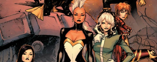
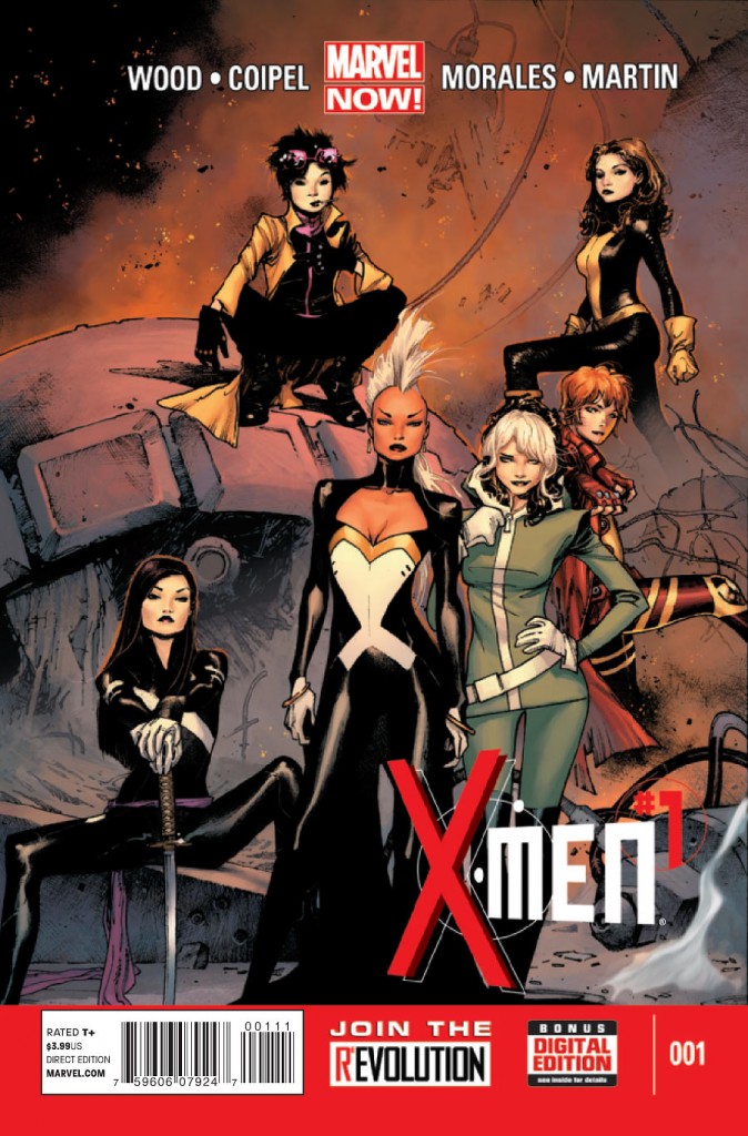 X-Men #1
Writer: Brian Wood
Artist: Olivier Coipel
Ever since Marvel announced their all female squad of X-Men getting their own title the expectations and anticipations have been quite high. Did it live up to the hype? Was this just another failed attempt wrapped in a bad ass cover? Was this money well spent? Yes, no, and yes again!
What’s great about this series other than focusing on an all female team of X-Men is that with all of them already established, Wood can get right into the story. He wastes no time with the setup as Jubilee is on the run with a baby in tow. This leads into a great action sequence on a high speed train that ranks right up there with all the other cool train sequences thanks to Coipel’s artwork. As the story progresses you’ll enjoy that the all female team doesn’t come off as a gimmick nor is it reduced to pin up shots and excuses for gratuitous poses for the ladies. This team is just as strong as any group of the male X-Men members and Wood makes sure that they’re taken just as seriously and in some cases a bit cooler.
There’s not much that Coipel puts his skills to that doesn’t look great and this issue is right up there with some of the best. He tells his story in and outside of the panels and makes sure that the breaks fit perfectly together without distracting the flow of the story. I’ll also admit that I didn’t miss Storm’s mohawk until now. This has always been a bad ass look for her and it’s one that needs to stick around for a while.
We’ll have to see if this solid storytelling and artwork last a while longer but this is a great first issue. Strong dialogue, eye catching artwork, and a strong female cast that can run with the big boys any day of the week. This means you should pick this up and give it a shot! –IS
Cover: 9/10 Writing: 8/10 Art: 8/10 Relevance: 9/10 TOTAL: 34/40
Infinite Speech: I was shocked at how good X-Men #1 was and want this title to do very well!
Jeff Jackson
jeff@comicattack.net
@FrJeffJackson
Infinite Speech
infinitespeech@comicattack.net
@InfiniteSpeech
SpidermanGeek
spidermangeek@comicattack.net
@SpidermanGeek