 Welcome to the 141st edition of the Uncanny X-Piles, where we give you our thoughts on the week’s worth of X-Men books!
The X-Piles Numbers next to each title are the cumulative ranking of the latest issue out of a total of 40. Numbers in parentheses indicate the previous issue’s rating. Blue indicates a raise in the chart from last issue; red indicates a drop; green indicates the book stayed put.
1. All-New X-Men: 37 (36)
2. Uncanny Avengers: 32 (27)
3. Uncanny X-Men: 31 (29)
4. Cable & X-Force: 30 (29)
5. Wolverine and the X-Men: 30 (23)
6. Astonishing X-Men: 30 (10)
7. Savage Wolverine: 29 (28)
8. Gambit: 25 (25)
9. X-Men: 21 (23)
10. Uncanny X-Force: 19 (26)
11. Wolverine : 19 (17)
12. X-Factor: 18 (23)
______________________________________________________
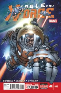 Cable & X-Force #8
Writer: Dennis Hopeless
Artist: Salvador Larrocca
So, Cable and his squad have seemingly broken a genocidal alien out of the Raft. The only problem is, the alien has the upper hand and is on his way to annihilate the planet.
Hopeless is at his best when he’s writing characters at their worst. It seems that the entire deck is stacked against Cable and X-Force and when they’re pushed against a wall, that’s when things get really good.
They say the enemy of my enemy is my friend, but whoever said that hasn’t seen Cable and Abigail Brand go at it. They are forced to work together in order to capture the alien, which offers some awesome moments. Colossus officially leaves prison to join Cable on the rescue mission to save the rest of the team and the world, and Hopeless includes some great action shots like Brand and Cable firing Colossus like a missile at the getaway alien.
Larrocca continues to deliver good panels here. The less he tries to draw movie stars in these roles, the better. I have always enjoyed his X-Men stuff than anything else, and this is a great progression from his older work. Matched with Frank D’armata’s colors, this book looks fantastic.
I wouldn’t have thought that this was the X-Force book I’d be cheering for, but this is one great book. If Hopeless can keep the status quo with crazy big action and hair-brained heists, then I’m sticking around! –JJ
Cover: 8/10 Writing: 7/10 Art: 8/10 Relevance: 7/10 TOTAL: 30/40
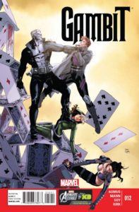 “Gambit” #12
Writer: James Asmus
Artists: Clay Mann, Dexter Soy and Leonard Kirk
Time is running out for the enigmatic femme fatale, Joelle, to save her dying daughter. Turns out that the terminal disease she is dying from is actually old age. Joelle recounts the origin (for lack of a better term) of her own immortality in this issue.
Asmus closes the chapter on the relationship between Gambit and Joelle. Her appeal was her mystery and I’m glad that the writer dug just deep enough into her past for the reader to sympathize and understand her choice in the final pages without losing her enigmatic aspect. As for the rest of the issue, the inclusion of Rogue was a smart choice and added a welcomed anchor for Gambit in the climax of this story as he was left to deal with Tombstone on his own. Otherwise, readers might tend to forget that this is happening in the Marvel Universe since Gambit has been out of his usual surroundings and acquaintances since issue one. Rogue also provides witness to the events here which lends an unspoken credibility to any character progression that James Asmus wanted to impart throughout this particular set of adventures.
Considering that two teams of three different artists worked on the pencils and inks, it all looks surprisingly seamless with the Dexter Soy pages being my favorites by a slight margin. I’m a fan of all three of the artists, but Clay Mann’s pages seemed a little lacking compared to the first issues he’s penciled for this series. Leonard Kirk’s contribution was minimal from what I can tell. Editorial must have really wanted this book to meet a deadline to have called him in for one or two pages. Rachelle Rosenberg keeps things consistent with her work on colors and helps visualize the time lapsed as the sun slowly begins to rise throughout the issue’s backgrounds.
The bottom line is that this was a fitting end to a plot thread that started with the launch issue of the series. With only five issues to go before this volume of Gambit ends, it’ll be interesting to see what James Asmus has planned for the Ragin’ Cajun and his narrowing cast of supporting characters. I hope we haven’t seen the end of Fence just yet. –SG
Cover: 7/10 Writing: 7/10 Art: 6/10 Relevance: 5/10 TOTAL: 25/40
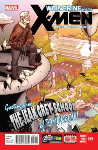 Wolverine & the X-Men #29
Writer: Jason Aaron
Artist: Ramon PerezStories like this can either be really good or go horribly wrong. Fortunately this one finds it’s happy medium delivers a solid and entertaining story. One where we see how life will be like 25 years in the future at the Jean Grey School. How fitting we make this shift as Wolverine is giving a speech to the students as they are putting item into a time capsule to be opened years from now.
After the last couple of story arcs which weren’t up to the standards set by the earlier issues this one is looking very promising. The elements that made those earlier stories fun and unique show up all throughout this issue. From the dialogue to the way Aaron has crafted how events have unfolded in the future. We see Bobby and Kitty’s child, an older Eye-Boy who can’t get Logan to call him “Eye-Man” even at the age of 40, even the Bamfs are still around and noticeably aged. As much fun as it is to see the future Aaron also makes it’s ties to the present very strong by weaving several plot threads in the issue. He shows how the past affects the future which again affects the past. We also get a glimpse of the Hellfire Club’s intentions as well.
Perez’s artwork is pretty fun and cool the entire issue. The double page spread showing the large cast of students at the assembly is one of the stand out scenes in the book. Though it also strengthens why we need to see more of them instead of introducing new characters (looking at you Shark-Girl). Perez also gives you so much to look at as the school is filled with a lot more students and is just fun organized chaos all around. The only problem was that it looks like both Aaron and Perez forgot that Glob Herman didn’t come back from the Savage Land adventure yet he was added in this issue.
If for some reason you haven’t started this series or have been gone a while I’d go out on a limb as to say that this is a pretty safe jumping on point. Aaron hints that some big things are coming and you’ll want to be around to see what happens! –IS
Cover: 7/10 Art: 6/10 Writing: 8/10 Relevance: 9/10 TOTAL: 30/40
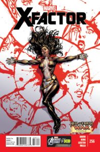 X-Factor #256 Writer
: Peter David
Artist: Leonard Kirk
Well, it’s been officially announced that X-Factor is on Marvel’s chopping block. I can’t say that I blame them. This book certainly has lost its luster. But it was a good run and PAD should be proud.
The only really good thing about this issue is yet another incredible cover by David Yardin. Sweet Christmas, the faces drawn from Monet’s blood is truly remarkable. I would love to see this guy do some interior work in this style. I’ll be keeping my eye on him for sure.
This issue wraps up the ever-lengthy “Hell on Earth War” storyline. While this story hasn’t really clicked for me, some significant things take place in this issue. The once-dead Monet comes back to life. Wolfsbane’s son Tier finally gets killed, and in that happening, the killer gets to take over Hell, and it’s not who you think. I was hoping that Mephisto would win the title of Marvel’s Hell King, but instead of something logical, PAD decides to make Guido the master of Hell. Believe me, as a story point, this makes no sense whatsoever.
Whatever happened to the happy-go-lucky Guido? I guess his soul included everything that was likable about him, because once that piece got taken away, he just got lame.
The other big thing missing in this arc is Madrox. He got turned into some kind of demon and we’re supposed to think that perhaps he’s not going to make a miraculous return soon, but the less he’s featured in this book, the less I really care. In fact, I keep wondering who the central protagonist in this arc is supposed to be and I come up short. Polaris maybe, but why? Tier? Layla? The rest of the team just sinks into the background and are all but forgotten.
The art of Leonard Kirk leaves much to be desired. I feel like if he had more time to work on the book, it could look really nice, but every figure lacks the detail to make them pop. The art looks rushed and just plain lifeless. Kirk has done much better.
I hate to see X-Factor go, but if this is how the book is going to be, then I say good riddance. –JJ
Cover: 9/10 Writing: 3/10 Art: 2/10 Relevance: 4/10 TOTAL: 18/40
Most X-Cellent Pick of the Week:
Jeff: Out of this group, Cable & X-Force #8 gets my top spot.
Infinite Speech: I was really impressed by the turnaround of Wolverine & the X-Men #29!
SpidermanGeek: “Cable & X-Force” #8 was a ton of fun with gorgeous Larroca art.
Jeff Jackson
jeff@comicattack.net
@FrJeffJackson
Infinite Speech
infinitespeech@comicattack.net
@Infinite Speech
SpidermanGeek
spidermangeek@comicattack.net
@SpidermanGeek
 Welcome to the 141st edition of the Uncanny X-Piles, where we give you our thoughts on the week’s worth of X-Men books!


Man, why is the formatting all wonky? It seems to be getting worse everytime this column gets posted.
Sigh…I don’t know. I had fixed it before I published it.