The release of Phoenix heralds the return of Atlas Comics! For those that don’t know, Atlas actually has a brief, but deeply rooted history in comics.
Here is a quick history lesson about Atlas. The company was formed in 1974 to be a direct competitor to Marvel and DC Comics. Created by Martin Goodman, who had sold Marvel Comics in 1968, Atlas consisted of black and white as well as color comics, with over 20 titles. Many top names in the industry such as Neal Adams, Steve Ditko, Wally Wood, and Howard Chaykin had stints with Atlas, but it folded shortly after being formed in a less than reliable industry.
Now, Jason Goodman (Martin’s grandson) has allied himself with Ardden Entertainment to bring us the revival of Atlas and its characters. Grim Ghost, Wulf, and Phoenix are just the beginning!
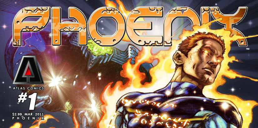
Phoenix
Writers: Brendan Deneen and Jim Kreuger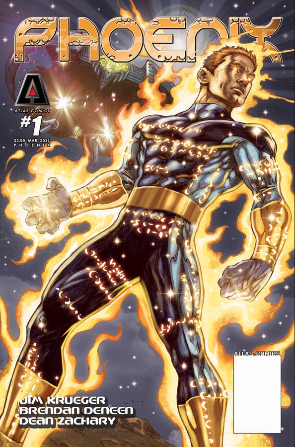
Artists: Dean Zachary
Color: Mai
Now, I have to be honest, I’m not very familiar with much of the titles coming from Atlas. I was a little young (actually not even born) when Atlas came and went. My brother had mentioned this title to me because it was cosmic-themed and he figured I would like it…
So I walked into this book pretty blind, and came out pretty much the same way. Jim Kreuger is a well-known name in the comic industry, so I expected something pretty simple but entertaining. Unfortunately, Phoenix didn’t really deliver on that end. The whole read seemed pretty vague. We have a guy, Ed, decked out in some pretty slick looking gear. He’s trapped by some aliens and attempts to escape. He sees some familiar faces along the way (his apparent blood brother and what seems like a girlfriend), but makes his way to Earth to meet Denise. Denise is his sis – no wait, girlfriend – wait, I’m sure she’s his sister. Actually, I have no idea. It felt as though while reading this I had to fill in a lot of the blanks on my own, which can sometimes be fun, but in this instance, I pretty much had to put all the pieces together. I’m still not quite sure who is what, and what is going on.
The art in the first couple of pages really pulled me in. I liked the way the pencils and colors worked together. Problem is, things started to get a little inconsistent after the opening pages. I’m not too familiar with Dean Zachary and he seems pretty skilled. The poses and positions were spot on, and actually better than average. Problem being, the size and build of his characters seemed to vary. Sometimes Ed appeared frail and had a big head which didn’t fit with his body. Other times he was pretty jacked. I think a few more issues will do Zachary good, once he gets a real hold on consistency. The colors from Mai were really vibrant throughout.
I’m going to give Phoenix a few more issues. I like the look of the character, and I hope that things will start to get into focus eventually. It was a pretty vague issue, that’s the best way I can describe it. Not bad by any measure, but short and not really to the point. If the art can get a little more consistent and the writing more descriptive, this has the potential to be a decent read.
If you want to look into Atlas and some of its characters, click here.
Editor’s Note: ComicAttack.net has been officially nominated for an Eagle Award! Please click here to vote for us in the “Favorite Comic Book Website” category (question #27). Thank you for your continued support!
Mike Parente
mike@comicattack.net
I remember liking many of the Atlas comics back then…they seemed to follow a little more offbeat path than the other big companies. In fact, I just finished writing my Ink Stains for April 1st, profiling Hot Stuf’, which had several Atlas contributors, including Ernie Colon.
Sounds pretty good Mike. I’d definitely give it a shot!