 Soulfire vol.3 #1
Publisher: Aspen MLT
Writer: J.T. Krul
Artist: Jason Fabok
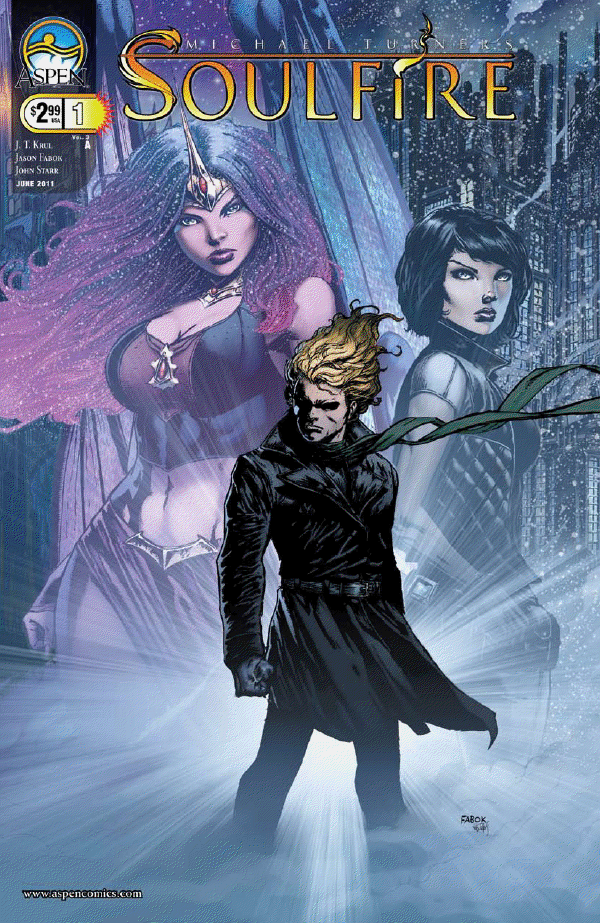
Cover: Jason Fabok
When I reviewed Soulfire #0 a few months back, I was a complete newcomer to both the series and Aspen Comics. I might not have understood what was going on in the series, but the important part was that it intrigued me and it kept me coming back for more. And now that Soulfire #1 is out, it’s time to see what they can really do, especially since this is a full comic, rather than being more of a sliver of things to come.
The fortunate part about this issue is that, for the most part, I’m starting to understand what’s going on. Yes, a lot of the details and background is still a mystery to me. But the important part is that I’ve understood the majority of it. I understand that it’s in a time where magic has reappeared to the masses and there’s another great age of magic, there’s a battle between two magical tribes/races (the Sethoru and the Rahtumi), and the blond guy is a magical fugitive hiding out in Siberia for the time being. Now, that’s far from the whole picture, but it’s also enough to keep me wanting more and enough promise that over time, I will understand everything without having to buy the trades.
Now, even with an interesting story and ideas, they’re nothing without good talent behind it. Fortunately, they’re the same guys who did Soulfire #0 and they’re still kicking ass. J.T. Krul does a solid job. Granted, the series is still warming up so there isn’t a lot for him to do with characters and themes yet. Still, there’s nothing I can really criticize him for, and I have complete faith that when the time for slowing down and exploring the characters and themes begins, Krul will make the most out of it.
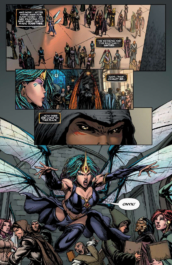
But the biggest eye catcher here is the artwork. Jason Fabok is to Soulfire what Jim Lee was to X-Men. Some artists can draw characters well, others can do backgrounds well. Fabok can do both. But especially the backgrounds, from the church to that Blade Runner-esque mining town in Siberia.
John Starr not only compliments Jason Fabok’s art with his coloring, but Starr also stands out as well. Sometimes you’ll get colorists who make good use of the pre-computer coloring, but end up feeling a bit too two-dimensional. Or other times you’ll have artists that make the most of Photoshop, but make it seem almost too slick, too fake. Not here. In fact, out of all the team’s work on this one, Starr’s work here might be my favorite.
Also, I liked the lettering here once more. Although I wasn’t always thrilled when the lettering got fancy with the style and coloring. Don’t get me wrong, it looked cool and it fit with the art style, but there were times when it blended into the background and made things hard to read.
All in all, Soulfire #1 was yet again another solid read, especially with the artwork. It’s nice to start to figure out everything, as well as get a sense of where things are headed. As stated before, though, I’d like to see in the future episodes some more focus on the characters. Something to give J.T. Krul more to do here, and also give readers a reason to care for this as much as any other comic with a great cast of characters. But for now, I’m pretty satisfied with the series.
Andrew Hudson
ahudson@comicattack.net
@Hudsonian