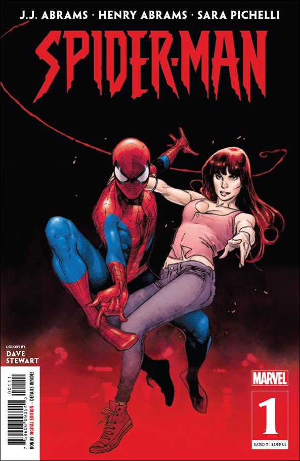
Spider-Man #1
Publisher: Marvel
Writer(s): J.J. Abrams & Henry Abrams
Artist: Sara Pichelli
Colorist: Dave Stewart
Letters: Joe Caramagna
Cover: Sara Pichelli & Dave Stewart
Since Marvel actually did a fine job with not spoiling too much of this story before it hit shelves I’m going to keep things as spoiler free as possible. Just know that there might be some minor ones in this review so proceed at your own risk.
Marvel’s latest Spider-Man title is an immediate roller coaster of emotions as J.J. and Henry Abrams settle in to tell a new story about our favorite Wall Crawler! Now some of you might be dying to know what universe this story takes place in since it’s yet another Spidey book and to that I’d say just forget about all that and sit back and enjoy. It’s a story about heroism, perceptions, and father’s and sons. Which makes the pairing of the writing team a little more symbolic once you start reading this one.
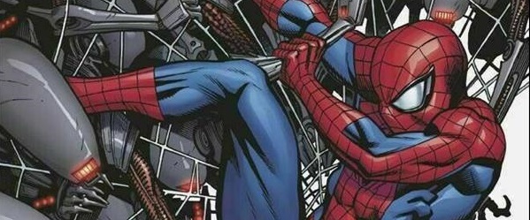
The story opens up with Peter in a bad way while once again saving New York. A new villain, Cadaverous, is introduced which is refreshing since we do get more than enough of Spider-Man’s rogues gallery in his other titles. However, the motives of the villain are still a mystery but he makes a huge impact early on in the story. As the writing team moves us ahead several years a new protagonist emerges that throws the story in a new direction. This turn does have some familiar elements to it but the Abramses hit some strong beats here we see how these characters have dealt with the fallout from earlier in the issue. We do get a constant here in Aunt May who always knows the right thing to say in order to nudge people in the right direction.
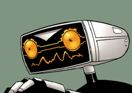
Sara Pichelli once again lends her talents to the world of Spider-Man along with Dave Stewart providing the colors. She nails every emotional point needed to drive the narrative home and those first seven pages are pretty brutal and sad. There’s a panel where you can actually see the hope leave Peter’s face and then you turn the page and Dave Stewart hits you with that color palette just driving the point home. Cadaverous has a character design that is monstrous and looks like something out of an anime while his minions resemble Xenomorphs from the Alien franchise. However, when we see his face there’s some vulnerability there but you won’t be able to forgive the guy regardless of how feeble his facial features look.
This creative team delivers a first issue that makes you want to pick up the second and see where they take these characters. For those of you who are stuck in the continuity cycle of these comics it might be a little hard but if you can get past that you’ll enjoy it a little more as well. 4/5
Infinite Speech
infinitespeech@comicattack.net
Pingback: Around the Tubes | Graphic Policy
Pingback: Around the Tubes | The Spinner Rack
Pingback: Chirpin’ Tuesday Reviews 09/18/19 – ComicAttack.net
So is it like an Elseworlds type of story? Might just wait for the trade on this one