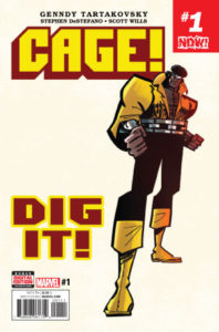
 Cage! #1
Publisher: Marvel
Writer: Gennedy Tartakovsky
Artist: Gennedy Tartakovsky
Colorist: Scott Wills
Cover: Gennedy Tartakovsky & Scott Wills
This title was announced almost ten years ago and now it’s finally here to see the light of day and at the height of Luke Cage’s popularity. Over the past several years we’ve seen this character cultivate a larger fan base, he’s back with is best friend in a series by David Walker and Sanford Greene, and his live action Netflix series has become a sure fire hit! So a new mini series starring Harlem’s hero seems like a logical step. However, it’s one that’s actually taken them in the wrong direction. And me being a huge fan of Tartakovsky’s other works doesn’t give him a pass as to how much of a let down this issue was.
The story is set in the late 70s and Luke is doing his daily routine of stopping criminals. But after Misty Knight fails to show up for their date an angry Cage sets out to look for her and this is where we find out that something sinister is going on since all of the police and other super powered characters have vanished. With a set up like this and some tongue in cheek humor the expectation was a fun issue but that’s not what happened. Cage’s over the top tantrum when Misty doesn’t show up for their date only produced a combination of eye roll and cringe worthy reactions. It was a sequence that was almost saved by a great pun but the following two panels just made it worse. Then we get a shoehorned cameo from some X-Men members that cripples the pacing and makes absolutely no sense and fails to entertain. When a group of villains do show up we finally get several decent moments in the issue but it feels too little too late. Especially when the only moment in the entire issue that was enjoyable for me was the interaction Cage had with some kids at the basketball court. The only part of the story that is impressive is that even though it’s a late 70s story, Tartakovsky does stay away from the dialogue issues that Marvel was notorious for in the past when it came to Black characters.
Tartakovsky’s visuals for this series have been the subject of some criticism and at times it does become problematic. There’s a scene in the jail where Cage questions a snitch and the depiction of the criminal is too close to those negative caricatures that Black people have had to endure for decades. Though I will say that the time period accuracy of Black Mariah’s look can’t be put on Tartakovsky so he gets a pass regarding that one. The opening scene where The Bank Rollers are introduced is actually a great panel that captures what everyone loves about Tartakovsky’s art. It’s full of energy exaggerated limbs and tells you everything you need to know about these bank robbers. The colors from Scott Wills are another strong point when it comes to the art helping this at least look better than it reads at some points.
I”m really not clear on who the target audience is for this title. Sure, not all comics need to be serious and everyone can appreciate humor but when it results in a character just being reduced to a stereotype it’s more like punching down and not fun at all. So if this is your type of thing then knock yourself out but there’s too many other comics out there worth spending your hard earned money on.
Infinite Speech
infinitespeech@comicattack.net