“Greetings O Seeker of Truth, thou has found thy true Nirvana!”
Thus began Stan Lee’s purple pronouncement and Foom, issues 1-3!
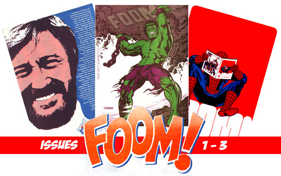
FOOM issues 1-3: 1973
Marvel Comics
Above you see the first three covers of the 70s Marvel house fanzine FOOM (Friends of ol’ Marvel). Why did I choose to cover the first three issues, you question quixotically? Because, fearless followers of the illustrious Ink Stains, I can! Forgive my pomposity, it’s hard to break out of “Stan-speak” easily. That cover of issue one to the left not only has Stan’s big mug staring you in the face, but a very long welcome filled with turns of phrase like “your days have found true meaning; your nights have been enriched, your world has gained new luster.” The guy knows how to rile up the masses, that’s for sure! Helping Stan in his effort to be a player in the then popular and growing fanzine community are editor Jim Steranko, associate editor/master letterer Ken Bruzenak, consulting editor Roy Thomas; and a host of staff members that include writers Don McGregor and Dwight Decker, The Collector‘s Bill Wilson, and several others.
Assistant editor Ken Bruzenak talks about why Marvel produced the magazine themselves after Steranko’s initial four issue run:
Marvel’s decision to make FOOM an in-house project was because they felt they could do it cheaper. Nobody really wanted to take on the job and they had to commission new art, so the cost effectiveness was never achieved, and nobody understood how to do the two-color process. It went from being a news/activities project to a schizophrenic Marvel hype-magazine, kicked around to a bunch of writers until they just gave up. I’m sure many people legitimately tried to do well on the Marvel run, but the vision changed almost every issue and the cheapness showed. Believe me, nobody at Marvel worked for less than me, and those first four FOOMs were the most bang for a buck of the lot.
Marvel wanted a fan-club they could control — without doing any work for it. They really didn’t have time for it, and it needed a different mind-set than doing monthly comics. Marvel didn’t need FOOM. Steranko attempted to do something quirky and Marvel didn’t understand it. FOOM was a noble experiment that got choked off, but then Marvel had lots of successful titles to produce that took priority.
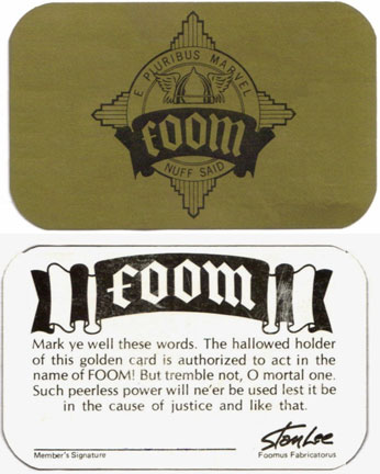
In the first issue, Stan and Steranko talk about how the magazine came to be. Steranko says he dropped in to the Marvel offices to “rap with Stan Lee about the current comic scene,” when Stan mentioned he wanted to start a Marvel club of sorts. He said he got the idea from one of his college lectures. Me, I think he got it when he saw the burgeoning fanzine scene going on at the time (and possibly why people like Bill Wilson ended up being on the staff). Members of FOOM not only got the magazine, but nifty little things like stickers and a membership card, both seen below.

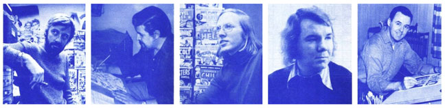
I have to say, I had all this stuff. As a high school comic fan, they made you feel like you were a member of a special club. The magazine itself was full of information about upcoming Marvel comics and products of course. There were also profiles of various artists and writers, complete with photos so you could actually know what your favorite artist or writer looked like. You can see a few below from issue one. Left to right we have Stan, John Buscema, Roy Thomas, Gerry Conway, and Joe Sinnott.
The magazine itself, at least in the beginning, was pretty much a two man operation run by Jim Steranko and Ken Bruzenak. Below you can read about how the 21-year-old Bruzenak learned the ropes of publishing from the ground up. I started by asking (via email) about how he got started, and ran with it from there!
I was working at Supergraphics in Reading, PA as an assistant/carpenter/painter/paste-up and production guy at sub-minimum wage. Comixscene had just begun publishing, and the second volume of History of Comics was just printed. I was assistant editor on Comixscene, so I got the same title on FOOM.
I did all the paste-up, much of the writing, proofing and photo retouching. I ran the photostat camera and did all the production. At that time, Supergraphics really was a two-man operation, and we pulled a lot of 20-hour days, including going to the printer in New Jersey, bring back a truckload of FOOM, addressing and mailing them. Jim would enlist some local fans to help with stuffing membership material into that giant Hulk-faced envelope.
When asked about the interplay between him and Steranko, he continued:
I worked with Jim every day, hashing out content. Jim would do layouts and I would translate that to pasted-up pages. We both did most of the writing, using several pseudonyms. I would call Roy Thomas, Len Wein and Marv Wolfman for news and write all that. Jim did most of the incidental art for the games and covers. Jim was the only one to talk with Stan, and that not very often. Steranko was packaging the project as a four-issue deal. Stan’s input was an editorial and final approval before printing.
Those first four issues are definitely Steranko-designed, and I executed a lot of the lettering, logos and production. At that stage, Steranko and I would proof and re-proof each other for weeks right up until printing, retouch the negatives, watch the presses run, unload the truck and crash in marathon 50-60 hour sessions.
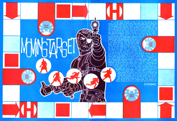
The magazine is chock full of games, puzzles, mazes, and other fun time wasters. Below you can see a Steranko game board, complete with instructions. Bruzenak jokes that the games were rigged in Steranko’s favor. As they play-tested them, Steranko would win the first few times, and Bruzenak the next couple of rounds once he got the hang of “the flaws.”
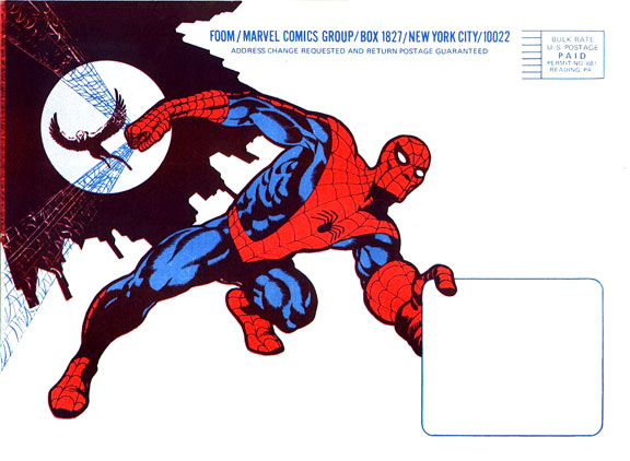
Even the envelope the magazine came in showcases some great art and design. Though the front of the first issue’s envelope is a sort of dorky Hulk (with the open mouth as a cut out), the back is a typically gorgeous and eye grabbing Steranko image (seen below). Of that Hulk envelope, Bruzenak wryly states:
I know that Stan did have an issue with that Hulk-faced envelope. I inked a different first version, which was all fierce and angry, and Stan wanted a friendlier, less mean-looking approach, so Steranko redrew and reinked it. I was just a few years ahead of the curve, cause now the Hulk is all about being mean and nasty looking.
There is actually some story material done specifically for the zine (as far as I can tell). The first of several goofy strips that would have been at home in Not Brand Echh, Fantastic Fear was done by Roy Thomas, Len Brown, Wally Wood, and Gil Kane (usually Kane pencils and Wood inks).
Articles in the first issue include the artist/writer profiles mentioned earlier, When Titans Clash, about the beginning of the Fantastic Four (complete with a checklist), a piece on the new black and white magazines Marvel started publishing (such as Haunt of Horror, Tales of the Zombie, and Monsters Unleashed), and Recommended Reading, which touts Steranko’s magazines, as well as fanzines such as The Collector, Comic Crusader, and Funnyworld.
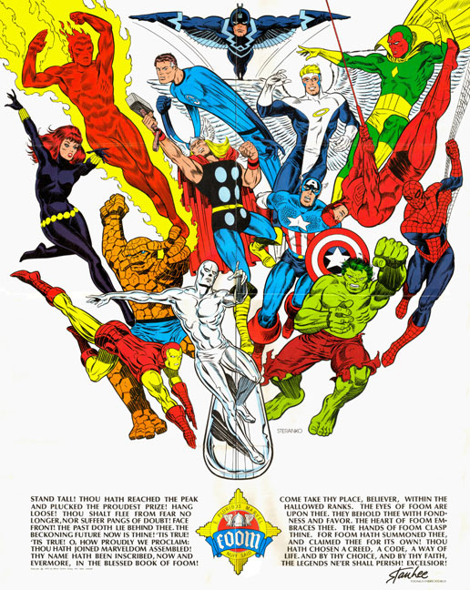
A gorgeous Steranko pin-up rounds out issue one, seen below (some of the Steranko art for the first four issues was recycled from various sources).
Issue two has a much better cover, a very powerful Hulk illustration by Steranko (seen at top). These first few issues spotlighted various Marvel characters. Issue one was somewhat centered around The Fantastic Four, while this issue is decidedly green.
The production throughout the magazine is top notch due to Steranko’s guidance and Bruzenak’s ever improving skills. When I asked Ken if he saw his future as a world class letterer, he said:
Not really. I was sick of rubbing Presstype, and the process of phototype-setting was really complicated and tedious in the early 70s. I was still learning the intricacies and discipline of hand-lettering — it’s a skill that demands precision and contextual sensitivity, and I was more interested in drawing (poorly) at the time. I turned to comic lettering because I had done that on the Outland adaptation, for Heavy Metal. Frankly, I needed to make a real living, and Supergraphics wasn’t working out. Entertainment Weekly had begun publishing, and made the whole Comixscene/Mediascene/Prevue project obsolete, which raised the stress levels between Jim and I as the prospects for the future got dimmer. I certainly got a terrific training and range of experience from Jim, but the end was coming, the money dwindling and patience running out.
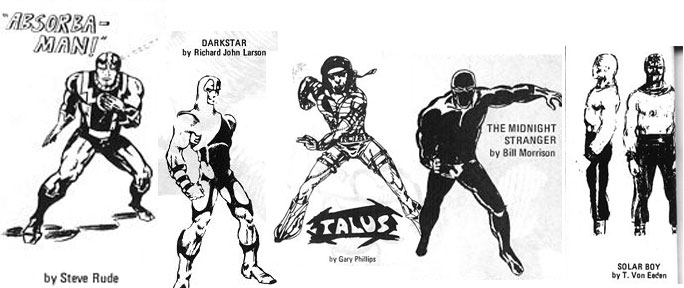
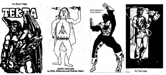
Issue two is also when the Marvel Character Contest began and the main reason I decided to do these three issues. Marvel offered the readers of FOOM a chance to create a character that would appear in a Marvel comic, and the entries flooded in. The entries appeared in this issue and issue 3. You will be blown away at some of the names in this group, the members of which were probably all still in high school. You will see characters from Steve Rude, the late Tom Lyle, Trevor Von Eeden, Gary Phillips and more! Some who didn’t make the cut to be printed are Lyndall Ferguson (Revolutionary Comics), Bill Mutschler (of the fanzine Entropy Cosmix), Howard Simpson, and Fred Hembeck! Below are a few of the entries that made it into issue 2.
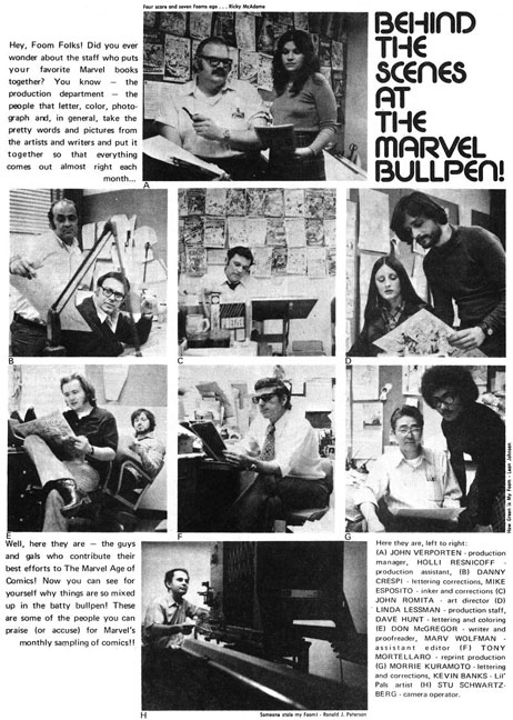
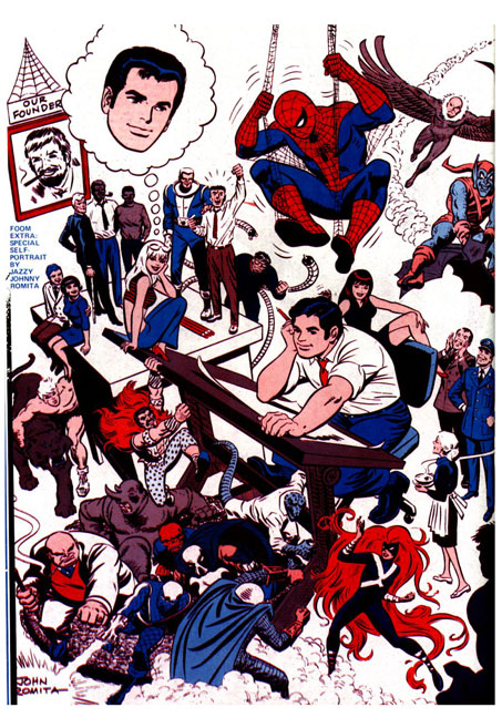
Another pretty neat segment of this issue is a look into the Marvel Bullpen. There are people here you probably never or very seldom see, but were important in various ways behind the scenes at Marvel. See a few below, including Marv Wolfman, Don McGregor, John Romita, Mike Esposito, and more. Bruzenak adds, “I would get in trouble because of the size of the phone bills when talking to Roy Thomas for 4-5 hours gathering news, plus lots of good gossip we could not print.”
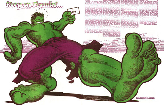
Paying a sort of tribute to the great Robert Crumb is a scratchy version of the Hulk, seen below.
More Hulk visuals in the magazine seen below, which accompany an article on Bruce Banner’s alter ego. It is interesting to see the different artists’ versions side by side. Though Trimpe will always be associated with the Hulk for many (including myself), I think the most savage version is a toss up between John Buscema and Kirby.

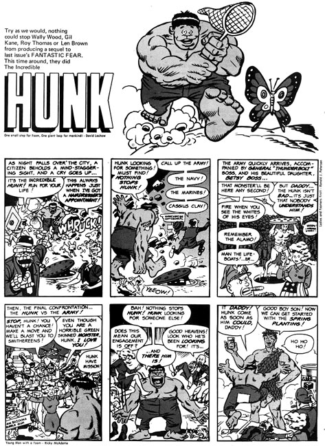
Later in issue two, there is an article about the return of Savage Tales and some behind the scenes information on its return. Also, there are more updates on upcoming comics (I swear, Gil Kane is everywhere!), and another installment of Recommended Reading, which mentions Graphic Story, Wonderworld, Ragnarok, The Buyer’s Guide, Heritage, as well as the zines mentioned in issue 1 (along with Steranko’s History of the Comics). But, the Hulk is not done with us yet…see below the second installment by Kane, Wood, etc., in the silly series, this time called simply Hunk.
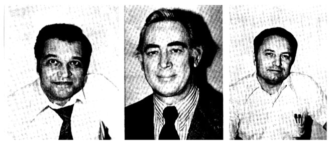
Rounding out the issue are various games, puzzles, ads and such. Let’s get on to issue three, shall we? Issue three has what looks to be a Romita Spider-Man cover and several Spider-Man related pieces inside. First, though, below you see the creators spotlighted in issue three, John Romita, Gil Kane, and Frank Giacoia, all Spider-Man veterans. In fact, Kane drew one of my favorite issues, the one in which Spidey had six arms. I later did a painting for a comic called Portraits of a Marvel Universe, which you can see here (top row, 4th from left, in the strip at bottom of page).
The contest winner was announced this issue, but first, a few more contestants….
….and the winnah!

In keeping with the Spider-Man theme, there is a checklist and a history, along with the Romita art below. I really remember loving these artist bio pin-ups so long ago.
And, for the third issue in a row, Thomas, Wood, Kane, and Brown give us a superhero parody (those are the listed credits, but Bruzenak tells me the art is all Wood). This time, it is The Amusing Spider-Guy.

Filling out the issue are the usual puzzles, games, ads for things like a Spider-Man record and T-shirt designs, and a gorgeous back cover by Sal Buscema, seen below.
Big huge thanks this installment go out to lettering god Ken Bruzenak, who provided inside information and anecdotes at the very last minute before my big move across the country! Thanks a ton, fellow Ken! If you want to see what ingenuity, experience, and hard work can do for a comic and its visual appeal, I urge you to check out his work on American Flagg!
I hope you have enjoyed your pulse pounding parade through the bullpen and down the hallowed halls of the House of Ideas and into the maelstrom of mighty Marvel! Face Front, True Believers, forsooth, I have many more illustrious issues of the fabulous fanzine! For now, you can dubiously download the issues! Until next time, tally ho! And leave some comments, you lazy bones!
Ken Meyer Jr.
kenmeyerjr@yahoo.com
These are great! I have some of the later issues, but I’d not seen the guts of these three issues until now. And the present-day interview of Ken Bruzenak was simply icing on the cake! Thanks!
Pingback: Comics A.M. | Batman: Earth One leads July bookstore sales | Robot 6 @ Comic Book Resources – Covering Comic Book News and Entertainment
Russ, thanks for reading and even more for commenting! I heard from both Tom Lyle and Steve Rude, but too late to include…Ken added a lot of great stuff, though.
Wow, flashback time. My only real comment is that the first two paragraphs from me should apply to issues 5 and up, after the four Steranko issues. We were a pretty autonomous operation for about a year. When Marvel took over they dumped almost everything but the 2 color printing, which was the part that needed changing — comics are a four-color medium, after all. The Marvel issues were just schizophrenic since there was little consistency in editors or concepts. It’s not that Marvel didn’t try to do well, well but FOOM was definitely not an important concern, and once the subscription was paid, future sales weren’t an issue, so it got shuffled off on the “new kids.” Really, Tony Isabella probably knew more about those Marvel produced versions than me.
I remember plotting out and drawing that membership card and the FOOM seal/badge based on some old Prussian medal. Jim never wanted FOOM to be simply a showcase for his work, but necessity forced him to do a lot of incidental pieces, like the games and covers. I wish he had just done some more comics, myself.
“Supergraphics in Reading, PA”. Wow, I’ve never heard of that company, but I live 25 minutes north of there (actually worked there for a year for my current employer)! I must investigate! Great stuff as always Ken. That Hulk collage is spectacular!
Ken, thanks for your input, stopping by, and commenting! Your comments made the article much better than it would have been otherwise…and thanks for the clarifications!
Billy, thanks for taking the time to comment! Dunno if SG is still there, tho.
I was wondering why issue four was not included, as I believe Steranko worked on the first 4 issues. I am with Ken, I wished Steranko had kept doing comics instead of devoting his time to FOOM.
What was the deal with the mutant contest? Was it rigged? Did they change the winner after they made the announcement cause I don’t remember that guy EVER appearing in an X-men comic. However I DO remember a guy called the Wolverine appearing and one of the entries was called The Wolverine and the drawings (while crude) did show what appeared to be a guy with an strange metal skeleton implanted under his skin. How odd. Maybe they took that character and modified it and polished it and used him instead?