The names alone will draw you in: Neal Adams, Mike Kaluta, Berni Wrightson, Tony DeZuniga, Rich Buckler, Ken Barr, Frank Brunner, Jeff Jones, Gerry Conway, Ernie Colon, Tom Sutton, Denny O’Neil…and more! All in Phase!
Phase: 1971
Published by Phase Publications/Sal Q
There were very few fanzines (or “prozines,” which an argument can be made that Phase is one of) that were able to assemble the vast and deep array of talent that Phase was able to gather. Included in that list at the outset are some of the biggest names, the best artists, the most lauded writers, and some of the most singular creators working in comics at that time. Honestly, it boggles my mind the amount of high profile and highly regarded creators that Sal Quartuccio and his associates John Carbonaro, Doug Foley, and Jim Ciccolella were able to corral into this impressive package. Add to that a high quality printing job and a slick paper in an oversize format, and you have in your hands one of the best of its kind.
Sal Quartuccio’s family moved from Queens, NY to beautiful Brooklyn around 1965. On the subject of the formative stages of his young publishing career, Sal states that:
I used to see John Carbonaro walking up my block, always reading a comic. We finally met during a stickball game on my block and found we had so much in common. He introduced me to Marvel Comics (I was basically a DC and Warren fan). John was friends with other comic fans, Jim Ciccolella and Doug Foley. In 1969 we saw an article in the Daily News about an upcoming comic book convention in New York City. We all went and had a ball. We met many artists and writers, and got some nice sketches from several of them. I spent all of my money at one table – buying back copies of the first 4 or 5 issues of Witzend. I fell in love with the idea of publishing this type of black and white comic.
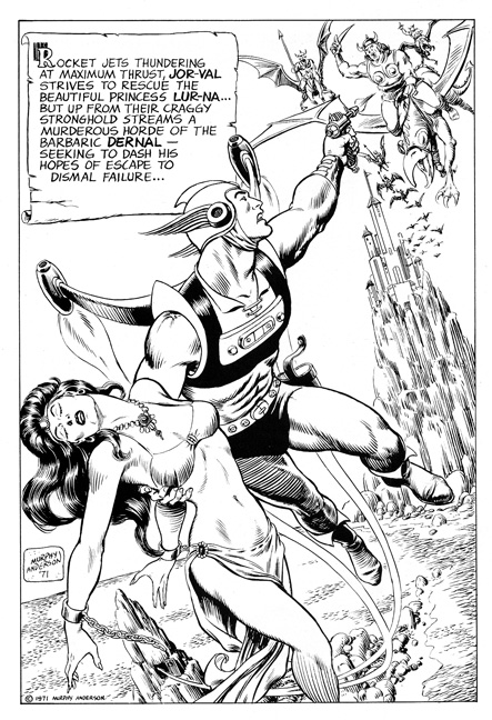
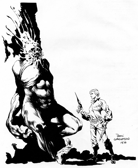
After publishing a mimeographed fanzine called A.C.E. (Amateur Comic Enterprises), Sal and his friends decided to up the ante and publish something more substantial in every way, and that enterprise became Phase. Like many other fanzine publishers, it was remarkable how much he accomplished at such a young age. Sal was only 18 and a freshman in college when he started putting together Phase. Sal Quartuccio appears to have made a decision to concentrate on providing a wide variety of stories and story subjects. A few stories dealt with the big stories of the day, such as the Vietnam War. However, other genres covered included sword and sorcery, fantasy, humor, science fiction, and even a western tale. There were also several beautiful spot illustrations and pin ups. Look at the gorgeous and skilled line control from an inking master, Dan Adkins, the round and rendered forms in the Murphy Anderson piece, and the usual macabre mastery from Berni Wrightson!
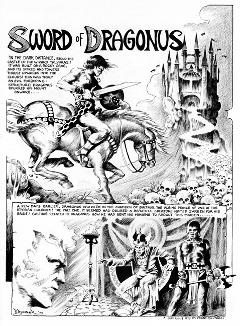
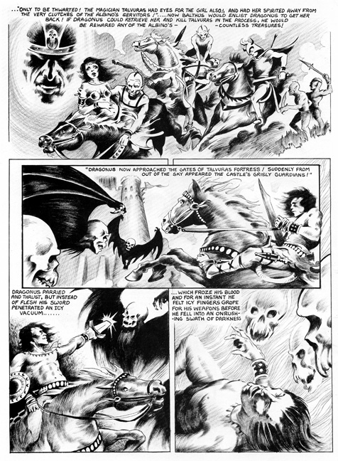
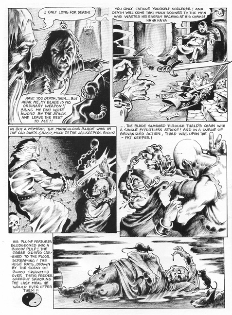
But, as I said, Sal and his team were able to procure full stories from many of the creators, so let’s get to those! Frank Brunner starts the issue off with an 8-page sword and sorcery tale called Sword of Dragonus. It’s a great chance to see Brunner in his early Frazetta-inspired style. It was during this time that Brunner’s work was used in publications such as Web of Horror, Creepy, Eerie, and Marvel Premiere (doing one of his signature characters, Dr. Strange). Through email, Brunner told me that, “My inking was still developing. I used ink wash and pencil gray tones. The story was originally done for Web of Horror 4, which never saw print. Phase actually outbid Warren for the story, which Jim Warren wanted for Creepy!” Check out Frank’s official site here, and some selected pages from his story below.
After the wizards, creatures, and demons of the first story, we jump far forward into a science fiction short story called Impact, by Ernie Colon, complete with a twist ending. Bill Stillwell provides a breather with a full-page illustration, and then we are again thrust into a totally new frame of reference with The Coming of the Pirahnas by Denny O’Neil and Steve Skeates. Drawn by Skeates (a writer who produced a large quantity of work for Warren publishing, winning several awards along the way) in a style reminiscent of marginal cartoons in a high school notebook, it appears to be a lesson on how to conform and survive. Along the way, we are treated to some very fishy puns and jokes. Changing tracks again, the Phase train pulls into a town in the old west for Gerry Conway and Gray Morrow’s Duel. This is a classic western tale of a man wrongly tried, sentenced to death by hanging, and then…well, read the story! What I appreciate the most, being an artist myself, is the wonderful and seemingly effortless realistic style and skill of Gray Morrow. Morrow was a mainstay of Warren like many others in Phase, but he also did his share of work for other publishers, including a plethora of paperback book covers, Perry Rhodan being the most well known. His style was perfect for horror, western, and anything else that required a level of realism that few comic artists could muster. In fact, it was possibly the quieter type of drama inherent in truly realistic work, that stopped him from succeeding as well in fantasy arenas such as superhero comics. Sadly, Morrow took his life in 2001, after suffering for a time with Parkinson’s disease. Below you can see one illustration from Duel, showcasing his mastery of the toning material, zip-a-tone, as well as his command of line weight and variety.
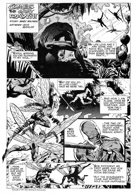
 A spot illustration by pro Tony DeZuniga fills the gap between Duel and the next story, Soul Food. Written by New York Comic Convention founder Phil Seuling and drawn by Chris Notarile, it is a tale of a man who commits an act that does the very thing that he is trying to escape…lose his soul. Notarile’s name was familiar to me for some reason I could not remember, until I did a web search and was reminded that he was a very accomplished illustrator, doing TV Guide covers and many other high profile pieces. You can see samples of some of his work here. A short 2-page fantasy tale by Marv Wolfman and Rich Buckler follows called Comes the Gray Dawn. This is another instance of Buckler showing what a pro he is and always was. I especially love the drama brought about by the skillful using of shadow and light in the first panel of the page below.
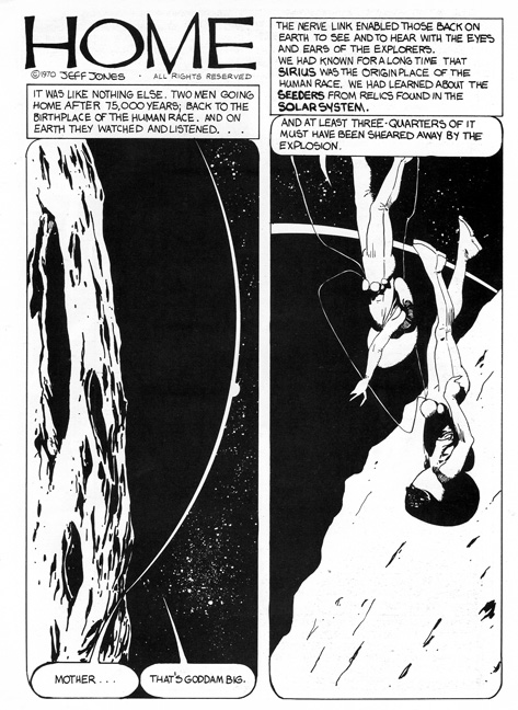
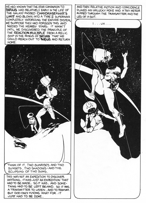
 Continuing in the fantasy vein, but in a much quieter fashion, is Jeff Jones and Home. As always, Jones shows his mastery of composition and placement of black fields. His work always astounds me. As I mentioned in another column, keep an eye out for the film by Maria Carbado on the life of Jeffrey Jones called Better Things. Maybe you were lucky enough to see the panel at the most recent San Diego Comic-Con on the film…I sure wish I could have! See the story below and find out more about the film here.
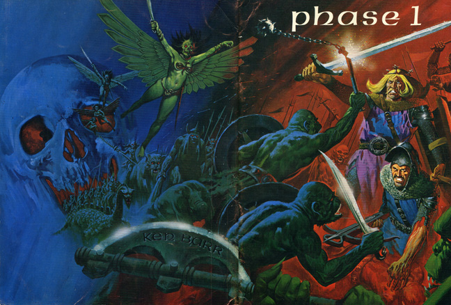
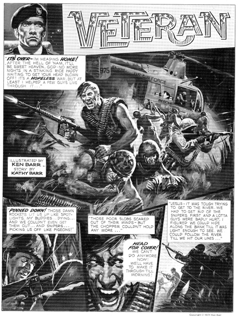
Cover artist Ken Barr treats us to an anti-war story next with Veteran. Like Morrow earlier, Barr is a master of realism, though he does it with paint. I believe I can spot a few of his photo referenced subjects, including John Wayne, E. G. Marshall, and possibly even Leslie Neilsen. However, it’s Barr’s superlative painting skills that really shine here, and on the cover even more. Below you can see samples of both.
Following the Murphy Anderson pin up you saw earlier is a creator who, in Sal’s words,
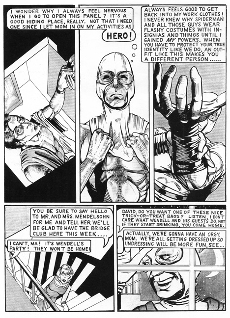
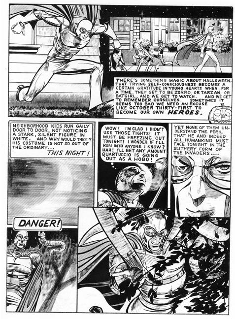
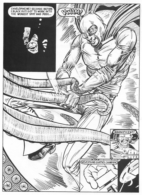
has more talent in his baby toe than most artists in the biz, his only problem is sitting down and finishing something. He had so many ideas floating around, but he rarely ever got to finish anything. I always wanted him to continue with Hero, but that never happened, he did several short bizarre stories for Hot Stuf’ (there was a lot of interest in Scarecrow – but that was just a series of spot illos, nothing more). Then Bil went into computer graphics, worked at Disney’s Imagineering Dept., and then teaching art in Canada.
He is talking about Bil Maher, whose work you saw in an earlier installment of Ink Stains on the aforementioned Hot Stuf’. The little bit of work I saw of Maher always left me wanting more. He seemed to have a command of a lot of techniques and could handle many types of subject matter. In Hero, a few pages of which you see below, he handles line and tone easily and moves back and forth between humor and “serious” sf/superhero type material with ease.
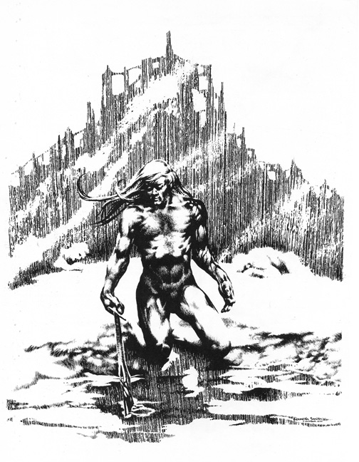
 After Maher’s 10-page story, Mike Kaluta contributes a two-pager entitled As Night Falls, after which we are given A Subtle Philosophical Sword and Sorcery Tale called Getting the Point by Kenneth Smith. Always a smarty pants (and I mean that very respectfully), Smith also is very good at throwing a little humor the reader’s way. Illustrated with Smith’s always incredibly rendered illustrations, it is a feast for the eyes and mind. See a sample below.
An about face is given to us by Tom Sutton with The Comic Book Freak, drawn in a Mad Magazine type style and peopled with parodies of some of the best known comic strip characters, such as Dennis the Menace, Beetle Baily, Daddy Warbucks, Dick Tracy, and even Archie! Zany! Next, we are thrust into a serious story by Steve Fritz called Yesterday’s Rain, chronicling the violence in human nature from the caveman to the atom bomb. Fritz uses many visual techniques to tell his tale, including pen and ink, photography, and collage. Ken Kelly, illustrator of many a sword and sorcery paperback book, follows with a cheesecake pin up. Bill Stillwell appears again with another pin up, and then a two-pager from Len Wein and Tony DeZuniga called Dragon Slayer that allows us to see that, yes, the Philippino artist can draw beautiful, naked damsels!
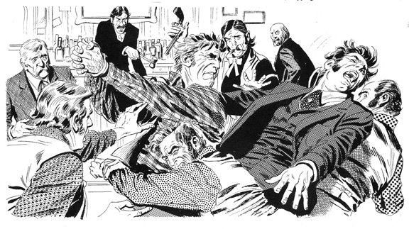
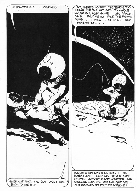
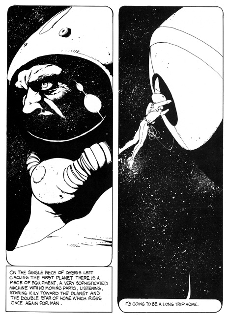
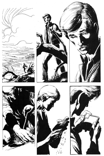
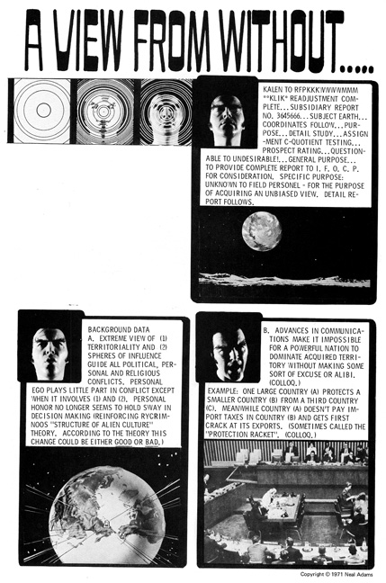
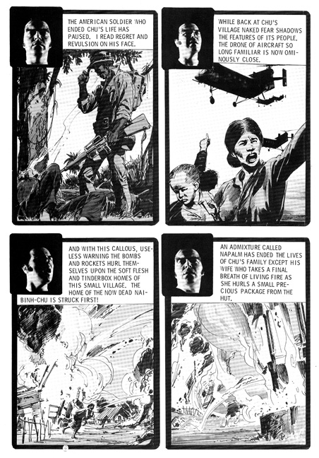
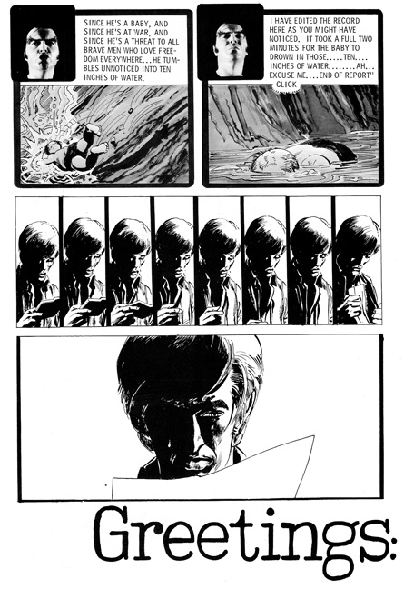
Pulling up the rear with the last story, Neal Adams delivers a big emotional punch with A View From Without. Adams’s incredible rendering ability is on display here, along with his political views on war in general, and the Vietnam war in particular. It opens with a young man on a hike in the mountains, who finds a strange and futuristic communication device, much like the advanced cell phones we have today, 40 years after Adams did this story. Adams uses his hefty drawing skills and combines them with some photo collage and even a fumetti of a sort (the artist himself appears as the narrator/communicator on the device, complete with dramatic lighting and some darn huge eyebrows). Some of the images are just too graphic to show here, but suffice to say it illustrates the horrors of war pretty convincingly. See a few pages below
After the emotionally draining Adams story, Billy Graham contributes a full-page Conan-like illustration, and then the magazine is pretty much over. Now, after seeing the incredible talent in this magazine, it shouldn’t have surprised me to hear from Sal that “Jim Steranko was the planned cover artist, but when we met at Phil Seuling’s home, all he offered us was a very nice and very dark western painting. We thanked him but passed.” How many 18 year olds would pass on a Steranko cover? Sal must have had a ball assembling this group. He thanks many people familiar to Ink Stains readers (such as The Collector’s Bill G. Wilson, TBG‘s Alan Light and Fantastic Fanzine’s Gary Groth). Of this group, Sal goes on to say that “many fellow fanzine publishers were kind enough to include our flyers in their mailings. That’s when publishing was just a fun thing to do, no one was looking for a film deal, no one was looking to get rich, we just wanted to pay the printing bill. We had a much better system then, now everyone is dependent on one comic shop distributor, and the 2 major publishers just want to flood the market and tie up every dime to prevent anything else from getting out there.”
Sal Quartuccio says that later, “in 1973 I decided to go on my own and start Hot Stuf’, and brought in my good friend Bob Keenan to help it along.” Sal also published many other fine books and magazines and continues to do so today. Along the way, he worked and hobnobbed with the best, including playing softball with Phil Seuling, Angelo Torres, Gray Morrow, Dick Giordano, and occasionally Frank Frazetta. What a life!
Now, obviously, this was one long installment of Ink Stains! So, you shouldn’t be surprised that the pdf download comes in three parts!
I would like to especially thank Sal Quartuccio for answering questions via email and Facebook, as well as Frank Brunner. Tune in next time, as we will be seeing either Infinity 2 or Fantastic Fanzine 13! Feel free to send me your votes as to which you would like to see! And please, if you read the column, leave a comment behind…without ’em, I feel lonely!
LATE BREAKING ADDITION! SEE BELOW THE STERANKO COVER THAT WAS REJECTED FOR THE KEN BARR COVER!
Thanks very much to the mighty Tony Robertson!

Ken Meyer Jr.
kenmeyerjr@yahoo.com

That was an amazing fanzine, although after they advertised that it was going to have a Steranko cover and it didn’t, I remember being disappointed when it arrived. That dark western painting was eventually published many years later as a card in the Steranko Fantasy card series.
I still have my copy; still one of the best of the “ground level” comics of the time.
Nice read…thanks 🙂
Thanks to all three of you for stopping by and taking the time to comment! Myself, I am just disappointed that number two never happened!
Nice job on this look through, Ken! Phase was a very uneven collection but it did have some great stories in it. Great job as always.
Note the Joe Kubert homage by Adams on the first panel of the third page you show up above. That was a very typical Sgt. Rock stance that Joe used a lot.
Thanks, Rich! And yeah, I remember Rock tipping his helmet many times.
By the way, if anyone is reading this, I will be adding the Steranko cover that was refused in the next day or two.
That “Sword of Dragonus” looks sweet! Great job as usual Ken.
Thanks, Billy!
Pingback: Happy 69th birthday, Steve Skeates ‹ Scott Edelman
Another fantastic Ink Stains column! Phase #1 was a legendary graphic-story magazine and I’m glad to know more of its background — thank you to Sal Q for that. But however in the world did 18-year-olds afford a Neal Adams story, let alone all the rest?
Y’know, the Barr cover painting is really nice, but so is the “rejected” Steranko painting. I really don’t see choosing one over the other, especially if they were offered the Steranko piece first for publication. Some fantastic work in that issue.
John was a dear friend, he had a big heart. Frank Cho introduced me to Gray and I remember bending his ear about Stingaree.
Thanks for this blog post.
Pingback: Ink Stains 29: Hot Stuf 1 – ComicAttack.net
Pingback: Ink Stains 156: The Collector 26 – ComicAttack.net