Seraphim was one of the select group of fanzines that catered to those that appreciated the best artists in the business. The final issue delivered in spades, with stalwarts such as Al Williamson, Berni Wrightson, and Kenneth Smith. Get ready for a feast for the eyes!

Seraphim 5: 1970
Editor and Publisher: Tom Veilleux
It is somewhat fitting that, considering this edition’s subject, Seraphim 5, I don’t have as much to say as I usually do. Seraphim was one of several fanzines that focused on the visuals. Editor and publisher Tom Veilleux put it best when he described the fanzine’s mission to have been: “…crammed with never before published art by the greatest pros around.” Though the fanzine does not possess a huge page count or number of contributors, the level of notoriety and quality is disproportionately high.
 Above you see the image from the cover, a beautifully understated and typically graceful piece by Al Williamson. Inside the pages of this issue, you will also see a Flash Gordon head sketch by the artist, to whom this issue was dedicated.
Directly following that is an ink drawing by Dan Adkins that appears to be referencing a still from an old adventure serial. It is a skillful exercise in crosshatching, line control, and using the light areas to direct the eye, all signs of an experienced and expert draftsman.
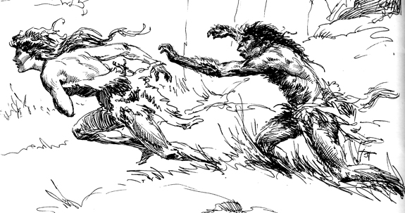
Several other artists do one-off illustrations, including Gray Morrow (a back cover that looks to be a rough for a book cover) and Jeff Jones (seen at right).

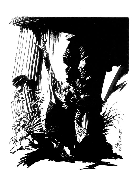
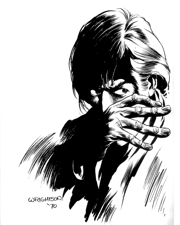
The main focus of this issue however, is divided between portfolios by three artists who are acknowledged as masters of their respective fields. These folios start off with a bang, courtesy of a still young Berni Wrightson, only a year from starting his career defining initial Swamp Thing appearance in House of Secrets number 92 in 1971. What is really striking is the incredible leap in quality between his work in Squa Tront (click on title to go to that column), to the four illustrations in the this portfolio, spanning a mere two or three years. A sampling to whet your appetite (and get you to download the issue) is below.

Following the Wrightson portfolio is an article on the early Mad Magazine, and especially Harvey Kurtzman’s part in the seminal humor magazine’s beginnings. It is accompanied by a black and white reproduction of the cover of issue ten. What I find charming, especially in this digital age, is the obvious (and maybe even manual) typewriter that was used to write the article. Letters rise and drop from the baseline, misspellings appear here and there. Keep in mind that this is the way many fanzines were produced back then. Methods available then seem primitive today, obsolete. But many a teenager or college student produced their fanzine in their home on typewriters, mimeograph machines, or, if they had money to burn, printed their gems on an offset printing press. Perhaps it is only charming to someone of my generation, who actually used these things!
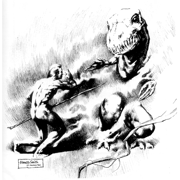
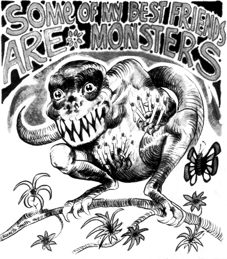
After being immersed in the dark and shadowy world of Wrightson, the master of the macabre, it’s time to go back to that magical and fictional age when dinosaurs and man lived (and died) together, guided by the fine pencil and pen strokes of Kenneth Smith. Kenneth Smith was the artist and publisher behind the incredibly high quality Phantasmagoria (see issues for sale here, though they are pretty pricey). The work in this issue of Seraphim looks to be very early. Smith’s usual attention to detail and fine line work is evident, though there are a few anatomy issues that he worked out later in his career. Smith was also one of the most intelligent artists (and writers) at that time, having finished a philosophy degree and begun his Ph.D in the same subject at Yale. No slouch in the brainpan area is Mr. Smith! Below, you see a few plates from the portfolio and after that, the cover of the first issue of his fanzine. I urge you to search for more issues and pages. You can see a great selection of Creepy and Eerie covers, as well as other work, courtesy of “Mr. Door Tree” and his blog here. They are simply mind-blowing in their attention to detail, a tiny taste seen below.


 The last portfolio in this issue spotlights the incredibly prolific Roy Krenkel. I recall seeing (and buying) numerous great science fiction and heroic fantasy paperbacks in the 70s, especially those written by Edgar Rice Burroughs. Many times I bought them solely because of the great covers. It was in this commercial arena of the gods that it always felt like it was a battle between titans and good friends Krenkel and Frazetta. In fact, if I may digress a bit into a personal anecdote, I spent almost all the money I had earned de-tasseling corn one summer in Minnesota on books with covers by these two great artists in one stop at the bookstore! I must have been about 14 at the time. Those were the days! After a short bio, we are treated to 8 pages of Krenkel sketches and finished drawings. I would submit that the sketches (as with many artists), have more life than the actual finished work.
From a succinct but very good online Roy Krenkel bio, it is said of his career as a commercial artist that “…most of Roy’s ‘career’ consists of occasional bursts of commercial output mixed with prolonged submersion into personal creativity. He told Bhob Stewart that he did the minimal amount of commercial work that would give him just enough to live on so he could spend his time drawing his own ideas — with no one to please but himself. Non-paying gigs like his uncounted contributions to the sword and sorcery fanzine, Amra, and the Burroughs fanzine, ERB-dom, were much more interesting to Roy than getting paid to illustrate some stories in Analog. He did five or six of the latter and hundreds of the former in the early sixties. Roy’s focus was always the past, not the future.”
“Roy’s knowledge of the past, both artistic and historic, were brought into play when Ace  Books hired him to produce covers for their early 60s revival of the works of Edgar Rice Burroughs. It was this canon of three dozen books that would start a revival of fantasy fiction in that decade. The earliest to see print was At The Earth’s Core. Each book had the extra bonus of a small frontispiece in pen & ink. Halfway through the project, he enlisted Frank Frazetta’s help. The thought of the self-effacing Krenkel trying to convince the self-assured Frazetta that Frank would actually be a success at painting goes contrary to everything we know about the two men. Still, after a couple of collaborative efforts, Roy sent Frank out on his own and the rest is history.”

Krenkel is widely admired by many artists, writers, and fantasy fans. Well known illustrator Mike Kaluta, in an online testimonial to Krenkel’s effect on his art says, “…I can still cast my mind back to those first impressions, very useful when called upon to work up anything remotely in the same vein. Spoken aloud in those earlier years and now a silent inner voice when caught at a loss, my mantra is: ‘What would Krenkel do with this?’ If the prayer is answered, I’m well on my way to a fine composition, thanks to the guidance I gleaned from my appreciation of Roy’s work.”
Kaluta continues his admiration with, “The overall effect Roy’s work had on me was it gave me permission to delve into realms of imagination untouched by the run-of-the-mill illustrator. ‘Giving Permission’ is the greatest gift one can give to another, in art as in real life.”
Krenkel’s sketches remind me of the great J. Allen St. John, his quick and lively strokes exuding a lifetime of skill and experience. He is one of the more overlooked artists of the past, and I urge you to search out his work.
Publisher Tom Veilleux appears to have continued his appreciation of amazing art, as his website says he has been assisting customers with their fine art needs for thirty years. Please visit his website here.
Also, as always, please avail yourself of the download I have provided of this fine fanzine here. Show me I am not doing all this scanning and assembling for nothing!
In two weeks, Nimbus 3 by Frank Lovece, including work by Mike Zeck, Craig Russell, John Buscema, Walt Simonson, as well as great (then) fan artists Sam De La Rosa, Ric Cruz, Pete Iro and more…and an interview with Tony Isabella! Also, keep in mind, I take requests!
Ken Meyer Jr.
kenmeyerjr@yahoo.com

It is interesting to se the reference to old repro techniques. I do not miss them (especial stats) but they forced a kind of simplicity that many try to simulate today.
This Krenkel work is amazing. I admit to not being familiar with his work before.
Well, I don’t think these artists changed anything of their style for these repro techniques…back looong ago, when artists did actual woodcuts, they tailored the work somewhat. However, yeah, look up Krenkel, he produced a large volumne of work and was a pivotal part of the fantasy art scene of about 1960-1980 or so.
And thanks for checking in, Christina!
I’ve often wondered what this magazine looked like. The answer is–pretty damn cool! Thanks for sharing.
Rich A.
Man, Rich, there are sooooo many good ones out there…many that I had and lost along the way, many I never had. Wish I had money to burn!
Krenkel knows how to draw a lady for sure. 🙂
Another fantastic installment! I’m always anxious to see what will show up every two weeks. Can we e-mail you requests?
Ah, this is more along my tastes…. That’s some beautiful artwork.
Amazing stuff here Ken. Thanks for sharing it with us!!
Wow, that’s funny, Jason…without even seeing your post, I just added “I take requests” to this installment! Keep in mind, I only have what I have, though.
Kristen, what I am doing, to some degree is alternating between the zines with the big name stuff and the smaller (but no less important) ones that really epitomize fandom.
Thanks for all the comments, people!
Well, it’s more…. I have more interest in fantasy art than I do in super heroes or sci-fi. And I definitely prefer the more polished, artsy look.
Ahhh, I see…well, be sure there are more fanzines coming in the fantasy realm in the future.
Pingback: Reach Your Potential With Internet Marketing | Sample Sales Letter
A very minor footnote: The MAD article by Bill Parente in Seraphim #5 was a reprint from EC Fan Addict #1 … the original title of this fanzine. 🙂
Pingback: Ink Stains 163: Seraphim 4 – ComicAttack.net