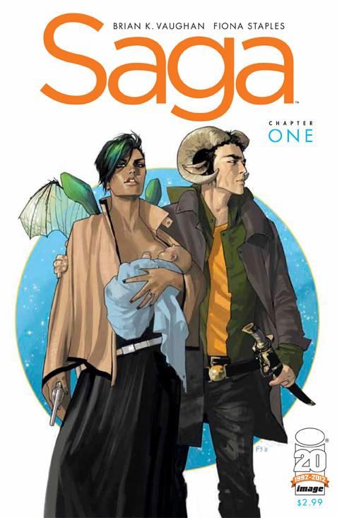
 Saga #1
Writer: Brian K. Vaughan
Artist: Fiona Staples
Letters and Design: Fonografiks
Publisher: Image
Release Date: March 14, 2012
Brian K. Vaughan and Fiona Staples unite to bring us the new science fiction/fantasy series Saga. The story spans across multiple planets with characters on all sides of an intergalactic civil war. The focus is mainly on two soldiers who went AWOL due to love, and are on the run with their new born baby.
Staples’s artwork is top notch as she gives life to these landscapes and people, giving robots equal parts humor and humanity (which is a real treat since they have televisions for heads). She brings these characters to life such that while they are all aliens to one degree or another, I can imagine seeing them out in public. No two characters look alike, even the robots are distinctive from one another, so you won’t be getting characters confused in this series for looking vaguely similar.
The idea of a war that is outsourced is interesting. It explains why it’s an intergalactic civil war, when really it’s the fight between a planet and its moon, which are both able to enjoy relative peace since the fights are on other planets. It is a nice commentary on how we distance ourselves with wars, especially ones fought away from home.
The narration lettering, done by Staples, is also noteworthy since it is its own character in the story. This narration has its own style that evokes that whoever is talking to us is not bound by the story it is telling us, and yet at the same time blends in with the story to where it is part of the scenery.
The colors are vibrant and really make the book shine with how much variety we get. The contrasts between cold scenery and the bright fire in one scene in particular stands out. The book also has really cool design concepts, my favorite being a scene in which it is spaceships versus a giant turtle. I don’t really want to post any of the images here just because the art should be seen in its entirety and not in segments. I feel like I’d just end up posting the whole issue since it gives a “Now look at this scene! Now this one, too!” energy. So all you’re getting is the cover.
The book is definitely geared towards adults, with nudity and violence to be found throughout. Several people get a case of lost body parts that are shown mid-loss. Vaughan is able to blend humor well with the action scenes of Staples to create a book with lots of energy. The art alone is worth the price of the book. I could go on and on about this art (it’s right up there with Batwoman for art), and the Vaughan seals it with solid writing. This is a definite buy if you like Vaughan, wonderful art, or science fiction/ fantasy, as this book has them all. Rating: 5/5

A copy of this comic was provided by the publisher for review.
Alexander Bustos
drbustos@comicattack.net