Captain Marvel, created in 1967 by Stan Lee and Gene Colan, debut in the pages of Marvel Super-Heroes #12. An alien Kree sent to infiltrate and eventually lead to the demise of Man, Captain Marvel switched sides and lived among his Earth brethren before eventually meeting his demise. Most feel that heroes should die in a glorious firefight, defending their ideals right to the end. Mar-vell did not see such a glorious end. He was poisoned by Compound 13, and slowly dying of cancer. Before he met his end, all of the heroes he had helped gathered at his side to see him off. His greatest enemy, Thanos, even powered him up again for one last fight.
Death of Captain Marvel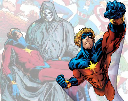
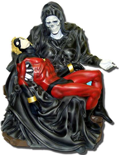
Manufacturer: Diamond Select w/ Art Asylum
Sculpted By: Meg Stone
Dimensions: 8.5″w x 10.5″ h x 8.25″ d
Released: 2002
Retail Price: $150.00
Circulation: 4000
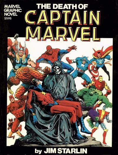
Now before we get into the details of the actual piece, let’s look at some of the history behind the sculpt. It is based on Marvel’s very first graphic novel, The Death of Captain Marvel. Released in April 1982, Jim Starlin took full duty in creating this true masterpiece. Captain Marvel sales had been failing, and Starlin wanted to see this character go out as none have seen before. In the lap of death, Captain Marvel is surrounded by his allies in the background. It was a truly shocking cover for its time, because death was never very permanent, and certainly not for a character that publisher Marvel was trying to push on readers.
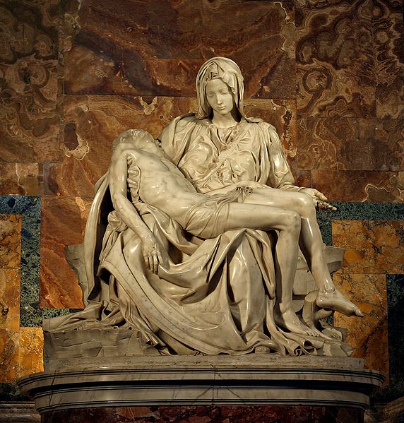
Now although Starlin is a master on his own, he had a little help for the inspiration behind this cover. Some may or may not know this, but this pose is based off of actual Renaissance era art. La Pieta, sculpted in 1499 by master artist Michelangelo, features Mother Mary holding the body of her son Jesus in her lap.
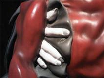
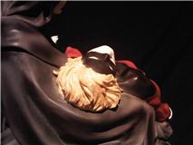
There is our little history lesson behind this piece. Now onto our actual statue. There are a couple things that make this statue pretty amazing. First the colors, which were done with amazing detail and accuracy. The red of Captain Marvel’s costume is shadowed, giving his frail body some serious layers. The folds of Death’s cloak are also done with some pretty amazing coloring. The grey is not dust, but highlighting. I also really appreciated the detailed coloring put into Captain Marvel’s hair. It’s not just one flat color, but a few shades of blonde, which is really nice. There is a bit of bleed off of gold from where Marvel’s Nega Band meets Death’s cloak. Where Death’s fingers are holding Marvel, the bone color is a bit inaccurate, and the cloak also bleeds a bit onto Marvel’s right hand, but other than that, the rest of the statue is dead on.
The other thing I really like about this statue is the way they display Marvel’s body. This was a man who in his prime took on Thanos alone, and is now at Death’s door. You can see the major muscle tone that is slowly atrophying into a very frail and weak man. The original sculpt with Jesus is not as muscular, so you can appreciate the difference.
There are two gripes that I have, one that has merit, one that doesn’t. Death’s right hand, which cradles Marvel’s body, looks really awkward, almost as if the fingers are sprouting from his arm. In the Pieta, the fingers are pretty defined apart from Jesus’s body, but in this sculpt they’re a bit closer than they should be.
As for my unwarranted gripe, it’s the scale between Death and Captain Marvel. If they were standing side by side, Death would be about 8 ft. tall. Her body just looks so much bigger than Marvel’s, but so does Mary’s in La Pieta. I’m sure this was done in both the original and latter sculpts so that a little lady isn’t trying to hold a man much bigger than herself.
And there you have one of my favorite statues. The irony of Captain Marvel being held by his greatest foe’s biggest love is not lost, and the emotion it evokes in fans of Captain Marvel is great. The parallel with actual Renaissance art shows why comics is a medium that really reflects real life inspirations.
Mike Parente
mike@comicattack.net

Looks like a decent piece but CM’s face seems a little dull. I’m a huge fan of this story and could read my copy on a weekly basis. 🙂
Every time I see that cover I feel bad for walking past it back when I was a kid knowing now what a good story it was.
I’m a massive fan of Mar-Vell and I gotta say, I’m a bit disappointed by this statue for one reason; Mar-Vell’s eyes. They look like they are wide open… Thats not the way they look on the original cover and not appropriate for the statue. I consider this a fail for that reason. Otherwise, this could have been a nice piece.