Hey there Boils and Ghouls. Welcome back to another installment of the Dark Delights. This week we dive into the dungeon of reviews and take a look at 5 More Minutes, Wulf and Batsy, Praetorian, Zombie Tramp, Planet Lovecraft Magazine, Ghostface, The Adventures of Doctor Zombie and The Living Corpse.
________________________________________________________________________________

Issue : 5 More Minutes #1
Writer : Bryan Fowler
Artist: Bryan Fowler
Letters: Bryan Fowler
Cover Art: Bryan Fowler
Publisher: Dakuwaka Productions
Release Date: June 2007
Pages: 32
Price: $2.95
5 More Minutes is a unique and original idea that works very well. On Halloween the beasts of hell are let loose upon the earth with only one rule: be home before curfew. If they are not on time, Sam, a supernatural hunter, is sent out to find them.
Artwork: 4.2 out of 5
I will admit I had never heard of Bryan Fowler prior to reading this issue, but I am going to keep an eye out for him now. He did an amazing job on this issue with keeping consistent character designs. The artwork really did a great job of setting the mood of the story.
Story: 4.2 out of 5
The story is very nice. The idea is unique and it leaves things open at the end for more issues to, hopefully, come. The internal monologues get out everything there is to know about the main character and what he is up against. Great job on the storytelling.
Dying Breath: 4.2 out of 5
I always seems to be amazed at what is out there that the main companies aren’t picking up. 5 More Minutes just sets itself up to me as a great series, but with only one issue so far there needs to be more attention brought to it. The artwork is spot on for the story and it had me hooked with the first 5 pages. I hope to see more of Bryan’s work in the very near future.
For more info on 5 More Minutes please go to http://www.bfowler.com
If you would like to get issue #1 please go to http://www.indyplanet.com
________________________________________________________________________________

Issue : Wulf & Batsy#1
Writer : Bryan Baugh
Artist: Bryan Baugh
Letters: Bryan Baugh
Cover Art: Josh Howard
Publisher: Viper Comics
Release Date: April 2008
Pages: 32
Price: $3.25
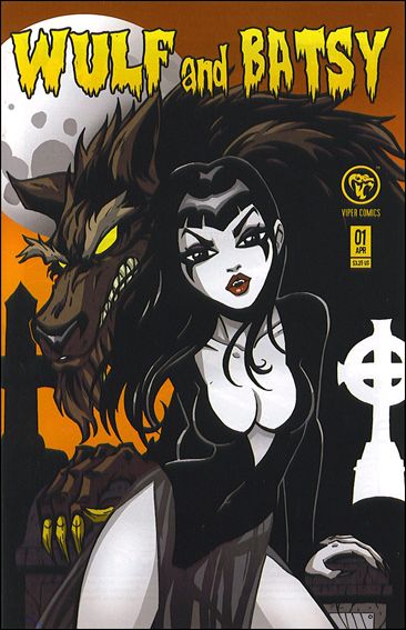
“Wulf and Batsy chronicles the adventures of a big bad Werewolf named Wulf and a feisty little Vampiress named Batsy, as they wander the earth in search of a place to call home and companions to call friends. Such things are not easily found.”
A very nice first issue with a great build up and a cliffhanger ending leaving you wanting more and more and more.
Artwork: 4.0 out of 5
The werewolf images are flat out some of the best for a cartoonish style. I really picked up an Elvira Claypool style when looking at the renditions of Batsy. Overall the book fits well with the Viper family of comics, and I would say it borders even on edge of Ape Entertainment’s style. Baugh even throws in some not so hidden characters that are nice to pay homage to what has come before. Great overall work.
Story: 3.9 out of 5
The story is a nice fun take on the two genres of Vampire and Werewolves. The communication between characters reads very well and the story builds as it goes on. It all leads up nicely to a cliffhanger ending that makes you really want to get issue #2 in your hands and keep reading.
Dying Breath: 4.0 out of 5
I am glad I was able to pick up the series in full, because I just know it’s all going to be a great read. The first issue explains what you need to know to be hooked on the story. The artwork is fantastic and they both merge together very nicely. This is one that is really worth checking out, and it was just released in trade form. So what are you waiting for?
For more info on Wulf & Batsy please go to http://www.vipercomics.com/ and http://www.cryptlogic.net/
If you would like to get issue #1 and the rest of the issues or the trade please go to http://www.indyplanet.com , http://www.havendistro.com, or http://www.vipercomics.com/
________________________________________________________________________________

Issue : Praetorian TPB
Creator : Rick Villa
Writer : Jason M Burns
Artist: Ramon Espinoza
Letters: Nick Deschenes
Publisher: Outlaw Entertainment
Release Date: June 2009
Pages: 112
Price: $7.99
“Made immortal in the wake of christ’s crucifixion, four Praetorian guards are tasked with protecting mankind in the centuries to come. Now 2009 and spread out around the globe, the Praetorians must reunite to track down a grisly serial killer whose seemingly random murdering sprees have been haunting them since their eternal rebirth.”
Wow! This was a fantastic attention grabbing story from start to finish! I was kinda on the fence when the religious tones started flowing, but I was so glad on how the story turned out. A very nice Serial Killer style story left wide open for more volumes to come!
Artwork: 4.5 out of 5
I loved the style used in this book. It was kinda cartoonish, but in a more stylized way. I felt it fit nicely with the overall feel and flow of the story. The coloring was spot on with perfect tones and shades. It’s so close to perfection. Hands down an amazing effort.
Story: 4.2 out of 5
If I fault the story on anything it would be the religious aspect, but it plays such a small roll in the whole of the story that I wasn’t bothered. A nice job on the overall concept that plays out so well. I really felt there were no holes in the story. It was all so well thought out and presented. The communication between characters is believable and it really grabbed my attention from the start.
Dying Breath: 4.4 out of 5
First of all, if you pass on a 112 page trade for under $8 you’re smoking something. Marvel and DC will charge you $15 for the same thing. But cost aside, this book delivers. A nice serial killer plot that runs throughout. It leaves itself wide open at the end, inviting you to come back for the next chapter. The artwork is great. An amazing first run that I can only hope builds a nice following so we can all read more. Pick this one up! I know I will be following what this company has to offer from now on.
For more info on Praetorian and to purchase this volume please go to http://outlaw-entertainment.com/
________________________________________________________________________________

Issue : Zombie Tramp #1
Creator : Dan Mendoza
Writer : Dan Mendoza
Artist: Dan Mendoza
Letters: Dan Mendoza
Publisher: Dan Mendoza
Release Date: June 2009
Pages: 36
Price: $5.00
“A story of revenge, when hollywood’s most beautiful call girl is set up as a zombie meal.“
Ingredients to making Decapitated Dan love a new Zombie comic:
1. Start with a killer story idea.
2. Draw some sexy women to grab my attention.
3. Mix in some nice, bloody, zombie killing human panels.
4. Give it a fun title.
5. Shake well and you have Zombie Tramp #1
Artwork: 4.2 out of 5
There are two styles of art I love. I love the highly detailed stuff and I love the cartoony styles. I think it’s more based on the fact that I like a nice humor story over the serious ones. So I was very pleased with the overall look of this book. It fit the story nicely, the panels were always looking great, and the subtle use of color sold it. Plus every now and then you get a sexy lady to look at. I want to see a lot more from Mendoza very soon.
Story: 3.8 out of 5
Overall a nice first issue. The story gets you introduced to the characters and dives a bit into the main plot. I liked how it was left open at the end for more, but I did have some confusion on the escaped prisoner, which will more than likely be answered in issue #2 . The communication between characters is great, with some good humor thrown in.
Dying Breath: 4.0 out of 5
It amazes me how much solid work is out there that I might not normally go and check out. Zombie Tramp #1 is a good solid first issue with some nice art and good story. It leaves you knowing more is coming, but is complete within itself. I think if you’re a fan of the art and story style it’s a must grab issue.
To purchase Zombie Tramp #1 please go to http://www.comixpress.com
For more info on Zombie Tramp and the work of Dan Mendoza please go to http://www.toxiccandie.com/
________________________________________________________________________________

Issue : Planet Lovecraft Magazine #4
Writers : J.M. DeSantis, H.P. Lovecraft, Vincent Ferrante, Martin Fisher, Rob Corless, Lee Davis, Abraham Martinez
Artists: J.M. DeSantis, Tim Spervero, Tommy Gun, Ben Hansen, Rob Corless, Lee Davis, Carlos de Anda
Cover Art: Rob Corless
Publisher: Lightning Strikes Twice Entertainment & Saturna Ink
Release Date: Fall 2009
Pages: 56
Price: $7.99
“Planet Lovecraft is a B&W illustrated quarterly magazine in the tradition of CREEPY, EERIE and HEAVY METAL Magazine. Every issue is packed with comics, articles, and interviews with one common thread – the Master of Weird Horror, H.P. Lovecraft!”
I will come out and say it. I know nothing about H.P. Lovecraft, so a quick Wikipedia check and I was all ready to read this collection of 7 stories. A very cool collection, and I have to say I’m intrigued enough to want to check out more of this style of horror.
Artwork: 4.0 out of 5
Each story brings a nice new style along with it. I think they all fit very well. I personally enjoyed the art on “The Thing in the Box” and “Awakener“ the most. “The Thing in the Box” was the most creepy of the stories and the artwork really sold it. With “Awakener” I enjoyed the style so it stood out the most to me. But overall they were all great.
Story: 4.0 out of 5
I do have to say I enojyed all the stories, and what I liked most was “Hypnos“ because it was an actual Lovecraft story. So for someone with little knowledge on his writing like me, it was a nice story to include. The final two stories did leave me a little confused, but I think they were part of multiple arcs, and since I only read issue #4 I can see why that would happen. Overall very cool.
Dying Breath: 4.0 out of 5
I have to say that if you are a Lovecraft fan, and I know you’re out there reading the Boom titles, check this out. The stories are solid; they follow a great theme that I can’t wait to look more into. The description of this publication being Creepy or Eerie for Lovecraft fans is spot on. A cool collection of stories and some great artwork just got me to become a subscriber.
If you would like to get Planet Lovecraft Magazine please go to http://planetlovecraftmagazine.com/ or get your comic shop to order it through Haven Distribution. If you would like to know more about Planet Lovecraft Magazine please go to http://planetlovecraftmagazine.com/
________________________________________________________________________________

Issue : Ghostface #1 & 2
Creator : John C. Narcomey Jr.
Writer : John C. Narcomey Jr.
Artist: John C. Narcomey Jr.
Editor: Daryl Auclair
Production Manager: Neil Tolman
Publisher: High Tower Comics
Release Date: February 2009
Pages: 24
Price: $3.99
“A vintage pulp opera of dangerous dames, malicious mugs and hard boiled heroics.“
I liked this story from the two issues I read, and can say I see some good potential in what is to come. While it doesn’t follow my typical horror style, it seems more along the Pulp lines of say, The Goon, with its style, but also mixes in a nice 1920s gangster feel.
Artwork: 3.7 out of 5
I liked the feel of the artwork in these issues. It really sets the tone for the story and just nicely fits the era. I will mention though that issue #1 had some panels where I didn’t quite get what was going on, but by the end of issue #2 I really felt that the artist had found his legs and gotten a better grasp on it all.
Story: 3.8 out of 5
I can’t really say I have read a good deal of stories on this kind of topic. The issues contained what I would expect to find though. Kinda like that art, I felt issue #2 was stronger and I am glad I was able to read them together. I think that there are some holes that fill in as the story goes along, but from what I read it was strong enough to gain my attention and hold it from start to finish, and I am intrigued to see what comes next.
Dying Breath: 3.8 out of 5
A bit of a shaky start but the books quickly get rolling and it pulled my interest in. Then by the end of issue #2 I was left wondering what was next. Isn’t that what you want from a comic? Overall I liked what I read. I think it fits the genre nicely, and if you’re a fan of the Pulp Noir style check it out.
If you would like to get Ghostface #1 & 2 please go to http://www.hightowercomics.com/ or get your comic shop to order it through Haven Distribution. If you would like to know more about Ghostface and other High Tower Comics titles please go to http://www.hightowercomics.com/
________________________________________________________________________________


Issue: The Adventures of Doctor Zombie #1
Writer: Mackenzie Meredith
Artist: Erik Thompson
Script & Letters: Brian Meredith
Pre-Press: James Taylor
Publisher: Rorschach Entertainment and Micro Brew Comics
Release Date: November 2008
Pages: 16
Price: $2.50
“A new all-ages series! In this first issue, Doctor Archibald Zombie takes his faithful assistant Marigold Murray camping, in celebration of her birthday. However, they are immediately attacked by a pack of demons led by Ryan, a spurned suitor hell-bent on taking Marigold’s affection, even if it means Kidnapping Marigold! It is now up to Doctor Zombie to save her from their vile clutches!”
What would a horror book look like if you took a bit of Dexter’s Lab, mixed it with Dudley Do-Right and threw in a demon and zombie? What’s that you say? The Adventures of Doctor Zombie? Of course, you’re so right! There is nothing that the description above leaves out. This book is all ages fun; and did I mention that it was written by a 9 year old?
Artwork: 4.0 out of 5
There is nothing wrong with the artwork at all. I couldn’t get over how everything was so Cartoon Network. It just felt like I was watching a cartoon. The characters are fun to look at, it’s playful, and Hell Yes I did the maze on the last page.
Story: 4.0 out of 5
Mackenzie Meredith is 9 years old, and she delivers on the story which just feels like it is right out of the cartoons. Doctor Zombie has got to go save his gal from them bad Demons. Sure it plays down to the higher reading levels, but it’s a great well written kids’ story.
Dying Breath: 4.0 out of 5
Overall what is presented is for the younger crowd, since it was written by the younger crowd. From what I see when I go to my LCS, they need some nice new books like this one out there. I would give this to my kid any day of the week, and I will enjoy it as well. It’s fun, it plays along the typical story lines expected, and it’s affordable. Someone call DC Kids and tell them they got some competition.
If you would like to get The Adventures of Doctor Zombie #1 please go to http://www.microbrewcomics.com/ or http://www.indyplanet.com If you would like to know more about The Adventures of Doctor Zombie and other Micro Brew Comics titles please go to http://www.microbrewcomics.com/
________________________________________________________________________________


Issue: The Living Corpse: Modern Prometheus (#5 & 6)
Creators/Art/Story: Ken Haeser and Buz Hasson
Covers: Ken Haeser, Buz Hasson, Josh Medors, Juan Fernandez
Colors & Letters: Ken Haeser
Editor: Ken Kolasinski
Publisher: Zenescope Entertainment
Release Date: August & October 2008
Pages: 24 each
Price: $2.99 each
“The Living Corpse makes a desperate jump into limbo in search of sanctuary and finds… Frankenstein’s monster?!? What connection does the reanimated creature have in common with our own undead hero? Can the Living Corpse stand on the sidelines when the monster’s plan involves werewolves?“
Alright, so I decided to just jump past reading issues 1-4 and dive into 5 and 6 to present you with this frightful review. I will admit that I was a little bit out of the loop skipping those issues for now, but these two were self contained and well written.
Artwork: 4.5 out of 5
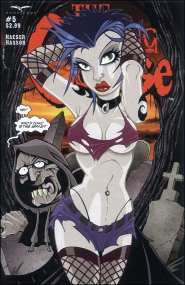
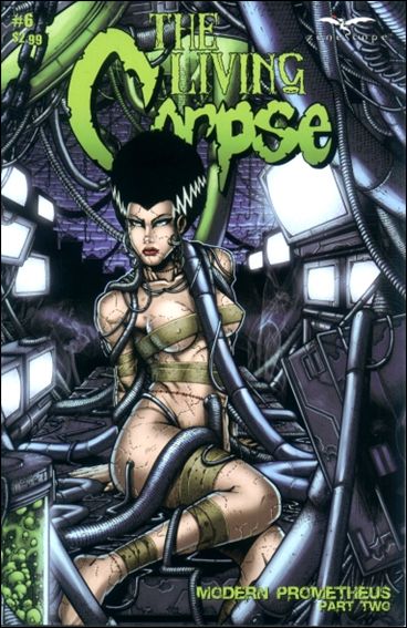
This is what stands out above anything else in this book. These guys know what is going on! I can’t get over how great the visuals are. From the Wicked looking werewolves to a beautiful bride, it’s all top notch work. The colors just make it that much better. Oh and did I mention the sweet covers to choose from. It is an all around win in my opinion.
Story: 4.0 out of 5
Granted I missed 6 issues (there was a #o and #1/2), but I felt the story was easily accessible. It was a lot of fun and humorous. There was good interaction between the characters as well. It contains all the characters I love with some new ideas behind them. I mean come on, who would think to bring back the Bride of Frankenstein with some Werewolf serum? Just an overall nice job within the two issues.
Dying Breath: 4.3 out of 5
Overall the two issues contain a good story with great art. The guys behind it know what they are doing and I was far from disappointed. I cannot wait to go back and see how the story progressed to get to this point. The “Modern Prometheus Story” arc is great, and because of it I have yet another new title on my pull list.
If you would like to get The The Living Corpse #5 and #6 please go to https://www.zenescope.com or get your comic shop to order it through Haven Distribution. If you would like to know more about The The Living Corpse please go to http://www.corpsecomic.com/
________________________________________________________________________________
Decapitated Dan
decapitateddan@comicattack.net


I like the artwork on the Wulf and Batsy cover.
You read some of the craziest stuff!
Like you wouldn’t read Zombie Tramp.
And Wulf and Batsy is by far one of my all time favorite series. I can’t really sum up how great it really is.