 Batman #6
Writer: Scott Snyder
Artists: Greg Capullo, Jonathan Glapion, and FCO
Cover Artists: Greg Capullo, Jonathan Glapion, and FCO
Publisher: DC
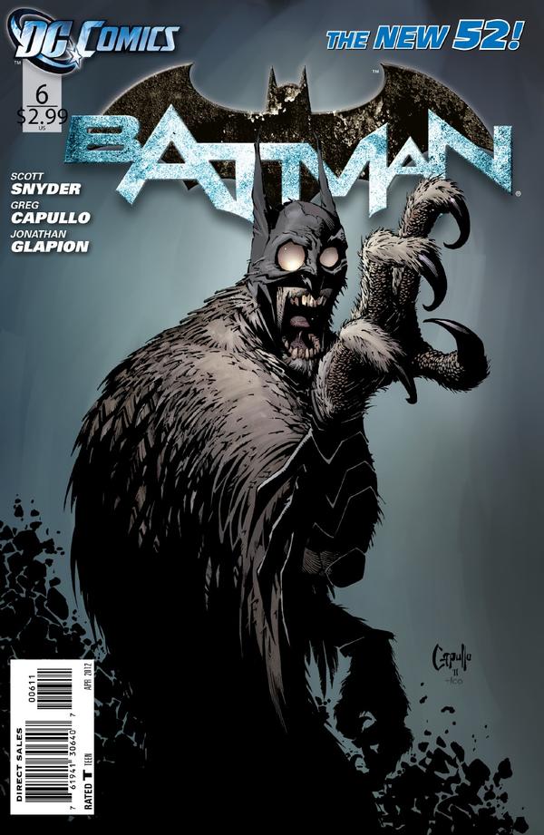
The epic tale of Owl vs. Bat continues as Batman finally comes face to face with the Court. We left the last issue right where this issue starts off, with Talon moving in on Batman for the kill. The Court of Owls finally reveal themselves to be the hideous monsters they are, as they cry out for more pain, more torture, more everything. Though near broken, Batman musters up his remaining strength to fight off Talon and escape the Owls’ labyrinth. If you didn’t like the last issue, this one will surely change your mind, and if you did like the last issue, you’ll definitely enjoy this one as well. Many of you have probably had a moment in your lives where you’ve been picked on, insulted, or even annoyed over and over till you just snap and bite back. For Batman, that was this issue. Scott Snyder has done a fantastic job with this story, chronicling the slow deterioration of Bruce’s mind since the Owls first surfaced. It’s been believable, understandable, and most importantly it’s been convincing. Being Batman we’ve come to expect more, though, and we finally get that satisfaction. Seeing Batman beat Talon across the miniature Gotham set, seeing him fend off the lecherous Court members, and seeing him use their own camera to escape was fantastic.
None of it, however, would have been as great without the art team this book has. Greg Capullo has a tremendous ability to make Batman appear broken down and destroyed one page, and as fierce as a mythical warrior just pages later. Not only did he impress upon the grand nature of the Batman, but in their first appearance he made the Court members look vicious and monstrous with an owl-like appearance. Jonathan Glapion’s ink bring an excellent depth and sharpness to the story. His lines are clean, smooth, precise, and they certainly help set the tone for each page. Similarly, FCO Plascencia’s colors, though limited due to the setting, are integral in setting the tone of the book. His vibrant reds in a sea of tones and black do an excellent job of highlighting just how broken Batman is. This issue is truly a testament of amazing creators working in wondrous unison. 5/5
 Catwoman #6
Writer: Judd Winick
Artists: Guillem March and Tomeu Morey
Cover Artist: Guillem March
Publisher: DC
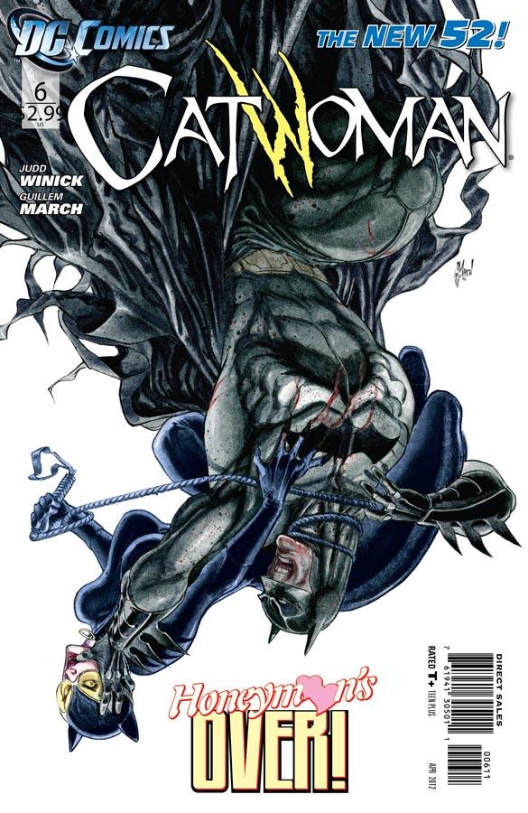
This series is at a pivotal moment where it could either excel or fade into monotony. Up till now the series has been steadily asserting its voice. We’ve been getting a look into Selina’s mind, and for the most part what we’ve seen is absolutely tragic. But ever the fighter, we’ve seen her claw her way out of trouble. Even up against Batman she doesn’t back down, and that’s really what has kept this book afloat: Selina’s strength. The most detracting factor of this book is in the lack of stable, consistent supporting characters. Characters are worth nothing if they aren’t shown interacting with others, and beating up bad guys doesn’t really count. The recurring cast of Catwoman has been Batman, Lola, Detective Alvarez, and Gwen. Of those, one will be gone for a while, one’s dead, and the other two have about three pages of face time between them. As we move into the next arc I think it’s prudent that we see more of Catwoman’s emotional interactions, emotions that range outside of her anger. The art was stellar in this issue. March did a fantastic job illustrating the full range of facial expressions that Catwoman goes through in this issue. Overall, it was a decent issue with some great scenes, but I want to see more interpersonal depth. 3.5/5
 Nightwing #6
Writer: Kyle Higgins
Artists: Eddy Barrows, Geraldo Borges, Ruy Jose, Eber Ferreira, and Rod Reis
Cover Artists: Eddy Barrows and Rod Reis
Publisher: DC
The first six issues have been leading up to this confrontation between Saiko and Nightwing, and Kyle Higgins does a great job of it. These six issues remind me of the original Nightwing series, which isn’t to say that the story is being recycled, but in the way the story has been laid out. It’s sort of the classic multi-issue arc with a couple one-shots thrown in. Just the pacing of it really gives off a classic vibe, and then when you couple in the story you’ve got a pretty darn good series. The best part of this book so far has been the way Higgins’s has been able to capture Dick’s personality. He has that character down perfectly. His witty humor, his unending compassion, he’s written the way you want him to be written. And that scene with Alfred? Perfect. While his actual fight with Saiko, who seems a little bit like a lover scorned, is fairly short, the repercussions will be long lasting. I’ve always felt that the Bat family internalizes their failures to a much greater extent than the other heroes, so it will be interesting to see how Higgins’s second arc plays out. One thing I noticed about the writers that have handled Dick’s character from when he became Batman up till now, is that his villains, the ones he didn’t inherit from Bruce, have all had a somewhat personal relation, which really emulates the blinding compassion and optimism that Dick has. We’ve certainly not seen the last of Saiko, and there’s also that ominous list of names we’ve got in store, which means exciting things are waiting just around the corner. 4/5
 Red Hood and the Outlaws #6
Writers: Scott Lobdell and Josh Williamson
Artists: Kenneth Rocafort and Blond
Cover Artists: Kenneth Rocafort and Blond
Publisher: DC
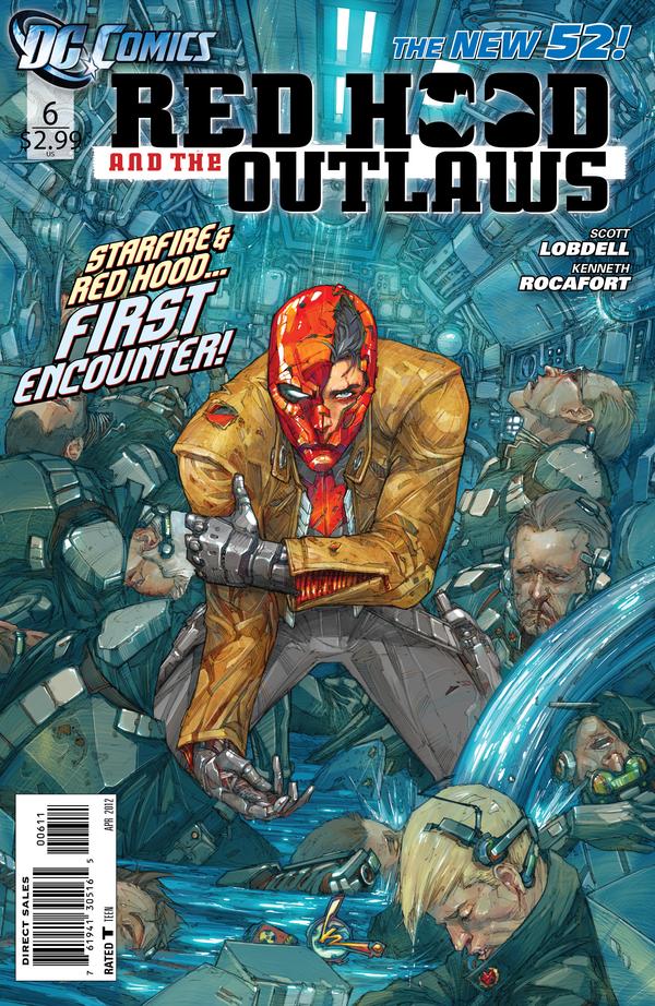
From the very beginning I knew there had to be more to Starfire than just existing as a powerhouse bimbo, if for no other reason than Lobdell’s portrayal of women in the two other books he’s writing and the women he’s written in the past. This issue certainly won’t quell everyone’s anger, not that it should considering the overt sexualization of women is still a common occurrence, but what it does is explain her new behaviors. This issue takes the time to show how Jason and Starfire came to be on a team together (and unlike Justice League, it only took one issue). We learn that due to her Tamaran origin, Starfire doesn’t retain Earthly memories for too long, explaining her distant emotional attachment to Dick as well as her willingness to be open and free with her companions. We see that not only is she not a bimbo, but she’s actually very biologically and technologically intelligent. She’s been an interesting enough character in this series, but this issue does a remarkable job of actually getting the reader to care.
Having an art background I tend to weigh the art for a book at about 50% of its total worth, as I think everyone should (hello, it’s a comic book). As such, I admire many artists, but Kenneth Rocafort’s art is the one I am most jealous of. While I love say, Capullo’s art, Manapul’s art, Williams III’s art, and so many others’, I myself would love to be able to do what Rocafort does. His figures are so full of energy and life, it almost radiates out of them. His hatching creates amazing depth, and conversely he makes remarkable use of negative space. Add to that the colors by Blond, and you’ve got one of the most contemporary looking books out on the market right now. This book is both a tremendously interesting read while also being a feast for the eyes. 4.5/5
Be sure to check out previous editions of Crisis of Infinite Reviews by clicking here!
Arnab Pradhan
arnab@comicattack.net


Ew, what is going on with Catwoman’s suit. Her left boob is just a blob with her left shoulder. Gross. Artistic fail.
@Kristin I think Batman’s arm is kinda pushing it up and she is all contorted like.
I can’t say I’m sure I understand what either of you are talking about. Her left boob is right about where it should be. To clarify though, her left shoulder is the round contoured blob right above her chin. To the upper left of that is her right and left breast. The right being directly behind Batman’s arm and the left being directly behind the right. With Batman’s arm blocking so much, and her actual pose, I think it’s difficult to realize that her upper body is meant to be contorted to be facing us, unlike the rest of her body. I’m not sure if I’ve clarified that as well as I could have.
Your explanation is OK Arnab. I think the problem is the drawing of that left shoulder/arm really.