Proctor Valley Road #1
Publisher: Boom! Studios
Story: Grant Morrison & Alex Chlid
Pencils: Naomi Franquiz
Inks: Naomi Franquiz
Colors: Tamra Bonvillain
Letters: Jim Campbell
Covers: Naomi Franquiz
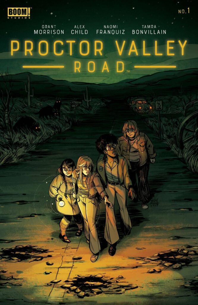
A horror period piece featuring a cast of teenagers may not seem, at first blush, like a novel idea, nor do writers Grant Morrison and Alex Child first spring to mind as one to create such a story. Any such negative preconceptions are unfounded after having read the first issue of Boom! Studios’ Proctor Valley Road.
Immediate comparisons to popular nostalgia-laced teen horror stories such as Stranger Things, Paper Girls, or even the Goonies are perhaps inevitable, but Morrison and Child take the story in a different direction: first by basing it on what many consider is the “most haunted road” in America, near the town of Chula Vista, California, just a few miles north of the US/Mexican border. Morrison is well-known for having a deep interest in the spiritual, the metaphysical, and psychedelia, and writing about a real place that many claim has supernatural properties fits right with Morrison’s world-view and gives the story added details that other writes might have missed. The descriptions and accompanying imagery of the events taking place on the road are unveiled slowly as teasers to the reader, in an almost cinematic way. There’s an underlying sense of unease the creative team brings to the story that is all the more unsettling given how many people actually believe there are strange things happening there in the “real world.”
The setting, while a period piece, also diverges from other similar concepts, by placing the events not in the 1980’s but in the year 1970, during a period of racial and civil unrest, misogyny, and the Vietnam War, when many people were still clinging to an idealistic and unrealistic view from the 1950’s and 1960’s of what small-town life should be like. The creative team don’t ignore these issues, but neither do they overtly push them as political commentary. Instead, situations and characters are presented naturally as they would be during that time, and the words and actions for the characters stand for themselves.
There’s a lot to accomplish in this first issue, the main job of which is to make the audience care about the characters. Horror stories thrive on the likability of the characters so that when something bad happens to them, the audience is shocked. Morrison and Child give unique voices to all the characters introduced, the main four of which are all teen girls (Rylee, August, Jennie, and Cora). Each girl is a well-realized individual with a strong personality, even if there are some short-cuts taken in the first issue to give each one a very specific and easily identifiable character trait to help tell the girls apart. The same treatment isn’t necessarily given to most of the teenage boy characters (with one notable exception), whose personalities blend a bit more into each other. However, the focus is on the girls as the primary characters of the story, so it’s appropriate they are given more attention. While the girls have the qualities of ingenuity and creativity, they are also shown as being imperfect and even rebellious: they smoke, drink, shoplift, and curse, all while trying to figure out a way to make money to attend an upcoming Janis Joplin concert. Using Joplin as a unifying pop culture device for the girls is a clever touch, as Joplin died of a heroin overdose about three months after the events in issue #1 take place, so her upcoming concert, described in the story as being “over three weeks” away, would be the last time these girls could see their musical icon perform.
What helps the characters be more likable is the art by Naomi Franquiz, who takes a “young adult” approach to the designs. It grounds the book by giving it an almost “Archie” comics style aesthetic, which is a perfect juxtaposition to the horrific events that happen toward the end of this issue, and which are hinted at during the opening pages. Tamra Bonvillain provides bright and cheerful colors for many of the scenes, but then mutes them just slightly to contribute to the sense that things aren’t quite right in this world. Those daytime scenes are then contrasted by deep, dark, saturated scenes at night that are disrupted by small, inconsistent amounts of light. In one particularly tense scene, Cora’s flashlight falls victim to a standard horror movie cliché by running out of batteries. What makes the scene even more powerful is Cora’s insistence that she double-checked the batteries before they left and her pleading that she has nyctophobia, a severe fear of the dark. Franquiz’s and Bonvillain’s art and colors seem purposefully designed to create a sense of fun and safety, which makes the introduction of the horror elements all that more terrifying.
There are some odd pacing issues, particularly the page in which the girls hatch their plan to make the money they need for the Joplin concert by offering ghost tours of Proctor Valley Road to the very boys who just told them about the ghost story. It’s a weird transition and feels as if some panels were cut without the dialogue being re-written. There’s also an anachronistic error of Rylee wearing a Pink Floyd “Dark Side of the Moon” t-shirt with the classic prism turning light into color, as that album and associated album cover image were not released until 1973, three years after the events of the first issue. It’s possible this could be a clue to future events and was done deliberately by the creative team, but without any other context so far, it appears to be a mistake.
Those are minor quibbles for what is an engaging first issue of a horror series with interesting characters (it’s hard to say “likable” just yet, but they’re close), unique and enjoyable art, and a historical backdrop that no doubt will be used to subtly raise relevant questions about current politics. This is definitely not a story that’s simply attempting to cash in on a familiar genre, but rather an intelligent comic that uses the strengths of the art and characterization to create something unique.
As a note to parents: Despite the YA-style art and the main characters being teen girls, the comic is suggested for mature readers based on both its violent and sometimes gory imagery, as well as the language and other adult scenes.
Martin Thomas
martin@comicattack.net


Morrison usually delivers but horror really isn’t my thing. Hard to decide whether or not to give this a look or just wait for the trade.