Eve #1
Publisher: BOOM! Studios
Writer: Victor LaValle
Art: Jo Mi-Gyeong
Colors: Brittany Peer
Letters: Andworld Design
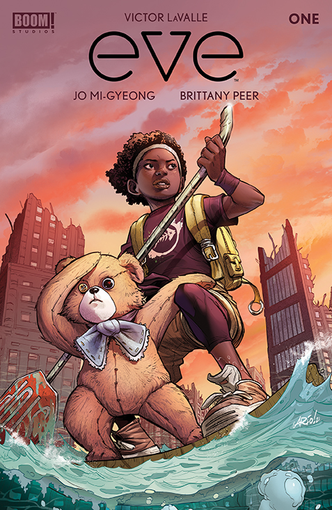
Cover: Ario Anindito
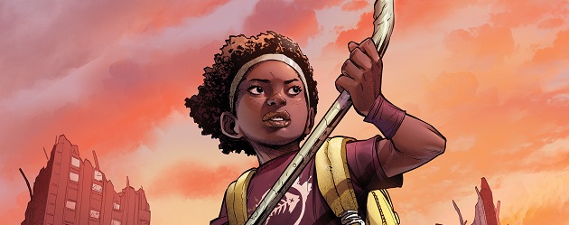
Eve begins in a lush island environment, with the 11-year-old titular character moving lithely through a forest. There’s an immediate sense of great pressure that begins with the first page depicting crabs crawling up a mangrove tree to save themselves from high waters and the predators beneath. The line work used in the backgrounds is stunning and speech bubbles are placed in a way that does not distract from it. The characters and their clothing could have used some more complication but the use of shapes as highlights gives some definition and the stylistic difference allows characters to come forward. On the flip end, Eve could have been more realized with texture in her hair and facial elements that would help the viewer recognize her from all angles. Panels of Eve from the side seemed to often be discrepant from panels of her facing the viewer, most noticeably in her nose which would sometimes appear too small due to lack of detail.
The setting quickly changes from tropical to technological. Eve and her father moving throughout the laboratory compound they live in creates an Afrofuturism aesthetic that is further complicated by the mandrake tree symbol throughout that subverts the sterile surroundings. Historically mandrake was believed to have magical properties and in real life application can both kill and cure, creating an interesting dichotomy for these post-apocalyptic characters. Mandrake imagery ties in well with Afrofuturism, which seeks to combine science fiction, fantasy, and history in order to create a cultural experience for Black people of African descent.
The issue becomes a lot more interesting and complex with the arrival of Wexler. Despite being an android dressed as a teddy bear, Wexler offers many rigidly sarcastic comments and jokes that come off amusingly human in the context of his doubly inhuman identity and provide a good foil for Eve’s easy going and curious personality. Their camaraderie is entertaining and organic but does seem to detract a bit from her emotional scenes. His character also has line work and detail that would greatly benefit Eve’s character if it were also applied to her. Perhaps it is done that way because he is technically an object, but she does appear less of the comic book’s world when next to her partner.
Overall an extremely enjoyable start to an interesting concept of twisting the cliché of a child saving the world by offering diverse representation and symbology in order to create a new narrative. The characters are very relatable despite their unique situation and the plot devices are obviously thought out as well as being highly organized and purposeful. Each panel is excellently composed, full of stylistic detail, and embodied with vibrant cool colors and muted warm colors to create a decrepit aquatic look. The plot was set, but the reader is not overloaded with information and becomes filled with curiosity about what will happen to this child trying to find her father and simultaneously restore the planet.
Alex
alexthegrave@comicattack.net

Pingback: Around the Tubes | Graphic Policy
I liked LaValle’s other BOOM title and the different social issues he tackled with the sci-fi/horror aspect. Might give this one a look too when it’s collected.