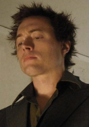
JK Woodward is an artist, a traveler, and a man of the people. His first works were self published in Germany, followed by work at BOOM! Studios, IDW Publishing, and Marvel Comics. He’s traveled across the US and abroad in hopes that periodical environmental changes would inspire greater artistic creativity. Although, JK is a respected member of the artistic and comic book community (He was commissioned by Peter David to illustrate and paint his creator-owned property, Fallen Angel), he’s highly accessible to his fans (add him on Facebook to see what I mean), and a really down to Earth guy. JK’s latest artistic endeavor is Belladonna, a graphic novel written by Ben Ross that hits comic shops February 24th, 2010. So, I figured this would be a great time to conduct an interview with this up and coming superstar. For those who haven’t heard of JK Woodward, this interview is a great starting point to get familiarized with his work. If you know the name, but not the man, this is a great opportunity to understand why JK Woodward is an important part of the comic book community. And if your already a fan, I hope this Q&A will given you additional insight and information concerning an artist that you already love. Regardless of which category you fall into, I suggest taking a minute to read the short bio on JK Woodward’s website to get an overview of the timeline covered in this interview. Most of all, thank you very much for joining me for the February entry into Comic Attack’s Artist of the Month column, featuring James Kenneth Woodward.
Comic Attack: What is your earliest creative/artistic memory (coloring, doodling, finger-painting, ect.)?
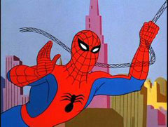
JK Woodward: The first substantial one was watching the re-runs of the 1967 Filmation Spider-Man at the age of five, and trying to draw it. I actually remember the day I decided I wanted to be (or already was) an artist. I noticed that I really didn’t see anything until I tried to draw it. As I was watching the cartoon with the purpose of learning to draw Spider-Man, I noticed things about it [that] I hadn’t before. The same animation sequences being used over and over, just with different backgrounds. I noticed he had no webbing on his chest, just his mask, boots and gloves. I noticed alot of things I wouldn’t have otherwise even considered when watching the cartoon in the context of simply enjoying the story. Seeing it like this was like having a superpower, and I didn’t want to go back to viewing the world the way I had before. So I started drawing everything I saw so I could truly ‘see’ it. Unfortunately I had no ‘natural talent’ (if such a thing exists), but it didn’t matter at that point in my life because I had other motivations to draw. Eventually this motivation led to alot of practice which led to me developing a skill.
CA: How old were you when you first moved from your hometown of Norton, MA to Los Angeles, CA? Why L.A.?
JK: [I was sixteen years old] the first time, but I came back and graduated High School and moved to L.A. again when I was eighteen. The main reason [I moved to LA] was [because] it was about as far away from [my home town] as I could get without leaving the country. At the time I was still thinking small and believed that leaving the country was just ‘unrealistic,’ but that would later change.
CA: How did the experience of living in L.A. affect your artistic style?
JK: Good question! Though its hard to quantify because I have no idea what my work would be like if I had stayed put. I’d have to guess it had a profound effect on my work, only because it opened a whole new world to me. A friend of mine had an extra easel in his studio and invited me to paint. So next thing you know, I’m spending all my money on canvas and discovering a vastness in art I hadn’t known from just my comic work. I went from a very rigid industry standard of bristol board and inks to [using] canvas, oils, pastels, watercolour,and assemblage ranging from clay to garbage and broken steroes and televisions. All of a sudden, there’s this freedom, not just in what media I’m using, but also in how I want to express an idea. I did everything from still life to surrealism to abstract, and I still apply everything I’ve learned over those years to [my work in] comics today.
CA: How long did you live in LA before you relocated to Germany? What was your motivation for the move?
JK: Twelve years off and on. While I was living in L.A. I would try out other cities now and again, but nothing held my interest over a year. Then, around 1993 I think, I was home painting one night and some friends stop by around four in the morning or so. They had just gotten back from a club or show or something and they had this German girl with them. I’m guessing they had told her about my work because she wanted to see some paintings. She started taking photos and talking about how excited her boyfriend would be when he saw this. I didn’t think anything of it. In fact I had just assumed that she mentioned this ‘boyfriend’ so that I wouldn’t misunderstand her interest in my work for interest in me. I thought maybe that was German for “you ain’t gettin any so don’t even think about it.” Turns out, not only was this boyfriend real, but he owned an indie record label in Frankfurt and had asked her to check out a number of the small galleries while she was in L.A. He was looking for an artist for an upcoming project and I had lucked into the job all because my drunk-ass friends decided to bring a German tourist to my house at 4am. I continued working with him for about 6-7 years before he told me he was increasing production and wanted me to come out and work full time. So, with barely a thought, I did.
CA: How were your two Self-published titles, Flesh Angels and These Things Happen, received among comic book fans in Germany? What kind of distribution did these books have? Can people still get copies in the states?

JK: Flesh Angels was very well-recieved in Germany. In fact, I would guess around 80% of the sales were from German readers. They understood what I was going for, the graphic symbolism, where American readers seemed to feel it was either vulgar or pointless. Now of couse, I’m basing this on the reviews and not the actual readers. And I’m not sure that says anything good or bad about American or German readers, I just think Europe and America are two very different market places when it comes to comics, and though we can all agree on alot of the stuff we like, most of it is just two different ways of looking at the comic book medium. Now, These Things Happen was kind of a cult favourite. No real big press runs. Only three issues and most of the people that enjoyed it, heard about it online. It occured to me one day that sometimes, particularly at conventions, you hear the craziest and funniest stuff. I thought I’d like to take a crack illustrtaing some of it. There wasn’t a writer most of the time. I would just record someone talking and weave the words into my illustrative storytelling and see if it had as much comedic value as I had thought when first hearing it. They were usually 8-12 pages per chapter. One I remeber most vividly was a theory by Lou Anders, if you’re a sci-fi or fantasy reader, you have probably heard of him, about Fonzie from Happy Days being a metaphor for the Shaman mythos. Real funny stuff. Normally I would illustrate all kinds of crazy stuff to make it funnier, much like SNL’s Fun with Audio, but for this I simply illustrated Lou telling his tale with Happy Days excerps painted in the background and the words just placed in the empty spaces as prose. Kind of reminded me of the old illustrated pulp mags. That one was my favorite.
CA: You’re now stationed in Long Island City, NY. How would you driscribe the creative vibe of your cuurent residence in comparison to the other places that you’ve lived. Do you feel your artistic style changes with your environment?
JK: Long Island City is a neighborhood in Queens, nestled between Astoria and Greenpoint, Brooklyn. My studio is more or less right on the East River.You could walk to Manhattan in two minutes from here if you were Jesus, but the rest of us have to take the bridge or the subway, so it’s about five minutes away. The creative vibe… Well, with the exception of Kronberg (place I lived in Germany north of Frankfurt), this is probably the most art friendly place I’ve lived. The neighborhood was recently converted from a strictly industrial area so all those old factories and warehouses are now studio spaces or T.V/Movie studios. The galleries and small theatres around here are like Starbucks. They’re everywhere. It’s also the home of PS! Contemporay Art Center. As far as my artistic style, it’s like I said before, that’s hard to say. Every experience in life augments your artistic style in some way. So in that sense, the more you experience, the better you become. [This] works for artists as welll as writers. Now does that mean you have to change locations to obtain that experience? No, of course not, but I can say that, for me personally, I get inspired by a new setting every two to three years, and every location has it’s influence, but it’s difficult to pinpoint exactly what that might be. One thing about this area is [that] there’s a lot of industrial texture everywhere, and I enjoy painting that and I think it may be starting to creep into my work.
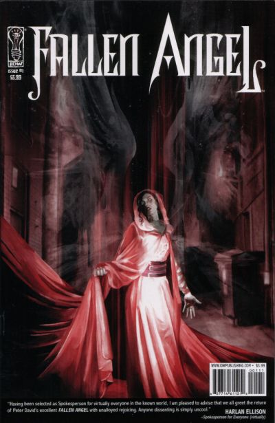
CA: Did Peter David contact you personally for IDW publishing’s Fallen Angel re-launch? How did you feel about doing the artwork for a re-launch of one of Peter David’s creator owned properties?
JK: No Chris Ryall contacted me. Though he did tell me that he gave Peter a stack of books to sift through and he chose me. The book that Chris had shown him was not an IDW book. It was a self-published book that Michael Colbert and I had done through DWP (Digital Webbing Presents), called Crazy Mary. Chris had [a copy of] the book because we had sent copies to just about every editor in existence hoping someone would pick it up. Well, instead I ended up working on Fallen Angel, and while I was sad for Crazy Mary, I was thrilled to be working with Peter David. At this point I hadn’t read Fallen Angel, so I didn’t know what to expect. I read the new script for issue #1 first, then I went out and got the DC Comics trade [paper back]. I remeber thinking, this isn’t Fallen Angel, because it was a lot different than what I had read in the script. When I started in on the script, I considered it a reboot, because first, it took place twenty years in the future and second, Peter David was explaining an origin to a character he had previously kept shrouded in mystery. I presume in the DC run, he kept the origin of the character a secret because they wanted to imply it was Linda Danvers from his previous run on Super Girl. I was careful to keep the look of the characters as close to what [David] Lopez had done on the DC run. That was important to me. Even though this may be a whole new Fallen Angel [series], I didn’t want to alienate readers of the old series by making the characters unrecognizable.
CA: Has the series received any negative feedback from the fans of the original DC Comics series?
JK: Not really. Most of what I was hearing and reading was overwhelmingly positive. I think most of the old readers were just thrilled to have it back. I do remember two comments expressing a preference for the old style [of art, compared] to the new painted style. Though, they didn’t have anything negative to say about the new run. They seemed to just not be a fan of painted art in general, so I didn’t take personally.

CA: You and Ben Ross have a new graphic novel coming out this month called Belladonna. How would you describe the story and art to someone who has never heard of it.
JK: Well, I would describe it as an exploration of nature versus nuture. Basically the hero has no memory of who she is and she ends up getting in all this trouble trying to find out who she is. She’s not really thrilled to find out her past and wonders if that’s who she really is or what she [has] learned to be. Within that context there is a lot of gun fights, action, and kick-ass motorcycle jumps, but what I found interesting was her journey of self-discovery leading straight to her inner demons. The Previews blurb reads like this: “The tables are turned on the world’s most beautiful and most vicious assassin. Gunned down, comatose in a city hospital for months, and with no clue to her identity, she eventually awakens. Fully recovered but with no memory and few clues to her past, she sets out on a dangerous journey to discover who she is. But will she like what she finds?” The art, I would describe as an almost impressionistic approach to watercolour, inspired by a similar style used by Tim Sale in books like Daredevil:Yellow.
CA: I saw on your Facebook page that you spent seventeen hours completing the cover for Belladonna. Is it safe to say you are a perfectionist?
JK: No, not really. That’s just how long that style of painting can take. Most stuff I can do within twelve hours, but I think I got caught up on the motorcycle. But nope, I’m definietely not a perfectionist. If I was, I would never get anything done. I’m never completely happy with any work I’ve done.
CA: What type of paints do you use for your work in comics.
JK: Winsor and Newton [Designer’s] Gouache and ink.
CA: Beyond the use of illustration, paints, and airbrush, do you also utilize digital effects when coloring pages and covers?
JK: No. Never any effects. I will airbrush flat color over black & white paintings or adjust the color hue or saturation digitally if I think something could be brighter or less saturated or whatever, but you won’t see things like photoshop motion blurs or stuff like that. I do those kind of effects in watercolour. I just like the look of brushstrokes better. Plus, I think it looks odd and out of place when you have a smooth and clean digital effect next to the anarchy of paint and brush. It seems obvious and kills the whole composition for me.
CA: Do you feel there is such a thing as too much digital enhancement when coloring a comic? Would you consider digital coloring techniques to be of equal importance to traditional painting techniques?
JK: Too much digital enhancement? Not really. It depends on what you’re going for. I personally prefer a natural look. I love brush strokes [and] pen strokes. I get a little turned off when they are covered up with digital effects, but I can see where it could have it’s place. It’s just not my preference. I don’t see digital color as having equal importance in my work. I wouildn’t even put it at 10%. As far as I’m concerned, it’s finished when I’m done the watercolor painting. But since people like color, for some reason, I’ll apply that digitally later. Like I said, the bulk of everything I do is in the traditional media. The colorization process is simply digital airbrushing [with] flat color over it.
CA: What kind of reference material do you use when painting? Statues, photos, live models?
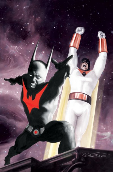
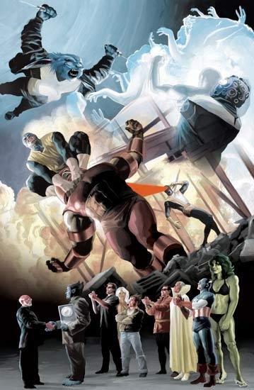
JK: Well, that depends on what I’m doing. If I’m painting in a photo-realistic style, I’ll use models or photographs of models for those that don’t want to spend all day posing for me. But generally, for my other style of painting sequentials, Fallen Angel: Reborn for example, I’ll just draw it. On occasion, I’ll use photo references for a likeness, if possible. In fact I prefer to do that because the likeness always comes out better, but sometimes the scene will call for an expression that you can’t find a photo for, and you have to wing it. A good example of that is in a Star Trek book I did, Alien Spotlight, where I had to paint an expression of extreme shock on Ensign Sulu’s face (Captain Sulu’s daughter from that scene in the Star Trek: Generations movie). There were no photos or footage of this, and I’d never seen the actress make the expression so I had to guess [what it would look like]. I’d rather not have to do that when a likeness is involved. I actually used myself as a model on the Batman Beyond/Space Ghost painting I did. This probaly seems strange because they had two very different physiques, but what I do is use my photo references for a basic idea of light and shadow on an object and then extrapolate from there.
CA: Who are your biggest artistic influences in the comic book community, past and present?
JK: There are a lot of them, but two stand out and for two very different reasons. John Byrne and Bill Sienkiewitcz.
John Byrne was an example in storytelling, perspective, [and] anatomy. He could do all kinds of backgrounds, landscape, tech, space, underwater. I learned more from him about sequential story telling than from any how-to books. He was just overall best at everything. Bill Sienkiewitcz showed me it didn’t have to stop there. Already I was amazed with what he was doing in just ink with Moon Knight, He had a design quality to his panels [that] I hadn’t seen before. But when I saw his color work and he just broke loose with all kinds of media I was blown away. Particularly with Stray Toasters. I had never thought a comic could tell THAT much of a story. Comics had just surpassed cinema, and it was all because of Bill Sienkiewicz!
CA: Biggest artistic influences historically?
JK: Cubists like [Pablo] Picasso and [Georges] Braque. Just about all the renaissance guys, Michaelangelo & [Hans] Holbein. [But], mostly contemporary I’d say, [David] Hockney, [Andy] Warhol, and surealist [Salvador] Dahli and [H.R.] Giger. I think my art history taste is probably pretty typical.
CA: What comics are you currently reading, back issues or otherwise?
JK: I’ve been revisiting Werewolf by Night and old Marvel Team Up [comics] from the Marvel Essentials. As far as new stuff, I’m reading, Sweet Tooth, Glamourpuss, Joe the Barbarian, Detective Comics, Last days of American Crime, The Marvels Project, All the Realm of Kings stuff, Johnny Recon [for which I’m] anxiously awaiting the second issue, and The Ghoul from Steve Niles and Bernie Wrightson which I’m really enjoying because it comes in two parts, the comic part and a eight page prose section in the back. I’ve recently reread Tricked by Alex Robinson. Online, I’m reading Box 13 by Dave Gallaher & Steve Ellis, and Troop 142 by Mike Dawson. I would highly recommend [them] both!
CA: Besides Belladonna coming out this month are there any other new projects in the works?
JK: I just finished a Star Trek Captain’s Log: Pike (for a look at the cover art, click here). It tells the story of [Christopher] Pike in his prime and how he eventually ended up paralyzed. [It] doesn’t matter If you have no idea who Pike is. It’s a self contained story about a starfleet captain I’d like to see a lot more of. I also did one of the X-Men Origins: Beast. It’s in the new collected [series] that recently came out. It was my first and to date, [my] only work for Marvel [Comics].
CA: Where and when can everyone get their hands on Belladonna?
JK: Either from the IDW website, comic distribution sites or your local comic book shop on the 24th of February, 2010.
Now, for Comic Attack’s exclusive look at JK Woodward’s sketchbook with artist’s commentary:
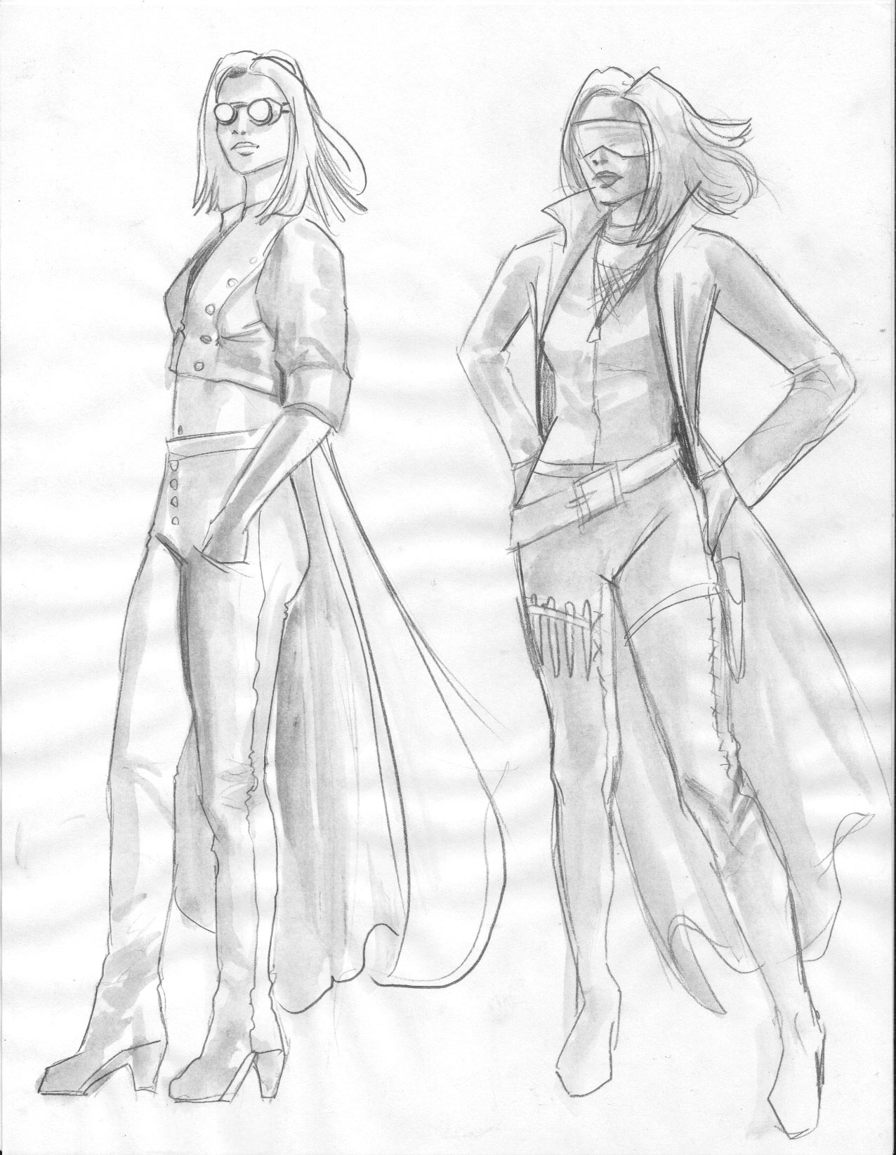
“The first costume conceptual from Belladonna. I ‘m a bit of a nut for steam punk, visually, so I think that’s what influenced the first sketch. However, it was completely wrong for this story, so I moved on. At first I was thinking of putting all her weapons showing on belts and straps all over her outfit. Fortunately, I changed my mind on that. A little too 90’s for a modern comic, and I personally wasn’t a fan of the look of that era. A fishnet shirt under the leather, and that visor? What was I thinking?” –JKW
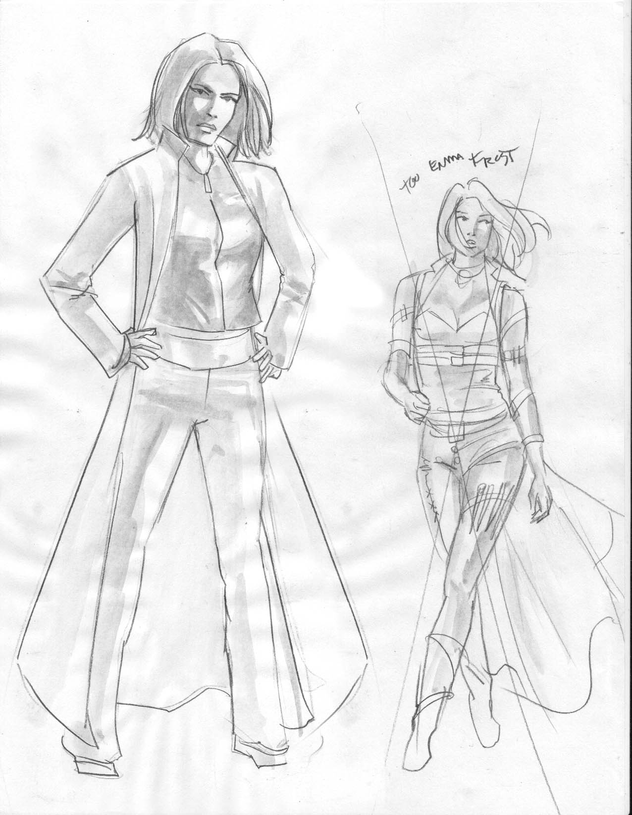
“More conceptual [sketches] from Belladonna. The next design I tried was on the right. And again I went with showing alot of straps and accesories, along with the stitching. Sort of a Rob Liefield meets Tim Burton design. Again, not for this book. The look just wasn’t what I imagined when Ben and I first met and discussed the concept. Besides, the cut of her top, along with the white leather, and blonde hair was looking too much like the X-Men’s Emma Frost. The sketch on the left is the closest to what we went with, only she wears a one-peice with a belt and has on mirrored glasses.” -JKW
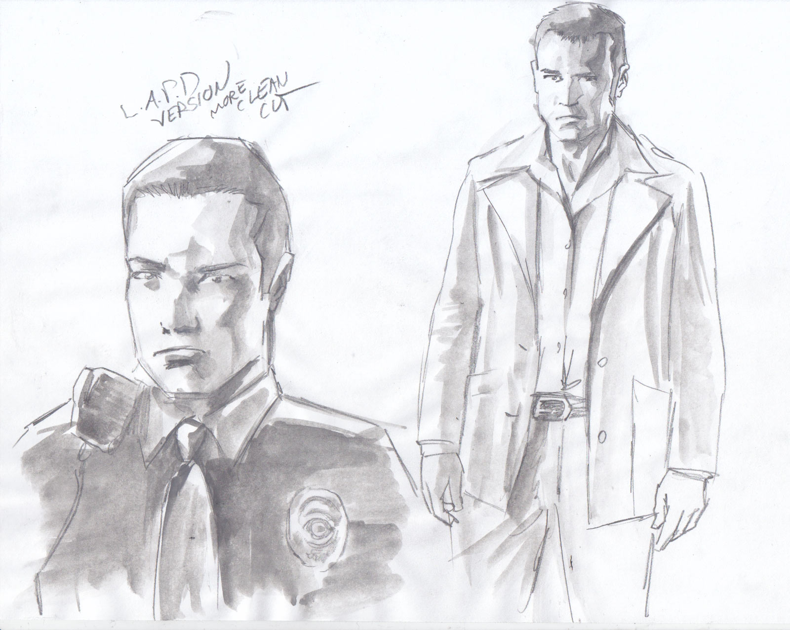
“This is a conceptual [character sketch] for the Belladonna sequel. This is Billy. Ben Ross described him as ‘a decorated cop out of Los Angeles who moves to NYC soon after the emerging story of Belladonna, and the public knowledge that she was formerly Carrie. Billy is assigned to the Larsen-run task force (which has over a dozen cops now), whose sole assignment is to find Belladonna.’ I decided to give him two slightly different looks. He’s a little more clean-cut as a LAPD officer than his look when on the task force. This is the very first sketch of this character, and is most likely going to change before the next OGN comes out for Belladonna.” -JKW
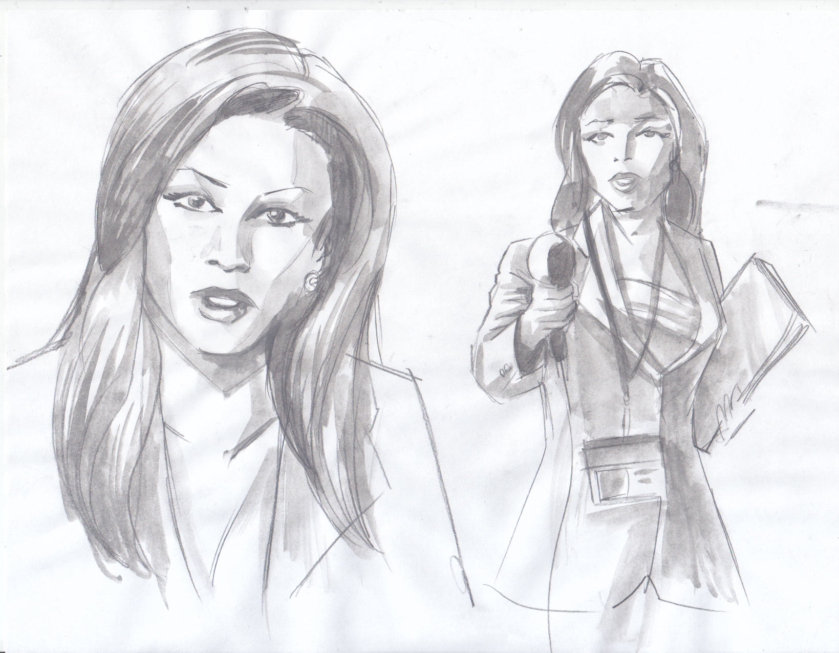
“Like the previous sketch, this is also a conceptual [character sketch] for the Belladonna sequel, and is also likely to change before the next OGN. Ben describes this character as VANNY – a hard-edged reporter who has no problem fucking herself up the ladder to get the fame and fortune she craves. But she’s also smart, and she becomes an anti-Belladonna voice in the press, and eventually has the ability to turn the public against our hero.” -JKW

“I call this one a felgat (FELine and GATo) demon because if it’s cat-like appearance.” -JKW (A character created for the Boston Children’s Hospital benefit comic, Beanbag. -CA)
Thanks again to everyone for checking out this month’s interview. Also, I would like to personally and publicly thank JK Woodward for providing a series of previously unpublished sketches for this article, as well as taking the time to give candid yet detailed answers to all of my questions. Mr. Woodward, you are well-deserving of your newest title, Comic Attack’s Artist of the Month!
For more on JK Woodward: JK’s official website and blog, Pete’s Basement Season 2 Episode 48 featuring JK Woodward (Video), Comic Impact Podcast Episode 74 featuring JK Woodward and Peter David, Comic Attack’s Fallen Angel interview with JK Woodward. Also, you can follow him on Twitter and/or add him on Facebook.
Josh Jones
josh@comicattack.net

Pingback: uberVU - social comments
I LOVE that Batman Beyond and Space Ghost!
That Beast Origins pic is freaky! Only because of how big She-Hulk is. Damn! Awesome work!
great interview & great artwork!
Batman Beyond & Space Ghost is cool. My earliest memories of cartoons is also that ’67 series in re-runs! lol good job Josh!
great interview and I love the Space Ghost and BB pic too!
JK’s now got his own discussion board forum at http://www.BeyondTheBleed.com — come on over and ask him your own questions, totally for free!
Im not impressed with the comic Belladona seems not very origional, but like the other work he did.