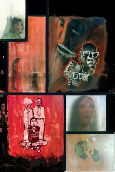
I was first introduced to Jon Ascher’s artwork when I read a preview of his first graphic novel, Neil: An Existential Crisis. The 23 page lead-in to the story was so impressive that I contacted him immediately. Jon responded to my inquiry by sending me a copy of his unpublished graphic novel in its entirety. My expectations were high, but they were exceeded by far. Neil is a complex story that is delivered with an incredible amount of artistic grace. Each panel of this 101 page book could easily serve as its own masterwork. The frames contain a very unique dynamic that is far beyond what most people would consider traditional illustration. At times the characters and backgrounds are rendered with rich multi-media textures. Though, in accordance with the emotional tone of each scene, the images can morph into a simplistic style of expressive representation. This creates a liberal amount of ‘white space’ that allows the reader to fill the gaps with his or her imagination. It also prevents the laborious sacrifice of over-working an otherwise impeccable interpretation of a specific mood. Regardless of the book’s various styles and techniques, there is an eloquent synchronicity that integrates all of the story’s distinctive imagery. In short, Neil is like a show at a fine art gallery that has been collected into a sequential volume, and condensed to be small enough to hold in your hand.
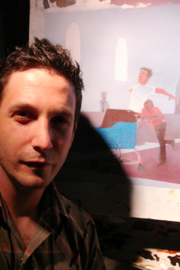
Even though Jon was in the midst of a hectic move, he was still kind enough to put aside time to answer my questions over the phone (he was surrounded by unopened boxes during the interview). Neither Jon nor myself are shy people, and we both love art and comics. So, more banter actually took place than is printed here. Because of this, I have distilled the conversation into a “question and answer” format for the purposes of fluidity. Without further introduction, I present to you Comic Attack’s Artist of the Month, Jon Ascher.
COMIC ATTACK: Where are you from, and how has your environment influenced your artwork?
JON ASCHER: I live in a very urban area in southeast Portland [OR]. I grew up in Queens [NY]. Then I moved to San Diego [CA] when I was 13. I spent an equal amount of time in both places as I was growing up, but I would say New York, and New York City influenced me the most out of the two. It was inspiring to be surrounded by millions and millions of people and all these huge buildings. That city has a lot of history. I just felt like I was part of something bigger than myself.
CA: Did you go to art school?
JA: Yeah, Rhode Island School of Design. My last semester I was sent to Santa Monica in an exchange program to work on the digital side of things. I took some web design classes. I worked mostly with Photoshop 3.o and 3D Studio Max. I never pursued the 3D art, but I did end up working as a web designer for a sizable company for quite a while.
CA: When did you first start reading comics?
JA: I mostly read comics between ages eleven and seventeen. All throughout Junior High and High School. I don’t keep up with a bunch of titles anymore. I read one thing at a time now.
CA: What are you currently reading?
JA: I’ve collected and read all of the Y: The Last Man and Ex Machina trades. I just recently started the first chapter of The Heartbreak Soup Stories but I didn’t get any further than that. Gilbert Hernandez is a really good artist and writer. I need to get back to it. It’s a big book and very awkward to hold. And its heavy. Maybe I put it back on the shelf because of the size. I guess I’m lazy (laughs).
CA: Who are your biggest artistic influences in the comic book community?
JA: As far as comic book story-telling, which is very different from the artistic side of things. I would say I was most influenced by David Mazzucchelli. I took a comic book story-telling class when I was attending RISD, and he conducted it. I don’t know how well I execute what he taught me, but [David] gave me a lot of insight. Visually, I’d say I’m most influenced by the painted works of David McKean, and especially Bill Sienkewicz. I also really love Ted Mekeever.
CA: Who are your biggest artistic influences historically?
JA: That’s a great question (pauses). A lot of illustration from [the] Art Nouveau [movement], and Alphonse Mucha. Most of his painted work depicts people that have realistic proportions, but they’re flat and intricate with colorfully decorated borders.
CA: Which masters do you reference the most for your artwork?
JA: Gustav Klimpt. And I love the colors of Edward Hopper.
CA: Describe your creative process.
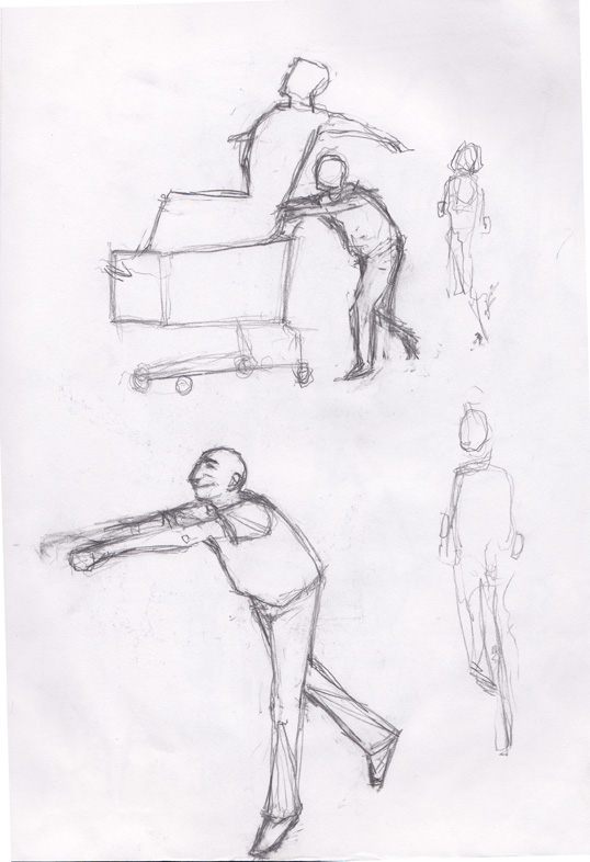
JA: All over the place (laughs)! I get an idea and it kind of sparks. 99% of stuff that crosses my mind artistically, never even hits my sketch book. I do a lot of really awful loose sketches that don’t look like anything. It’s mostly for composition purposes, to find where things are. I put absolutely no effort into ascetics when sketching. It’s my form of shorthand. I use them as reference when I’m painting. They’re just like ugly thumbnails that are barely more than stick figures. With the [Neil] graphic novel, I did more detailed sketches, so I wouldn’t have to spend so much time in the painting stage. Coffee helps too. I was thinking about putting in an acknowledgement to Starbucks when it’s published.
CA: When you hit a creative dry spell what pulls you out?
JA: If I go days without looking at something that I’ve been working on, it’s easy to fall out of rhythm. Even if I don’t work on a certain piece every day, it’s important that I at least look at it and keep it fresh in my mind. Though I might not have an idea, my brain is still working.

CA: Do you listen to music when you paint?
JA: I do sometimes. When I remember to. But there are times I just rush into painting without setting up my Ipod. When I do listen to music, I plug in my Ipod in and set it on random.
CA: What are three bands that would play on the rotation?
JA: Joy Division, The Pixies, and anything by Mike Patton.
CA: How would you describe your artwork?
JA: Some people have a different idea of what fine art is, versus illustration, but I would describe my work as illustration. The Sistine Chapel is basically a comic book, but today [Michealangelo] would be sneered at by the Art Forum crowd. There’s this idea that modern art has advanced beyond figurative work. As far as fine art goes, whoever painted those old Iron Maiden album covers was amazing. That’s fine art.
CA: What or who sparked your interest for the visual arts?
JA: When I was in kindergarten, I used to draw logos of movies I really liked. I would draw stuff like the Star Wars and Superman logos and try to get them as detailed as I could. I was also a big fan of iconic images like E.T. and the Statue of Liberty. I would draw the New York Yankees and New York Mets logos. It was pretty sloppy and I did it with crayons, but that’s all I had to work with.
CA: What do you think the fascination with the logos was?
JA: I don’t know. I think a market research person could tell you better than me (laughs). I guess certain shapes and colors appeal to children. I really bought into the whole branding thing as a child. I really loved those logos.
CA: What kind artistic work/jobs have you done?
JA: I’ve been doing freelance work since the late nineties. I’ve done a couple of CD album covers. I did the cover art for a Portland band called The Days The Nights. I got a lot of artistic license on that project because the band really liked my work. And I did an album cover for Tim Mudd. He’s a folk singer/song writer from San Diego. [Tim’s album] got a great review and so did my cover art. (read the review here)
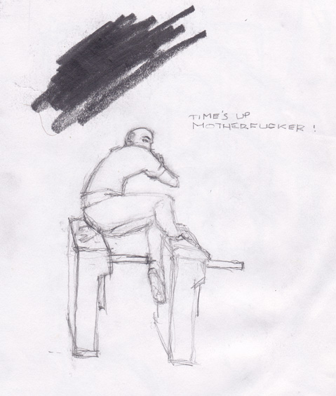
CA: The term time’s up appears numerous times in the graphic novel, and it’s also the name of Devon Devereaux’s short documentary featuring you and the artwork from Neil. What does time’s up mean?
JA: It serves the purpose of making [Neil] aware that the universe around him is conscious of his presence. Like he’s being watched or almost toyed with. [The phrase is] there to create a sense of building paranoia. It’s a fatalistic element that’s eventually personified by one of the characters near the end of the story.
CA: As you mentioned in the documentary, Neil is loosely based on a friend of yours that committed suicide. How would you explain the process of incorporating such a dark chapter of your life into the story.
JA: Some of the aspects of [Neil’s] personality were based on my best friend John, who killed himself a year after we graduated high school. A lot of the circumstances in Neil’s life were based on him as well. Like the hard drug use and the dysfunctional family life. I first wrote the story as a dark comedy, and John wasn’t even going to be incorporated into it at all. In its original incarnation, the story was similar to Kyle Baker’s I Die at Midnight. A teacher of mine in college suggested that I personalize the story. She said that it would help the reader sympathize, and feel empathy for the character and relate to his choices. But when I put John in it, the story became more dark. I wanted some comedy, and I wanted it to be uplifting, but not totally depressing. There’s just a lot of dark subject matter to tread through before you can get there. I really wanted it to be authentic, and I didn’t want to play it naive. That way it would be worth while, and it would mean something to someone who has hit a point that low. The book was very therapeutic for me. I feel that I have connected with [John] in some way. For me, in my perspective, I’ve done my part in making something good flower out of a tragedy.
CA: Have you heard anything from John’s friends or family?
JA: Not so much. Just that the art was beautiful. John’s old girlfriend went on to be an art therapist, and I was telling her about [the story] as it came along. She was very encouraging.
CA: Were there any other characters in the graphic novel that were based on people in your life?
JA: I guess the character Nada was very loosely based on my friend Anne, John’s girlfriend in high school. The same one that went on to be an art therapist. A bit of myself is in every character, and in everything [in the story], too. That’s just a byproduct of the process.
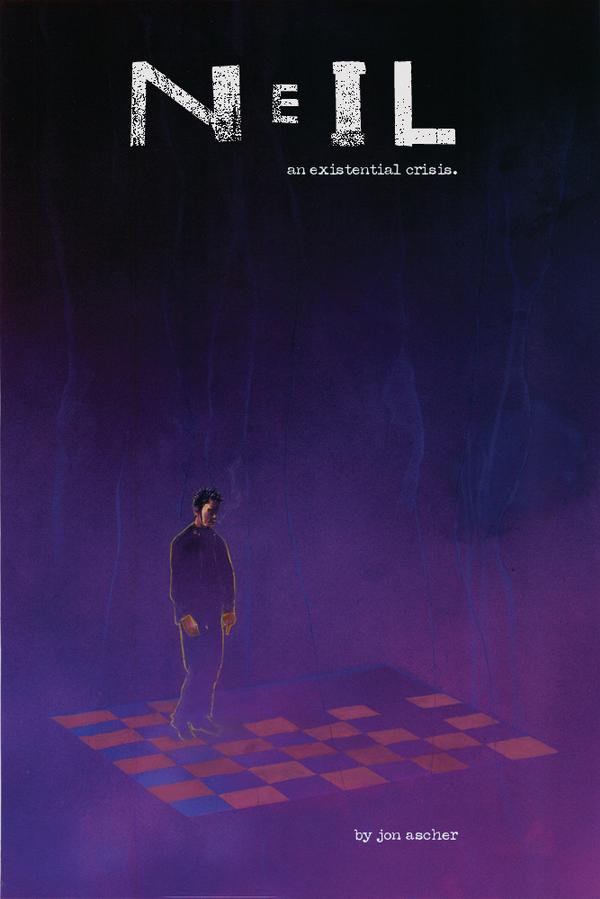
CA: The cover for Neil is simplistic when compared to most of the panels in the story. Why?
JA: I didn’t want there to be a background. I didn’t want to over-complicate things. The ideas [of the story] are better conveyed by him standing alone in the dark and on a chess board. It’s very much at the heart of what existentialism is all about. He’s a pawn, about to make his own move.

CA: Prior to Neil, have you ever worked on a graphic novel or comic book?
JA: I’ve never done a story this long before. I did a six page story for my comic book story-telling class, and I did a fully painted, seven page story for an anthology called Tales of Hod Rod Horror. It’s a collection of horror stories about hod rod’s and hod rod culture.
CA: As a painter how do you approach the composition of each page? Do you break it down to each individual panel, or you look at the page as the the complete artistic work?
JA: When I worked on Tales of Hod Rod Horror, I considered the whole page one piece of art, but in Neil it was broken down to panels. The whole point to begin with is the story, so a panel should make the page and the page should make the story. In essence, when you’re doing a graphic novel, the whole book is a complete piece of artwork.
CA: Your artwork in Neil has texture. Which is often absent from comic books. Why did you make that choice as an artist, and how did you create it?
JA: Though the story is primarily painted with acrylics, there were some pages I wanted to be smooth, and some pages I wanted to be rough and agitated. The smooth was meant for serenity, and the rough textures were reserved for more violent scenes. I used a dry brush to apply texture in scenes where it fit the mood of the story. I also used colored pencils, pastels, and spray paint to add texture. I didn’t have an air brush, so I would use [spray paint] on the pages to create a glow or a mist here and there.
CA: Any other projects in the works?
JA: Yeah. Right now I’m working on the sequel to Tales of Hod Rod’s of Horror. It’s a twenty page story about a cybernetic car that gains intelligence and becomes violent. It’s kind of a cliche’. And I have another experimental story that I’m kicking around. I’m going to get to work on that once I clear up some of these other projects.
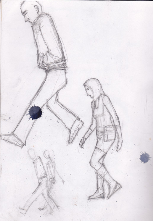
Now, for an exclusive look at Jon’s sketchbook, featuring conceptual illustrations for Neil: An Existential Crisis.

Because Neil: An Existential Crisis is essentially not in circulation yet (other than a few promotional copies), and publishers get a little uptight when the market is flooded before they get a chance to slap their label on it, there are no copies of Neil available for purchase at the present time. Although, Jon said he has been talking to publishers, and the feedback has been really positive so far. Hopefully, copies will be available in the near future so that everyone can get a chance to check out this awesome book. Many thanks to Jon Ascher for his time and contributions. Check out the links below for more of his work.
Related Links: Jonascher.com (contains the artwork from Neil and all 7 pages of Jon’s story in Tales Of Rod Rod Horror Vol. 1), John Ascher Facebook fanpage (contains an album with a 23 page preview of Neil with dialogue), John Ascher’s Myspace (contains an album of original artwork), Devon Devereaux’s full documentary, Times Up on Youtube (starring Jon Ascher and the artwork from Neil), Comiccollecterblog.com’s review of Neil: An Existential Crisis, Laughingsquid.com’s review of Tales of Hod Rod Horror.
Josh Jones
josh@comicattack.net


.jpg)
This is great Josh, nice work man! All the links provided throughout were incredibly informative.
Glad to hear Jon is a fan of Brian K. Vaughan and Y: The Last Man and Ex Machina; two amazing series!
And “Neil” is a take on existentialism, huh? On that premise alone I’m sold.
Wow his mother and I are so proud of him. Left out from the interview and most of the publicity around Jon’s success is that he has grappled with a very serious case of Multiple Sclerosis since he was 14. he has to battle with fatigue, an muscle coordination amking what he achieves quite remarkable. Ever since nursery school his art became prominent and praised by those who viewed it. i wish i kept some of the drawings Jon threw away in disgust, because I could never do what he considerd poor. He is somewhat of a perfectionist and I guess that is why he was voted in his senior year in high school as “most likely to have his art shown in a museum”. Quite an accurate prediction, i believe.
Good interview J. His work seems very thought out, cerebral even.
Really interesting read. I’ll have to keep an eye out for when this gets published.