 Grimm Fairy Tales Presents: Neverland Hook #4
Publisher: Zenescope
Writer: Joe Brusha
Artist: Jim Rodgers (cover by Ale Garza)
Colors: Jeff Balke & Ramon Ignacio Bunge
Nathan Cross is in big trouble in Neverland. He’s basically at the mercy of his captor, Barr. Barr was once the ruler of Neverland, but his pompous attitude and laziness made him weak, and a young, bloodthirsty man named Pan took advantage of it! This left Barr angry and hungry to get back his throne. He used a fairy to bring Nathan back to Neverland to power some sort of stone that will in turn make Barr a very powerful ruler. So powerful, that he claims that he’ll bring Earth’s biggest city to his realm, and suck all the “weaklings” dry for more power! Nathan’s friends have come to make a rescue attempt, but are quickly dealt a crippling blow. Will they be able to help Nathan in time? We shall see!
This series is one of the coolest offerings from Zenescope, for sure! Neverland and its occupants are all very unique, and the fact that roles are reversed here is fantastic (Pan is the villain here). We still don’t have a true answer to whether or not Nathan’s brother is dead or alive. One minute, Barr stated he was alive, then the next, he said he was dead. It will hopefully be a big reveal when we find out which is true! Something big is on the horizon in Neverland, but what will it be? Is Pan going to show up and throw a wrench into Barr’s plans? Possibly, but either way, it’s going to be a great adventure! Brusha hasn’t disappointed so far, and the characters are so strong, he probably never will.

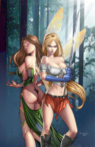
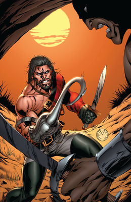
Rodgers’s artwork is solid throughout the book. He does have a tendency to be a bit more proficient in close-ups than far away shots. Not that they are bad, just not as detailed. He has a flare for the action scenes that cannot be denied. In one scene, Belle and Nyx are flying around a ship and fighting. It was definitely the best set of pages in the book. The colors are a big part of the artwork, as well, and we have Jeff Balke and Ramon Ignacio Bunge to thank for that! Two covers, one very sexy, and the other gritty (by Marat Mychaels), are both great representations of the inner panels from a story and artwork standpoint. Rating 3.5/5
Billy Dunleavy
billy@comicattack.net


I usually just ignore them, but that first cover…. Just…ug. They’re not even trying to pretend like they’re not all about the T&A anymore. Even if the story inside is decent, covers like that are a complete turn off.
lol, yeah, I see what you mean. I’m just used to it I guess. I just turn the page and go. 🙂