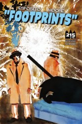
 Title: Footprints #2
Publisher: 215 Ink
Writer: Joey Esposito
Artist: Jonathan Moore
Cover: Jonathan Moore
“Iced: Part Two“: After a short hiatus, Footprints is back with Footprints #2. I was interested to see how it was. Not because I wasn’t sure if it was good or bad. I was pretty sure the issue would be solid (just as long as Esposito and Moore didn’t go crazy). Rather, I was interested to see what direction they took. I’m curious as to how the story will develop and if they’ll start taking advantage of the creatures’ mythologies. Either way, whether they stick with the classic noir or push the high concept of Big Foot as a detective, they can’t really lose as long as they keep going strong.
Well, I can say they definitely went with the former and they’re still going strong. You have all the myth characters. Big foot. Chupacabra. Loch Ness. And many more. But at the same time, it’s pretty much your classic hard-boiled. Private eye. Conspiracies. Damsel that can’t be trusted. Tough men in trench coats. Etc., etc., etc. You’ll probably know most of this story from past classic detective novels and films. In fact, I had a jazz track in my head as I read this.
Before you accuse this of just being a pastiche of hard-boil stories with mythological characters, let me remind you. It’s not always the story that matters, rather it’s how the story is told. And Esposito and Moore tell it well.
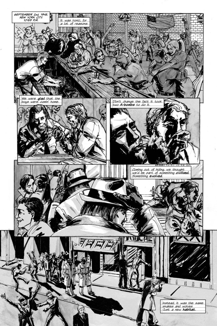
Perhaps it was the seven month hiatus, but for whatever reason, the quality of writing has seemed to improve with this issue. Not to say that the writing was bad or mediocre the last time. Rather, his writing has gotten sharper, tighter. He employs the detective tropes with precision. The dialog is a good mix between natural and hard-boiled.
Also, big props to Moore for the artwork. It’s a black and white work of art, where he uses shades of gray to his advantage to give emotion and atmosphere to the piece. None of the black and white (and gray) gets messy or blurs in. It’s just as interesting, if not more, than color. As before, the anatomies are correct, nothing is out of proportion. And I also like his sketch style for the drawing. Plus, all the characters are uniquely drawn and are given their own characteristics and expressions (and this isn’t just for the monsters).
Rounding out the artistic team is letterer Adam O. Pruett. He does a solid job with bubbling, nothing over the top. But I like how he uses a notepad style for the letter boxes. Makes it feel like we’re reading someone’s journal.
I’m not sure if it’s the seven months or if the story is starting to heat up, but whatever the reason, Footprints has been turned up a notch in story, writing, and artwork. If you’re only looking to get your kicks from a mythological story, then this is probably not for you. If you’re like the rest of us and just enjoy a solid story that has its hard-boiled flairs, then you’ve come to the right place.
Andrew Hudson
ahudson@comicattack.net
@Hudsonian
A copy of this comic was provided by the publisher for review.