The ultimate stylist. Magician, designer, illustrator, painter, writer, and all around coolest man in comics. Jim Steranko. It’s all Jim, all the time…50 pages worth!
Jim Steranko Portfolio, 1970
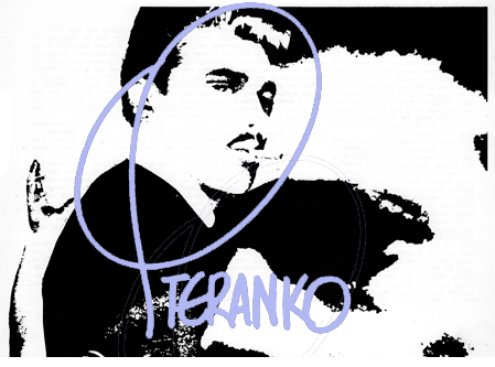
Editor and publisher: Supergraphics/Jim Steranko

If you are truly a student of the comic art form, you have to know the name Jim Steranko. True, his stay in comics was comparatively brief, but his impact was huge. Though he started out as another Jack Kirby follower, he very quickly developed an innovative style, constantly pushing the envelope of what could be done with the content of comics and above all, the form of comics.
 I can remember being a Marvel fan in high school and being just blown away by Jim Steranko’s forceful but lyrical artwork on comics like The X-Men, SHIELD, Captain America, and a plethora of gorgeous and eye catching covers for other books. His work, though initially somewhat like Jack Kirby (partially because his first Marvel job was inking Kirby in Strange Tales), blossomed into something unlike anyone else. Jim Steranko brought the era of psychedelic experimentation seen in film, and indeed, lifestyles, into the world of comics. But even visionaries have to start somewhere.

 Above you see the splash page of a very early strip by Steranko, who was a huge Marlon Brando and Saturday serial film fan. In the portfolio Steranko says:
Lifted directly from the film [The Wild One], my protagonist was named Johnny Thunder. My style was bold and simple and I took the most direct approach possible. Storytelling was my foremost concern as it still is today. I was about 15.
Fifteen! Can you believe that? Though obviously primitive compared to his later work (whose isn’t?), you can see a bold use of blacks, a conscious use of tones to force our eyes to the lit area of the middle-ground, and the smooth, cool characters that would populate his strips as the years progressed. One year later, at the age of 16, Steranko steered his horse into the world of westerns with the strip Gunfighter, seen below.

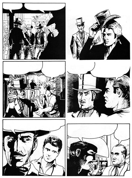

Above you see Steranko becoming more skilled at employing dramatic lighting on his characters. He is also moving the point of view around to suit his needs (though this page is composed primarily of a somewhat repetitive sequence of two shots). I have a feeling the pompadour coiffed chap in the background of panel 5 is based on a young Steranko. After he graduated from high school, painting signs to make some cash along the way, Steranko veered into the world of magic and the art of card tricks. He says:
…I focused my attention on the art of illusion, created a whole new approach to magic and wrote a series of articles and books about the subject while breaking out of jails, straitjackets and packing boxes dropped to the bottom of rivers. I abandoned art completely and joined a circus side show for a season as a fire-eater among other things.

This was all done around the age of 18, believe it or not. At 19, he says he “literally retired for a year except for a few dozen fast buck operations, then turned to commercial art again, eventually becoming Art Director of a small but busy advertising agency.” I have a feeling this time period influenced some of the graphics-savvy work that came later. After half a dozen years of agency work, Steranko started to think of working in comics again, and because of a chance meeting with artist/writer Joe Simon (of Simon and Kirby), he started creating new characters for Harvey Comics, a few of which you can see below.


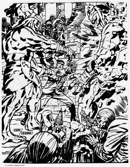
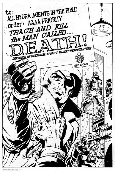
 During this time, Steranko created for Harvey Comics characters such as The Gladiator, Spyman, Magic Master, as well as scripting the initial stories for each of them. Others, such as Future American and Spacewolf, were rejected. It was Jack Kirby who insisted Steranko concentrate on art, rather than writing. After being turned down by Tower and a few other companies, Stan Lee was the first to see the incredible potential of the young and headstrong Steranko, and put him to work inking Kirby on SHIELD in Strange Tales (see below).

 After three issues of working over Kirby’s pencils, Steranko was let loose to stretch and show what he was capable of. In Don McGregor’s portfolio preface called Requiem, the writer speaks of the amazing strides Steranko was taking in the monthly book.
Expression became important. And in Steranko’s Agent of SHIELD strip, expression and style were the most important and consistent factors which contributed to the superiority of that strip. Mediocrity faded, if slowly, into a drastic representation of innovation, insight, imagination, creativity, emotion.
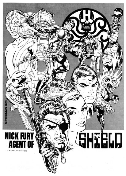
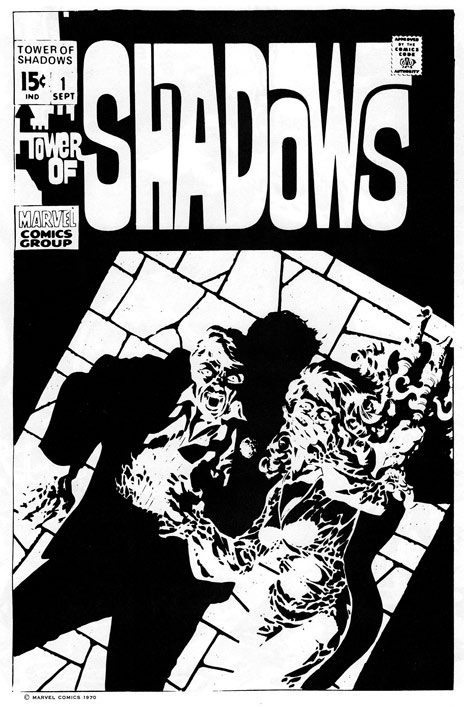
McGregor continues, talking about the increasingly evident attention to style that Steranko was exhibiting by saying that style “created an impact, combined fantasy with social comment. Life larger than real life yet a commentary just the same. And always present: style, a distinctive touch, an individualist brand that was synonomous with the name Steranko.” And an individual Steranko definitely was. He would not be corralled into a monthly book for very long, even by the adventurous Lee. Steranko would move on to Captain America and other books, even having covers rejected, such as the Tower of Shadows (for being “too far out”) seen below. Think Frank Miller might have seen this and been inspired to do his amazing Sin City work? Stranger things have happened.

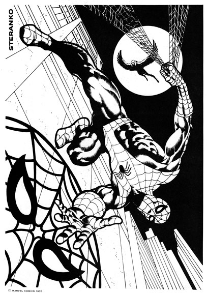
 I can remember seeing Steranko’s art in the Marvel house fanzine, FOOM. Below you see a beautifully dramatic rendition of Spidey as only Steranko could do it.

 A great place to see a Steranko checklist is on the Pencil Ink blog here. You will probably be very surprised by the amount of work Steranko did, because he jumped from book to book, cover to cover, short story to short story, genre to genre. As Steranko himself says in the portfolio, “I felt the need to expand my thinking into new areas. Mystery. Horror. Love. I experimented with styles.” One rejected idea called Waxworks was about a “mysterious ghost-breaker named Karstone,” seen below.

Long before Hellblazer, Steranko was there! He even covered his fellow artist/writer’s ideas when it suited his fancy, such as underground legend Trina Robbins and her Panthea character seen below.

 Steranko also wanted to work within the sword and sorcery realm, so of course, he created his own character, Talon. You can see some pencil sketches of this character in Ink Stains 23 here, covering his interview in Gary Groth’s Fantastic Fanzine 11 here (some art from this portfolio is seen there as well).

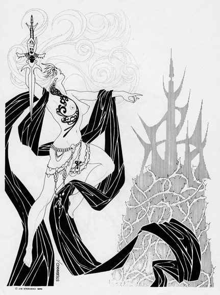
As I said before, the elements that drew me to Steranko and his art were the lyrical beauty of his figures and his attention to the design and composition of every single piece of art. You can see it in the piece above, the shadows of the imposing rocks engulfing the title character as well as the approaching foe, creating a dramatic middle ground. The skewed angle of the rocks leads your eye to the main character, as does the semicircular dissolving rock pathway. It defines the word dynamic, as does virtually every Steranko illustration.


 You can see the influence in the illustration above of the great golden age artist, Lou Fine, another artist who illustrated in a very posed and lyrical style. But Steranko outran his influences quickly, and created a catalog like no one else in comics. Very few have done so little work, but influenced so many. JH Williams III is one. (See his Steranko influence referenced here). Writer Ed Brubaker is another and professes his love of Steranko here, a group of gorgeous Steranko covers serving as visual back up. Hollywood screen writer Andrew W. Marlowe, writing a SHIELD film currently, talks about how Steranko informed his script here. Kavalier and Clay writer Michael Chabon tells us Steranko himself was the inspiration for his Kavalier character here. I remember one of the reasons I loved Paul Gulacy’s art on the wonderful Master of Kung Fu was because it looked so much like Steranko. You can read in the wonderful Comic Book Artist magazine about Steranko and Gulacy’s meeting in the latter’s interview here.
Suffice to say, Jim Steranko’s influence on the world of comics is felt far and wide. But Steranko would never be limited to just comics. When asked about his best work, it’s no surprise that he says “that work is yet to come.”
Thanks this time, in a huuuuuge way, go out to Tony Robertson for scanning and sending me this magazine (twice!). I am experiencing seeing this for the first time just like you, and it is a great experience! You can see his Steranko site here. I am not able to provide you a pdf download, as per Steranko’s agent, David Spurlock, however.
Ken Meyer Jr.
kenmeyerjr@yahoo.com
wonderful stuff… just downloading the pdf but the article is (as always compelling and interesting. and to get Stranko unleashed… well… it is a must
Roberto, thanks for stopping by and especially for taking the time to comment. I have not seen a few of these images (like the Spider-man) for sooo long, and there were so many I never saw…it is a great addition to Ink Stains!
Steranko, Steranko, Steranko
I was a little young to be purchasing comics when Steranko was working for Marvel but I kept reading his name in Bullpen Bulletins and lettercols. I had him built up in my mind as an unmatchable visionary. I can’t remember the first time I saw his work (it was either an ad for FOOM with the Spidey poster or in Marice Horn’ s Encyclopedia of Comics which used that Nick Fury in outer space cover as an example of “chiaroscuro”) but incredibly his work surpassed what I’d imagined.
Interesting you should post this today as over at Golden Age Comic Book Stories Mr. Gatetree recently posted a Steranko portfolio from a comicon with many of the same pieces and a commenter makes the same reference to Miller’s Sin City style.
Steranko for me will always = Nick Fury! Great stuff Ken!
Wow, Todd that IS interesting…maybe I should drop by there and pimp my column!
Thanks, billy!
Beautiful artwork! Thanks for the column, Ken.
Thanks, Matt, appreciate it!
Pingback: Tweets that mention Ink Stains 25: 1970 Jim Steranko portfolio -- Topsy.com
Another great effort! I hadn’t seen some of this artwork and it’s all so good. Thanks for sharing!
Well, if YOU haven’t seen much of this, then I have done my job, Richard! I know I hadn’t seen much of it, and seeing some images again (the Spiderman, for example) really made me happy. Thanks for looking and commenting!
I remember the first time I saw one of Steranko’s pieces as a kid and my jaw hit the floor! I’ve been a fan ever since and I’m about to download the PDF in a sec! Thanks Ken!
Hope you like the pdf, Speech, it is worth the time!
Pingback: Cosplayer Spotlight: Eric “The Smoke” Moran
My first exposure to his work was the Outland adaptation he did for Heavy Metal. I loved it, and I loved all the Steranko work I’ve seen since then. I’m not by any means a Steranko completionist — most of these pieces are completely new to me. Thanks for posting them!
I’ve been through the above over and over but I can’t find the link to the PDF. Was it withdrawn?
Can you tell me which series the woman below Gladiator is from? i own a very similar Staranko original, and I am trying to identify its origin. Thanks!
Sorry I just saw this, James! I would say check with an authority like Tony Robertson (he is on Facebook).
Pingback: Ink Stains 131: Marvel World 2 – ComicAttack.net
Pingback: Ink Stains 135: Lollapaloosa 4 – ComicAttack.net