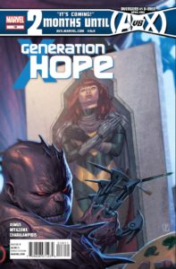
It really is kind of a shame that this series is getting cancelled just as it’s starting to get halfway good. Notice I said “halfway.” It’s still not stellar, but things are finally coming to a head as Zero has had enough of Hope’s controlling of the team. Zero has long been the wildcard of the bunch, and it appears that James Asmus has done a good job of laying out a plan for him to take out Hope. It appears that with the help of his connection to Martha Johannson, he’s doing some controlling of his own in a plot to kill the Messiah. Asmus seems to have a better grasp on these characters, more so than Kieron Gillen ever did. Not only that, but Asmus has expanded the cast to include people that longtime X-fans actually care about like Pixie, Shaw, and even the Cuckoos. Heck, even the D-list villains like Random and Erg make good antagonists to Hope. Not only is Asmus paying off the Zero betrayal here, but he also throws in a couple of other interesting side stories, like Gabriel and Pixie sharing a moment, and Hope trying to resolve the Sebastian Shaw mind-wipe. My only prediction is that Shaw will end up being Hope’s savior in the end, making the X-Men think twice about his villainous past. Joining Asmus on this issue is the incredibly talented Takeshi Miyazawa. Who can forget his fantastic work on Runaways years ago? He is a much-needed breath of fresh air, as his manga-esque pencils lend themselves to a cast of teenagers. But Miyazawa doesn’t just draw great young people, but even his depictions of Shaw, Cyclops, and Emma are original, and well-suited for this book. His pencils and inks are loose and unconstrained. I would love to see him on any Marvel book on a regular basis. As this series begins to close out, I can’t help but wish it had been a little different. It’s really a shame that yet another teen X-book is getting cancelled, while something like New X-Men is just out there waiting to be taken up again. Maybe they’ll give the job to this creative team whenever the next iteration of X-teens comes about. –JJ
Cover: 5/10 Writing: 7/10 Art: 8/10 Relevance: 6/10
All I really say about this issue is that I’m officially dropping this book. So this is the last issue that I’ll be covering in the X-Piles. I haven’t had anything nice to say other than about Paco Medina’s art, and I can’t even say that about this issue. Instead, we get Medina-lite in Carlo Barberi, who’s work is so much of an ape of Medina’s, that it’s embarrassing. This issue focuses on Quicksilver, who has been written as super-confident in the previous issues, and now is being written so out-of-character, that I’m thinking he’s bipolar. It’s just amazing how bad the story is here. Also, this issue reveals that Magneto is not really dead, and everything that I once liked about the possibility of the Ultimate Universe is now gone. A world without Xavier or Magneto was something I was really looking forward to seeing, but now it appears they’re both back. I had high hopes for Nick Spencer, but once again, the Ultimate version of the X-Men completely disappoints. –JJ
Cover: 4/10 Writing: 3/10 Art: 5/10 Relevance: 0/10
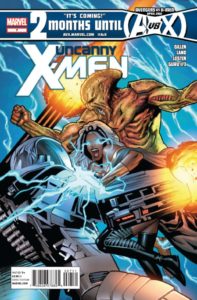
I’m depressed. Take what I said about Ultimate Comics X-Men above and multiply it tenfold. This is the worst this book has been in quite possibly ever. Let’s start with the obvious–the Greg Land art. Wait, you know what, I have nothing new to say about his work. It’s just abysmal. This is just more of the same. There is not one emotion conveyed in the faces he draws. Storm screams once, but that’s about it. Maybe there’s something redemptive about the story? Nope. This is the most nonsensical piece of trash story I have ever seen. Someone give me Plant-Man! Someone give me the Draco! Anything but this. I couldn’t tell you what’s going on in this book if I tried. The team is literally walking behind a strange creature the entire issue, who keeps talking about his friend who’s not his friend anymore. Then, to make it worse, they start calling themselves “unwife?” I couldn’t even keep up with who was talking when. These Apex characters are among the flattest and uninteresting creatures I’ve ever seen. The one thing that has kept this story going was the secret Betsy is harboring about the creation of Tabula Rasa, but that’s not even touched on in this issue! This is like one of those Warren Ellis out-of-continuity kind of stories that uses way too much jargon that tries to sound scientific and has absolutely no characterization or plot development at all. I thought Matt Fraction was bad! This is serious…I’d rather read New Mutants than this garbage. If there were any writer and artist who would make me consider leaving the X-Men franchise for good, it might be these two. Fix this quick, Marvel, I want my Uncanny back! –JJ
Cover: 0/10 Writing: 0/10 Art: 0/10 Relevance: What the fuck happened?
Writer, Jason Aaron has really recaptured Logan’s character over the the past year. Long-time Wolverine fans must be relishing the opportunity to see Logan back in Japan involved in a Hand Yakuza gang war. Sure, it’s been done before; sometimes well, sometimes not so much, but this time around it seems more sincere.
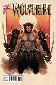
A good place to start this review would be the cover. I usually don’t notice things like this, but for some reason it really stuck out to me with this book. The cover artist is not included in the credits at all! I fell in love with the cover as soon as I picked the book up at my local comic store. Immediately, I went to the inside cover to confirm that the man responsible for the beautiful work on the front was Olivier Coipel. Even as I am typing this, I stopped again to see if I just overlooked something. This might be a petty thing, but I really hope that this is just an oversight on the part of Marvel’s editorial staff. In today’s age of self promotion every piece of labelling is vital, especially when your work is so beautiful that people independently seek out who the creator is. French artist, Olivier Coipel captures more of his painterly style that was so effective in his earlier work on House of M. The cover flirts between traditional wall tapestry and movie poster, effectively drumming up drama and mystery. Well done Mr. Copiel! We need to see you doing more interior work for Marvell!
That was my “I” paragraph (Brian Michael Bendis said on Twitter that any reviewer using more than three “I’s” in their review is just plain amateurish. Of course, I disagree 100%) Now that it is out of the way, we can move on with a more professional sounding review…..
Quickly becoming “longtime” Wolverine writer, Jason Aaron, does a fantastic job of portraying a contemporary feudal Japan in this book. Using quick panels and high paced storytelling, Aaron gives the reader a sense of desperation as the Hand and the Yazkuza scramble for control over the lucrative Japanese criminal underground. This is much more than a cheap Black Rain (Micheal Douglas) ripoff, although the Yakuza on motorcycles with chainsaws and the ensuing flying body parts are surely a little bit of an homage to the cult classic 80’s crime film. Like always, Aaron is able to satisfy a wide audience in the way that he layers the story. There is a bizarre family triangle with Wolverine looking for his daughter while battling her boyfriend, who just so happens to be the son of his long time enemy the Silver Samurai. The re-introduction of two of Logan’s oldest enemies help further the tension. Wrap all this storytelling up with a bow decorated with ninjas, Japanese gangsters, misplaced honour and gory fight scenes and you have a scrumptious little book!
Despite the great storytelling, I would be remiss in not complaining about the art. Billy Tan and colourist Jason Keith’s work on chapters 8, 11 and 12 were great. Steve Sanders work on chapters 9 and 10 was waaaaaaaaay too much like Howard Chaykin’s work, which is not a compliment at all! Likewise, somebody needs to explain to me why this book uses two separate artists at all. It’s not like one is drawing a flashback or a separate storyline. Both artists simply carry on the same story. Sharing the art duty on a single issue rarely works and this is a perfect example. Sanders blocky art slows down the pacing of the book, and is just plain ugly to look at. Let Tan handle all of the art duties and if that is too much for him go get Lienil Yu, who draws a a great Wolverine and even better ninjas!
Ultimately, I’m just happy that Aaron has transformed Wolverine back into the character he used to be. I now look forward to buying this book on a monthly basis.-CK
Cover: 8/10 Writing: 8/10 Art: 7/10 (More Tan than Sanders thankfully!) Relevance: 7/10
This title is best left for fatherjeff to review as opposed to me. I just don’t have the backstory which means I can’t get into a relationship with these characters. I enjoyed #231 but found #232 a bit anti-climactic.
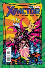
By no means was this story bad, it just didn’t speak to me the way most X-books do. I am sure this has to do with my limited exposure to X-Factor. The idea of Jamie jumping from one reality to the next was interesting enough, but again, I don’t much care for Madrox, which makes it hard for me to care about his plight or witty banter. Peter David crafts a solid script, and plays with the dialogue in a clever way. I think the overall concept for this book is not for me. For instance, I didn’t care that Layla and Jamie were making out in the end. In fact, I found it kind of creepy. Last I checked, she was like twelve or something. I know a lot has happened since then, but it still grosses me out. Lastly, the fact that three baddies followed Madrox back from his universe hopping adventure, doesn’t leave me excited at all. In fact, I see this as lazy storytelling. David consistently creates these minor problems for X-Factor, and rather than them seeming as though they are fighting the good fight, I always get the impression that he is just trying to keep them busy. No thanks, not for this guy.
I have to admit, I do enjoy Lupacchino’s art style. She uses classic lines but poses and models her characters in a more sophisticated way. She really knows how to fill a panel, and carries the storytelling all on her own.
From here on in I’ll let Jeff do the X-Factor reviews. I think he has more history with the book and would do it more justice than me.-CK
Cover: 7/10 Writing: 6/10 Art: 7/10 Relevance: 4/10
Most X-Cellent Pick of the Week:
Capekiller: Wolverine #301 showcased body parts flying all over the place and Wolverine taking a beating at the hands of the new Silver Samurai. Kung-Fu awesomeness!
Jeff: X-Factor #232 had me standing up and cheering! What a great issue with some nice carry-overs.
Capekiller: Wolverine #301 showcased body parts flying all over the place and Wolverine taking a beating at the hands of the new Silver Samurai. Kung-Fu awesomeness!
Jeff: X-Factor #232 had me standing up and cheering! What a great issue with some nice carry-overs.
Capekiller
capekiller@comicattack.net
capekiller@comicattack.net
Jeff Jackson
jeff@comicattack.net
jeff@comicattack.net


I actually preferred the Sanders art to the Tan stuff. Haha!