 Welcome to the 121th edition of the Uncanny X-Piles! Boy, almost everything came out the week before Christmas! Find out which books we thought were naughty and which ones we thought were nice.
The X-Piles
Numbers next to each title are the cumulative ranking of the latest issue out of a total of 40. Numbers in parentheses indicate the previous issue’s rating. Blue indicates a raise in the chart from last issue; red indicates a drop; green indicates the book stayed put.
1. All-New X-Men: 34 (31)
2. Uncanny X-Men: 31 (16)
3. Wolverine : 30 (24)
4. Uncanny Avengers: 29 (32)
5. Uncanny X-Force: 29 (30)
6. X-Factor: 29 (27)
7. Wolverine & the X-Men: 27 (32)
8. Astonishing X-Men: 27 (18)
9. Cable & X-Force: 26 (27)
10. Gambit: 23 (22)
11. X-Men: 22 (26)
12. Age of Apocalypse: 20 (22)
13. A + X: 18 (29)
14. X-Men: Legacy: 15 (16)
15. First X-Men: 11 (14)
______________________________________________________
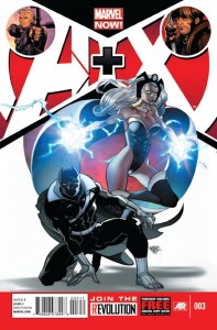 “A + X” #3
Writer(s): Jason Aaron & James Asmus
Artist(s): Pasqual Ferry & Billy Tan
So this is how Marvel chooses to end the Black Panther/Storm marriage? This was a pretty weak ending to a relationship that was decades in the making and undermines much of what was established in regards to the strength of their relationship. Though, there are times when Aaron tries to make sense of things and not have their marriage seem more like a few hot dates. It doesn’t do much in the end. Mostly because there hasn’t been much talk about their issues other than broad comments here and there sprinkled about during the Avengers vs X-Men event. There was more excitement in watching them casually stop poachers than their entire reconciliation story.
At least Ferry’s artwork made it look pretty good during AIM’s raid on Wakanda. Hawkeye and Gambit’s story is one of one upsmanship as they attempt to save a damsel in distress from some type of monster. Now, we aren’t told where the creature comes from or why it even pops up but who really cares right. Asmus gets a pretty good rhythm going between the two characters but it’s always interesting when a writer has Hawkeye call into question another’s morality. Being a former criminal himself that always seems pretty weak. However the banter between the two gets slightly annoying instead of fun though the slight twist at the end was a step in a better direction. Billy Tan’s work was a bit hit and miss and seemed a bit rushed at times. All in all this is another series that makes you ask if it’s really necessary. There’s other books on the shelf that need some attention and this isn’t one of them.-IS
Cover: 6/10 Writing: 5/10 Art: 5/10 Relevance: 2/10 TOTAL: 18/40
 “All-New X-Men” #4
Writer: Brian Michael Bendis
Artist & Cover: Stuart Immonen
I admit, it never occurred to me to bring the original X-Men, five of my favorite characters of all time, and plop them into the current 616 continuity. But if I had thought of that, there are a number of things that I would want to see happen. First, I’d want to see how that team mixes with the team as they are today. I’d want Wolverine to see Jean again, I’d want old Iceman and young Iceman converse, I’d want to see everyone who cared about Jean to see her once more. But more than anything, I’d want to see the old Cyclops, the brooding, insecure one, meet this current, unrecognizable Cyclops. Lucky for me, Bendis has done everything right so far in this book. I was disappointed with last issue, but now I see why Bendis had to spend some time with Cyclops, Magneto, and Emma. He had to build that up in order to have the ultimate meet-up between the old and new groups. Bendis asks all the right questions that Scott should be asking, “Who would do this?” “Is it mind-control?” “Is it a shape-shifter?” He has Scott ask these questions so seamlessly.
Jean’s trouble with her newfound telepathy is an added bonus. I loved when she struggled with this way back when, and to have her struggle with it now in this time period is perfect. The only question I have is what will she do without Xavier to train her? Hank McCoy being the doctor to himself is also a wonderful addition to this book, although I did roll my eyes on the password comment. Did they have passwords back in 1964? (I know, I know, Marvel time and all that). Simply put, Bendis has a clear and perfect grasp on these characters, and I couldn’t be happier that he’s writing this book. Stuart Immonen is firing on all cylinders with this book. From using similar panels to show Scott past-and-present sitting and thinking, to his exquisite double-page spreads, this book looks phenomenal. Page 2 is particularly well-done with 7 vertical panels of 7 faces making up one complete head. This book is exactly what I want in an X-Men comic and I can’t wait to see where we go from here. –JJ
Cover: 7/10 Writing: 8/10 Art: 9/10 Relevance: 10/10 TOTAL: 34/40
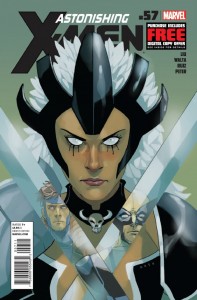
“Astonishing X-Men” #57
Writer: Marjorie Liu
Artist: Gabriel Hernandez Walta & Felix Ruiz
Cover: Phil Noto
Jason Aaron gave some character development with this new Warbird character in “Wolverine & the X-Men” making her a closeted artist from the Shi’ar culture which does not value or encourage art. This certainly sets Warbird apart from the typical role she was likely to play as the uber-violent warrior from another planet. Here, Marjorie Liu takes a stab at exploring this side of Warbird a little more. Warbird feels alone, not just because she’s an alien warrior who has been denied her primary mission of watching over Kid Gladiator. She’s alone in her own skin.
But this story sends Warbird on an adventure on her own when she discovers an artifact from another alien culture long-thought-destroyed by the Shi’ar. I want to like Warbird’s character, and think she’s in good hands with Liu. After that way-too-long last arc, it’s nice to see Liu use Warbird as a central character in a quieter, more reflective story. It’s also wonderful to see Gabriel Hernandez Walta on another X-book. Some may not like his style, but I think it’s a fun style, well-suited to a story like this.
My only complaint would be that I would have preferred Walta to be the only artist on this. Felix Ruiz, remember the one who draws like Bill Sienkiewicz, also adds art here, which hinders the book. Walta’s art is so soft, and Ruiz’s is much rougher. It would have made more sense to choose one or the other. Phil Noto provides a simple, but elegant cover. When in doubt, find a way to include Wolverine & Gambit in the cover, even when their appearances are rare in the book. Overall, this is a nice start to a new arc. It won’t blow you away, but it might help you soften to Warbird. –JJ
Cover: 7/10 Writing: 7/10 Art: 7/10 Relevance: 6/10 TOTAL: 27/40
 “Cable & X-Force” #2
Writer: Dennis Hopeless
Artist: Salvador Larroca
With the shaky start of the first issue things seem to get a bit more solid with the second installment here. Hopeless shifts the focus to the last member of the team that didn’t get much exposure in the previous issue and that’s Colossus. We’re given a glimpse of how being in touch with the Phoenix Force has messed with his powers and what he was up to when Cable reached out to him to become a member of X-Force. This seemed to overshadow Hope and Domino’s attempt to stop the techno virus that was attacking the beach. Though Hopeless kept it plenty entertaining with the great dialogue and not dragging it out for too long. Cable is once again in a life or death situation and Hopeless seems to be putting him on borrowed time as well.
Cable & X-Force is one of the better looking books on the shelf and should be recognized for that. Larocca’s pencils along with D’Armata’s colors keeps the story moving at a very good pace. From the confrontation between Cable and Colossus to the beach action things stay consistently eye catching. This is something that can and should be expected from Larocca for as long as he’s on the series. My personal issues with Hope’s character way aside, this was a much better issue and is beginning to get interesting. The test is going to be Hopeless making us care about Cable’s situation and the direction that the team is headed in.-IS
Cover: 4/10 Writing: 7/10 Art: 8/10 Relevance: 7/10 TOTAL: 26/40
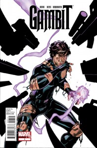
“Gambit” #7
Writer: James Asmus
Artists: Diogenes Neves & Al Barrionuevo
Gambit’s adventure with Borya Cich and MI13 comes to a close.
James Asmus crafted a pretty interesting story arc involving a bunch of new characters like artifact collector and all around sleezeball, Borya Cich, his right hand man, Remlik, Gambit’s personal “gadget-guy”, Fence and the mystery tattooed woman from the first few issues. It was a fun ride with a real 007 and Mission Impossible vibe to it all, making it action packed and mindless entertainment.
If you’ve ever watched any of the aforementioned blockbusters or other movies like Indiana Jones or the Bourne series, you probably saw Asmus’ plot coming from a mile away. The formula is far from original, but the writer managed to hold readers captivated with decent dialog and plenty of action sequences. I especially liked Pete Wisdom’s ranting. Man, that guy needs to take a chill pill.
Better art would have catapulted the Gambit series at the top of the X-piles, but that’s not to say that it hasn’t been adequate. In fact, it’s the perfect type of book to have up and coming artists hone their craft. Here, we have collaboration between Brazilian artist Diogenes Neves and Argentinian artist, Al Barrionuevo. Neves’ work closely resembles Clay Mann’s, while Barrionuevo’s style is comparable to Mike Perkins’ pencils. This is a bit of an odd mix to have in the same book and the contrast in styles can be a little off-putting. If I had to pick a favorite between the two to continue on as regular artist, the more experienced Barrionuevo would get my vote. Check out Neves’ work on other titles though, because some of the other stuff he’s done is fantastic.
The Dodsons provided the cover, and it just looks like they phoned it in. It gets the point across, but it’s rather generic and uninspired.
Unless you’ve been reading since issue #1, you’ll probably be completely lost as to what is happening. So if you’ve been planning on picking up this title, I would recommend next issue as a jumping on point. Don’t expect a mind-bending literary experience, but if this upcoming story offers more of the same blockbuster thrills as the first 7 issues, it’ll be worth the $ 2.99 cover price. –SG
Cover: 5/10 Writing: 8/10 Art: 7/10 Relevance: 3/10 TOTAL: 23/40
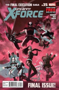
“Uncanny X-Force” #35
Writer: Rick Remender
Artist: Phil Noto
The last issue of this series ends on a pretty somber yet strong note as Remender wraps things up quite well. With the big fight already handled last issue, Rememder is able to focuse on the various team members and pushes the story on a more emotional level. With Logan dealing with his decisions concerning his son and Betsy reconciling with her brother there is a strong sense of finality through it all. It was also good to see that Remender could make Captain Britan interesting for a moment. Throughout the series it’s been great to see Deadpool written with a bit more subtleness while still maintaining his core character traits. Remender continues this here and shows a great moment between Genesis and Deadpool as the merc gives some much needed advice to the child. Then it ends in true Deadpool fashion when it’s all said and done with.
Noto’s artwork is still strong here as we’re bounced around to various locations that he makes look great. Everything is clean and precise from beginning to end. His style fits this more character driven story quite perfectly and helps to get over Remender’s script with ease.
From beginning to end Remender and the collection of artists who worked on this title has made Uncanny X-Force one of the strongest of the X titles to come out in recent years. This issue actually ends the series and gives the reader a sense of finality with these characters and their mission. –IS
Cover: 6/10 Art: 7/10 Writing: 8/10 Relevance: 8/10 TOTAL: 29/40
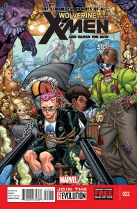
“Wolverine & the X-Men” #22
Writer: Jason Aaron
Artist: Nick Bradshaw
Frankenstein’s Monster finally gets his hands on the last surviving member of the Frankenstein bloodline, Baron Maximilian von Katzenelnbogen, but this may spell certain doom for the young mutant girl trying to help the Hellfire Club member escape the Murder Circus. Oh yeah, and the faculty of the Jean Grey School are still brainwashed into thinking they are carnies.
I’m not really sure what the point of this Frankenstein’s Monster’s quest is. I guess it’s just supposed to be an off-to-the-side adventure for the JGSHL crew of X-Men. Generally, these are fun and as mentioned in a previous issue’s review, fans of Generation X should feel right at home with this story. Although for a story arc that seems kind of pointless so far, it’s really damn wordy. It’s almost distracting when coupled with the highly detailed panels from Nick Bradshaw.
Speaking of Bradshaw, his artwork is really starting to grow on this X-piles reviewer. Clean lines, strong inks and a vivid color palette all contribute to the consistently high quality of art displayed in “Wolverine and the X-Men”. I’ve also found myself taking an extra second to appreciate Nick’s representation of the female form, or maybe it’s just the swimsuits and school uniforms that warrant the attention. In either case, it all comes from Bradshaw’s imagination and beautifully printed to paper.
This current “Circus” story might not appeal to all readers of the series, but there is enjoyment to be found here. I would have liked to have seen it capped off at the end of this issue though. Hopefully, “Wolverine and the X-Men” #23 will be the finale for Frankenstein’s Murder Circus and we’ll see some sort of payoff for Oya and the Black Bishop before this book starts losing some readers. –SG
Cover: 8/10 Writing: 7/10 Art: 8/10 Relevance: 4/10 TOTAL: 27/40
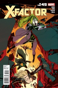
“X-Factor” #249
Writer: Peter David
Artist: Leonard Kirk
A volcanic portal has opened up near the Bronx and X-Factor is the only thing keeping the hordes of demon underlings from invading the area.
Peter David finally gives us a healthy dose of action in an X-Factor book. It seems like it’s been forever since we’ve seen a battle of this scale in this series, but now that PAD seems to have concretized the current X-Factor team roster, he decided to show readers what kind of damage these folks can do. The battle scene, which runs for essentially the entire issue, is pretty epic. You can almost hear the characters shouting at each other over loud explosions and shrieking demons. He manages to have some of the characters use their powers in imaginative ways and doesn’t fail to deliver when it comes to Multiple Man taking charge with an awesome display of power.
The fantastic pacing is probably mostly due to Leonard Kirk’s visual storytelling, although a lot of the panels seemed rushed, Kirk still applied extra care to some of the facial expressions, especially when they mattered. It’s not his best work, but it’s still effective. I would love to see what Kirk could do if he was given a looser deadline. Rachelle Rosenberg’s colors are spot on and the use of a blur effect in some of the action sequences was a nice touch and helped give life to the hectic action.
Kris Anka’s cover is adequate, but cannot quite measure up to the caliber of covers we are used to having from David Yardin.
Hopefully, this demon/Hell story arc will come to a close shortly though as it would be nice to see X-Factor take a break from the supernatural and get back to solving mutant crimes. I’m scoring this issue high on relevance because it’s a great example of how this team line-up works together. –SG
Cover: 6/10 Writing: 8/10 Art: 7/10 Relevance: 8/10 TOTAL: 29/40
 “X-Men: Legacy” #3 Writer: Simon Spurrier Artist: Tan Eng Huat Cover: Mike Del Mundo The cover of this issue is wonderful. Mike Del Mundo does an inspired impression of M.C. Escher in the form of a little girl. However, the cover doesn’t signify anything relevant in the issue. It’s just a great piece of art. There is a little girl in the issue, but beyond that, there’s no connection. Let me just be blunt. There is nothing in this issue worth reading. I love the idea of a Legion book, but this is just not working. First of all, I could be wrong here, but why is Legion being written like he’s a Scot? Legion is the son of Xavier and Gabrielle Haller, who is Israeli. Perhaps you could argue that he spent much of his life on Muir Island in Scotland with Moira MacTaggart, but the fact that Spurrier writes David’s dialect so frequently with a Scottish brogue, makes me wonder if he’s confused Gabrielle with Moira. Second, this book has no discernible status quo. What is Legion’s mission here? He’s just going to go around and save young mutants in order to be like Xavier? That’s not particularly a direction that fits with Legion. When you couple this with the confusing nature of the battle going on in his head over his powers and personality, it is a muddled concept. The art in this book doesn’t come close to doing justice to what I think Spurrier is trying to achieve. Part of what makes the story muddled is that Tan Eng Huat doesn’t distinguish between what’s going on in Legion’s head and what’s going on in reality. Sure, Legion is wearing different clothes, but the panels jump back and forth so much that it’s hard to tell. Perhaps the colorist could be involved in coloring “mind-panels” differently than “not-mind-panels.” This happens in flashback panels, but that’s all. At this point, it would be good for Marvel just to cancel this quickly and move on to something else. –JJ
Cover: 9/10 Writing: 2/10 Art: 1/10 Relevance: 3/10 TOTAL: 15/40
Most X-Cellent Pick of the Week:
Jeff: Bendis & Immonen have me hooked! All-New X-Men #4!
Infinite Speech: Yet another week that All New X-Men #4 is my top X book!
SpidermanGeek: X-Factor #249 was a lot of fun and one of the few occasions where we get to see the team in a full scale battle.
Jeff Jackson
jeff@comicattack.net
@FrJeffJackson
Infinite Speech
infinitespeech@comicattack.net
@infinitespeech
SpidermanGeek
spidermangeek@comicattack.net
@spidermangeek

