 Welcome to the 105th edition of the Uncanny X-Piles! This week includes some lovers’ spats, an all-Brotherhood issue, and an AvX respite! What did the guys think?
The X-Piles
Numbers next to each title are the cumulative ranking of the latest issue out of a total of 40. Numbers in parentheses indicate the previous issue’s rating. Blue indicates a raise in the chart from last issue; red indicates a drop; green indicates the book stayed put.
1. New Avengers: 34 (33)
2. Avengers Vs. X-Men: 28 (33)
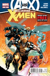
3. Wolverine & the X-Men: 27 (31)
4. X-Men Legacy: 26 (21)
5. Age of Apocalypse: 26 (19)
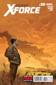
6. Uncanny X-Force: 25 (29)
7. X-Factor: 25 (28)
8. Avengers: 25 (20)
9. Astonishing X-Men: 24 (20.5)
10. AvX: Vs: 22 (31)
11. Gambit: 22 (21)
12. First X-Men: 20
13. New Mutants: 16 (25)
14. X-Men: 15 (15)
15. Uncanny X-Men: 14 (24)
16. X-Treme X-Men: 9 (10)
17. Wolverine: 7 (8)
_________________________________________
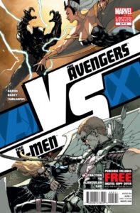 AvX: VS #5
Writers: Matt Fraction & Jason Aaron
Artists: Leinil Francis Yu & Tom Raney
At least it’s a pretty book. These VS books could have been so much more. There’s an infinite amount of potential here. Most of us understand that a clear winner can never be truly named as circumstances typically play a deciding factor in Superhero fights, but if this series of books was meant to appease rabid fans of “who could beat who“ stories, it failed by delivering nothing but cheap outcomes and ridiculous advantages given to some of the obvious underdogs.
For example, in this issue, when Black Panther fights Storm, he just happened to have had a contingency plan against his own wife. With the use of technology, he essentially nullifies Storm’s lightning storm and turns it into a cool breeze. Where the hell was this tech when Namor drowned Wakanda? Ridiculous. We shouldn’t blame the writers though as these short stories are editorially mandated from the get go. In some way, I applaud their creativity to lead the characters into the predetermined outcome even if some of the plot devices come straight out of the absurd.
As has been common in most of this series, the artists really bring their A game. There has been a gorgeous display of art and talent across the board and this issue is no different. Yu serves it up nicely with the Wundagore mountain backdrop. He also has Hawkeye make creative use of his arrows for some close quarter combat. Tom Raney does a wonderful job displaying deep guilt and sorrow in Black Panther’s face, even with his mask on. The emotion conveyed by both Storm and Black Panther ooze off the pages. The colors are absolutely perfect in both of these stories as well.
It’s not the most entertaining of the VS books, but definitely on par art wise. It’s unfortunate that most comic fans will be found uttering “Oh, Come on!” or “WTF?!” by the end of each story as the outcomes tend to feel like cop-outs. The bottom line: Don’t feel bad for leaving this one on the shelf at your local comic book store. You’re not missing out on much except for some nice artwork. –SG
Cover: 8/10 Writing: 2/10 Art: 8/10 Relevance: 1/10 TOTAL: 22/40
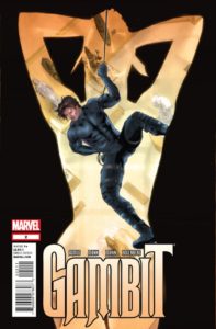 Gambit #2
Writer: James Asmus
Artists: Clay Mann
At the end of the first issue, Gambit found himself in a bit of a predicament when an ancient artifact he stole suddenly came to life and embedded itself into his chest. We kick off issue number two with Gambit laying on a make shift operating table where we meet what we can presume will be a recurring supporting character who goes by the name Fence. Think of him as what Microchip was to The Punisher. From there, the rest of the issue moves at a rather slow pace compared to the previous issue.
Gambit is on a quest for answers as to what this artifact is and how to get it off his body. Asmus continues to offer us a spy-thriller feel throughout the book. Gambit has a run-in with the mysterious woman from last issue, but unfortunately we get little more than that. The writing is still pretty good though and Asmus is taking Gambit to places we all know this character should be, but to my knowledge has never been explored in this fashion before. My only comment to that is “Why hasn’t this direction been taken sooner?” The character really is a perfect fit for this kind of adventure.
Clay Mann continues to deliver the goods with a “real world” feel in every panel and every page. Great job on the character design for Fence as well. He’s kind of a cross between Walter Sobchak and Forge and has the potential to be a great addition to Gambit’s supporting cast as the comedic relief and go-to guy for Remy. The cover of this issue is kind of bland and boring, but still hints at the overall flavor of this series so far. On the inside pages, I still feel that the panels could benefit from some slightly heavier inking.
If you’re a fan of Mission Impossible, Thomas Crown Affair, James Bond and the like, you shouldn’t miss out on this series and I’d be willing to wager that anybody who reads this series will gain a higher level of respect for the otherwise generally disliked and disrespected titular character. –SG
Cover: 4/10 Writing: 7/10 Art: 7/10 Relevance: 4/10 TOTAL: 22/40
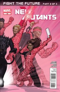 New Mutants #48
Writers: Dan Abnett & Andy Lanning
Artist: Felix Ruiz
Don’t let that awesome John Tyler Christopher cover fool you, the Hellions barely appear in this book. Every so often, whoever is writing New Mutants will dig up the dead Hellions and parade them around for a story arc. It’s rarely, if ever, effective, mainly because the Hellions are always cast in the costumes and personalities they had in 1987, while the New Mutants have somewhat moved on from then.
Last issue was really hopeful, with a new artist in Felix Ruiz. However, this issue’s art looks less like last issue’s Sienkiewicz homage and a little cleaner. That doesn’t really work, as this book really needs art that stands out to make this story more interesting. Ruiz doesn’t turn in awful work, but it didn’t sing like the issue before. There’s a panel with Doug Ramsey wearing short-shorts, flip-flops, and bandages around his head while he exclaims, “Everything is my fault!” I laughed at how silly that was.
But Doug is right, everything is his fault. As much as I thought the use of Doug’s powers had developed, he is not working as a central character in this book. He’s whiny and annoying throughout every panel. I really just can’t care about his future self and this alternate world in which the team is stuck.
I really can’t believe Abnett and Lanning are the writers here, as their strengths just aren’t shining through. I don’t know if it’s the idea behind the lackluster story or if editorial is hamstringing them, but this is just odd. Only 2 more issues, and we can say goodnight. –JJ
Cover: 7/10 Writing: 3/10 Art: 5/10 Relevance: 1/10 TOTAL: 16/40
Writer: Rick Remender
Artist: Dave Williams
Writer: Jason Aaron
Artist: Jorge Molina
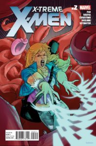 X-Treme X-Men #2
Writer: Greg Pak
Artist: Stephen Segovia
This book really doesn’t have a lot going for it. The main character is Dazzler, who has never been cool nor ever will be cool. It features a cast of really poor versions of existing X-Men. They are stranded in yet another alternate reality with even worse versions of the X-Men. The only thing that should make this book good is Greg Pak, but even the fact that he wrote this isn’t helping.
The problem with this is that for long-time X-Men fans like myself, there is not much at all that we haven’t already seen. This type of book was unique and awesome when it was called Exiles. But this is just a sad retread of that idea. At least in Exiles, there was a neat premise of them going to fix the realities to which they were sent. This has none of that freshness. It’s just alternate reality for the sake of alternate reality.
The worst part is Dazzler’s dialogue. In order to make sure we know she’s a “hip” pop star, she says things like, “This is cray-cray,” and “You bamf your own bad self out of here…” Pak even tosses her into a “Slave Leia” costume for no particular reason. And yes, she sings a song in this issue.
Segovia’s art has all the trappings of typical X-Men art. Sexy poses on the women, angry faces on the men, he tries hard to make this book dynamic. Why does everyone draw Sabretooth as if he’s got fake vampire teeth in his mouth? Segovia also likes to trade bird-eye-views with worm-eye-views in almost every other panel, making me feel like I’m nodding as I read. It’s not particularly effective and his storytelling needs some work.
I will be surprised if this book lasts beyond 5 issues. –JJ
Cover: 3/10 Writing: 3/10 Art: 2/10 Relevance: 1/10 TOTAL: 9/40
Most X-Cellent Pick of the Week:
Jeff: I love quiet in-between issues that highlight the characters. Wolverine & the X-Men #15 hit all the right beats for me.
Infinite Speech: Wolverine & the X-Men #15 definitely brought something to the table that reminded me of how good the older Uncanny X-Men issues were.
SpidermanGeek: Gambit #2 is the best spy-thriller/superhero comic on the shelf right now.
Jeff Jackson
jeff@comicattack.net
@FrJeffJackson
Infinite Speech
infinitespeech@comicattack.net
@InfiniteSpeech
SpidermanGeek
spidermangeek@comicattack.net
@SpidermanGeek
