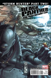
 Black Panther: The Man Without Fear #520
Writer: David Liss
Artist: Jefte Palo
Black Panther: The Man Without Fear will go down as one of those titles that nobody read, but people will discover later. David Liss was saddled with a tough job by Marvel; make Black Panther work in Hell’s Kitchen…oh, and he doesn’t have his powers, plus all the Vibranium ore in the world has been destroyed…by him. Yeah, now run with that. Liss has, but while it may have taken a few issues for he and T’Challa to find their way, once they did, this book has been a solid read. Sure, there have been guest appearances to help along the way, like Luke Cage and Storm, but T’Challa has always been the lead of his own title. He isn’t a sidekick, an angle this series is succeeding in whereas, say, Iron Man 2.0 is failing. In this issue, Storm arrives to help her husband, and while he most certainly needed the aid, Black Panther remains firm in his stance about going solo. No love lost to Storm, as she understands T’Challa’s need to discover his new power set. If she’s always there to bail him out, he doesn’t learn much about what his limitations are. Liss handles this situation well, not allowing jealousy to put a wedge between these royal lovers. He could have really dropped the ball here, but instead he successfully keeps T’Challa and Ororo’s relationship respectful and honest. Jefte Palo’s fluid artwork conveys the maneuverability of T’Challa’s namesake. He is certainly making this series his own, and with a book like this one, the artist needs to go all out with his chosen style to make it work. Francesco Francavilla accomplished this in the opening arc. In spite of everything mentioned here, people just want to hate on this series for no good reason. Which is unfortunate, but as time goes on, Liss and company are on the brink of proving what they are doing with T’Challa deserves attention. The first volume of Black Panther the Man Without Fear is released this week in softcover, and it’s worth a look. -AL
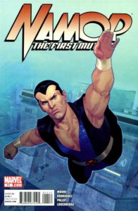
 Namor the First Mutant #11
Writer: Stuart Moore
Artist: Carlos Rodriguez
For a series that started out strong and then took a dive deeper than a plummeting seal in winter, Namor the First Mutant wraps up on a… somewhat positive note. Not an amazing series finale by any stretch, but Moore ties up his loose ends and provides an enjoyable closing chapter. Which is an unexpected change of pace given how the previous handful of issues stunk worse than a dead Atlantean. Once the news about this book getting the axe went public, it felt like everyone working on Namor just phoned it in. Namor was too soft, despite the interesting webs Moore was spinning in his life. He would constantly back down from opponents while simultaneously getting lovestruck by an Atlantean woman. In short, he wasn’t in the driver’s seat. Namor settles matters with Krang in this final chapter, as the former rival to our titular character is being featured in the new mini-series, Vengeance. What will become of Loa, the mutant kid sidekick to Namor, has yet to be seen. Her story was a casualty of Moore’s run that was engaging to watch develop. Alas. The only arc worth spending money on in this series is the opening stanza, a loose tie in to the Curse of the Mutants storyline. Namor goes searching for Dracula’s head in the ocean depths, with [most] visuals depicted by Ariel Olivetti. It’s freaky looking stuff. Unfortunately, the book loses steam from then on. Namor Goes to Hell was decent, but underachieving. It’s worth a look for hardcore Namor fans. Everything else? Just go read some old Aquaman instead. -AL
 New Mutants #26
Writers: Dan Abnett & Andy Lanning
Artist: Leandro Fernandez
I’ve declared this week the week of great stories with awful art. Unfortunately, DnA’s ideas are not being translated well by Fernandez’s pencils. While Sugar Man was my least favorite thing to come out of the Age of Apocalypse, I like what they’re doing here with him. He is trying to find his way back to the AoA (too bad he didn’t hook up with X-Force and Dark Beast) and is using former mutants as guinea pigs to explore dimensions. The machine he’s using to make these portals is being powered by none other than Nate Grey, who happens to be a loose end that Cyclops wants tied up. So he sends the New Mutants to do some sniffing around. What is really strong here is the continued use of Doug Ramsey’s power set as a real asset to the team. Started when Zeb Wells brought him back, DnA are doing a great job of continuing the idea that Doug can read anything in any language, and can decipher any kind of code, including “hobo code.” This makes for a really great way for the team to uncover the mystery of the building they are in, even under the nose of Steve Rogers and Victoria Hand, and allows them to engage the Sugar Man in battle. Now, back to the art. First of all, Sugar Man is so ridiculous-looking, but this is not helped by Fernandez’s work. He is trying so hard to keep a consistent look from former artist Leonard Kirk, but it feels like a really bad copy. The action is so stiff and lacks fluid. The faces lack any kind of emotion. Because of this, the impact of what DnA are trying to do here falls flat. I fear for books like this and feel like the X-Men editors better step up their game in the art departments or we will soon see sales dip. -JJ
 Wolverine #11
Writer: Jason Aaron
Artist: Renato Guedes
Good story, bad art: part 2. I have not been a fan of Guedes’ work on this title, and just 2 weeks ago I complained about his perspective. This issue is no different. I don’t think it’s Guedes’ ability. I think he could work on any book other than a superhero book. But once he starts drawing these well-known characters, he really loses me. For instance, the teeth he puts on Sabretooth are so ridiculous. They make him look goofy and not in the least bit intimidating. Reminds me of wearing those plastic fangs for Halloween that make your mouth look huge and awkward. But if you can get past the art, this story just continues to rock. Once again, Aaron focuses on a member of the Red Right Hand and tells their motivation for wanting Wolverine dead. He actually gets you to sympathize with the woman who is the central character in this issue, which makes villains much more effective in a book. Her tale is sad, and makes you see Wolverine from a different perspective. The pattern is now set for another really solid arc in this book, with a kind of surprise character popping up on the last page. One thing I haven’t talked about are Jae Lee’s consistently awesome covers on this book. They all follow a consistent pattern as well, with characters in the center of the page. They are all different, yet are so distinguishable. I’ve loved Jae Lee’s work for a long time, so to see him put out these covers and to see his style change over time is really fun to watch. -JJ
 X-Men Legacy #251
Writer: Mike Carey
Artist: Khoi Pham
Good story, bad art: part 3. I feel like Carey is finally on a good course with this book again now that he’s focusing on a set cast. However, once again he’s saddled with the mediocre panels of Khoi Pham. Like Fernandez above, Pham’s pencils give absolutely no dynamism to the story. In this issue, there is a ton of action with the team trying to contain another couple of Legion’s personas. This time, there’s a Multiple Man knock-off who can make dupes by touching people with the added dimension of giving each one a different weapon. Therefore, he really becomes the ultimate army. So with all these weapons and the X-Men fighting all these various folks, you would think it would really give the artist a chance to let loose and draw some really fun action sequences. However, Pham’s work just looks bland. His backgrounds provide no real setting, even though this issue is supposed to take place in London. The really neat thing that happened in this issue was that Magneto is revealed to be the “kill-switch” for Legion if he gets out of control. Their emotions get heightened because of another of Legion’s personas, but Magneto and Legion get into a scuffle, which is pretty great. Overall I really like this direction and like Carey’s pairing of all these characters in battle. Once again, I hope that X-editorial gets back on the ball with the art so that these issues can “wow” people instead of “meh” them. -JJ
Most X-Cellent Pick of the Week:
Jeff: Despite the bad art this week, I still have to hand it to Jason Aaron and Wolverine #11.
Andy: Black Panther. I really like where things are headed for T’Challa.
Jeff Jackson
jeff@comicattack.net
Andy Liegl
andy@comicattack.net


What is it lately with all of these books with horrible artwork but great stories??