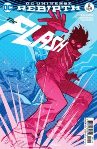
 The Flash #2
Publisher: DC
Writer: Joshua Williamson
Artist: Carmine Di Giandomenico
Colorist: Ivan Plascencia
Cover: Karl Kerschl
After momentarily reuniting with the original Wally West, it seems as if Barry realized he missed being in the mentor role and sharing the responsibility of being a hero. So when his friend, Detective August Heart is struck by lightening and gains similar powers Flash slowly enters that role once again. However, Barry should be more careful what he asks for because the Speed Force tends to over deliver as we see in the latest chapter of The Flash.
We get right into the story here without being loaded down with recaps or more retellings of Barry’s origin. The parts that are mentioned happen organically and only help to move things forward and not lingered on for too long. This is a reason why the first issue felt a little flat but I also understand that on the chance it was some kid’s first comic that exposition was necessary.
Williamson delivers a solid supporting cast so far and makes the Barry/August dynamic one of the highlights of the issue. August is excited about his new abilities and his mind starts racing about what he could do to be a better Detective. Some interesting points are touched on as Barry attempts to temper some of August’s enthusiasm with his veteran superhero knowledge and warnings. It’s a very real conversation and deals with a few things that Barry is unfortunately all too familiar with. Along with the solid character interactions Williamson also leads us to a fun action sequence that hints to at least one difference of August’s powers from Barry’s.
Di Giandomenico is just wonderful on this title. It’s an opinion that I’ll be sticking with as long as this level of quality art is put into the series from him. His style isn’t one that you’ll see in every comic and it’s one I’ve enjoyed since he was on that mutant title a few years ago. When we get to see Flash in action he makes sure to convey the energy and speed not only in the characters but in some of his panel arrangements as well. Even when Flash is standing still he still looks like he’s moving with the lightening just cascading all over him. Plascencia’s colors are very much on point and do everything to give that extra kick to the artwork. From adding more weight to the action scenes to the smaller details like the fluctuations in color between Barry and August’s lightening. These two make sure this series is one that will please the eyes. The only design that’s not too impressive are the foot soldiers for Black Hole who look too much like armor worn by a certain billionaire, playboy, philanthropist.
After a slow start The Flash is one track to maintain the top spot among the DC Rebirth titles. The character is in great hands with this creative team and it should be fun to see where they take Flash and his supporting cast in this series!
Infinite Speech
infinitespeech@comicattack.net

