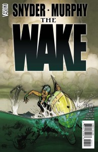
 The Wake #7
Publisher: Vertigo (DC)
Story: Scott Snyder
Pencils: Sean Murphy
Inks: Sean Murphy
Colors: Matt Hollingsworth
Letters: Jared K. Fletcher
Issue #7 of The Wake brings us Part Three of this 10-issue mini-series. As I noted in my review last month, issue #6 launched the Part Two story line, advancing the timeline into the future by several hundred years.
While issue #6 was nearly perfect in every way, from the world building, character development, and the combination of political thriller with science-fiction horror to the brilliant visuals of artist Sean Murphy and colorist Matt Hollingsworth, issue #7 falls just a tiny bit short of that achievement. It’s not a far drop, and it’s really somewhat expected after everything that happened last issue. As readers, we need a few minutes to calm down and reflect on everything that’s happening.
This issue begins with a flashback to Leeward’s younger days, then focuses for most of the issue on the perilous predicament she and her companion, the tavern-keeper Pub, have found themselves in following the end of the last issue. The flashback scene, while short, is really well done and helps to ground Leeward’s character by showing her interacting with her parents while she was little, so we can partly see how and why she’s turned into the woman she is today. However, after that, a little too much time is spent with Leeward talking to Pub about how they can and should escape, rather than actually just trying to do so. As a result, some of the real estate in this issue is used up when it could have gone toward some more world-building. In particular, I would like to have seen more than just half a page with Governess Vivienne of Crane City.
What doesn’t drop at all in quality this month are the spectacular visuals by the artistic team. There are some jaw-dropping scenes throughout the latter half of this issue involving the Mers, and you really do get a sense of how creepy it would be to have to face them out in the middle of the expansive ocean. In particular, there’s one rather large specimen of the underwater species whose size is properly put into context against a massive cruiser ship from Crane City.
Something else I really noticed this issue was the coloring of Hollingsworth. His coloring of the series has been extremely well done, but I never really focused on it until this issue. I noticed for the first time that he’s developed a kind of “color code” for different environments and cultures. When scenes take place outside on the ocean, a pale yellow sky is almost always juxtaposed against the blue sea. The sky looks almost sickly, as a reminder that things just aren’t right in most of the world. By contrast, Crane City and its reserves of fresh water are washed over with an icy blue palette, matching their cold and calculating leader, the Governess. The soldiers of Crane City, however, are a bit more “earthy” in demeanor and in their coloring, with reds, browns, and tans taking center stage. Reds and grays are used to maximum effect in portraying a claustrophobic industrial look, while aboard the Crane City cruiser and especially toward the end of the issue. This latter effect is reminiscent of old submarine movies, when deep under the surface and the interior of the sub, and it’s inhabitants are bathed in red from the glowing electronic consoles. Bright, cheery greens in the form of tall Redwood-like trees are only shown in the flashback scenes at the beginning of this issue, as though to suggest that happiness only exists in the past. And of course, we get those very atmospheric dark blue and black under-water scenes that so characterized the first half of the series. It’s a brilliant choice by Hollingsworth and having seen it now I can’t imagine anyone else coloring Murphy’s art in this series.
As with last month’s issue, there’s another fun reveal at the end of this issue that looks like it’s setting up “Part Four” for next month, and which continues to entice the reader with a mixture of adventure, mystery, and horror that makes the story so compelling. Combined with the fantastic art, The Wake is a story that continues to deliver the best of what comics has to offer.
Martin Thomas
@comicattack.net


