A Study In Emerald
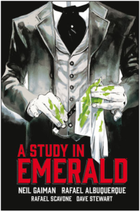
Publisher: Dark Horse Books
Story: Neil Gaiman, Rafael Albuquerque, Rafael Scavone
Art: Rafael Albuquerque, Dave Stewart
Colors: Dave Stewart
Letters: Todd Klein
Cover: Rafael Albuquerque
A Study in Emerald is a sci-fi, Sherlockian mystery with a story co-created by science-fiction and fantasy (SFF) novelist Neil Gaiman. For those who may be unfamiliar with Gaiman’s work, he is a giant in the world of SFF novels whose stories have been adapted for television and film. Rafael Albuquerque is best known for his work on American Vampire and Rafael Scavone has been a collaborator of Albuquerque’s since 2014.
A Study in Emerald is an interesting, if not entirely original story about a brilliant detective and his war-torn sidekick. However, in this world, the royal family is a group of alien creatures who have established dominance over mankind with their super powers. Someone is at odds with the royals and has set about the business of murder. Our two gentlemen employ all their investigative prowess to get to the bottom of this mystery.
For me, there was nothing particularly exciting or engaging here. The story felt comfortable and easy to read, but not really gripping in any way. Gaiman chose to give his detectives new names, despite their obvious and uncanny resemblance to Sherlock and Watson. The result was a story that felt a bit like a copy instead of an addition to Sherlockian cannon. Where this story did stand out was the ominous air the authors chose to give our “Sherlock”. There were several panels where his face was cast in shadow, his eyes blazed in the darkness, and he took on the look of a somewhat devious character.
Another standout was the artwork. Albuquerque and Stewart were able to perfectly capture the gray Victorian era London. There are no bright pops of color, sharp lines, or bold strokes here. The panels have an alternately sketchbook and watercolor appearance. Most of the characters are in poor humor for one reason or another and that grim mood is perfectly matched in the art. I enjoyed the excerpts from letters that characters wrote or typed to one another. They appeared on scraps of aged paper instead of the typical text box. I thought the splashes of blood superimposed over Victorian wallpaper patterns or scenes from the streets of London were a nice touch in the intro to the book and each subsequent chapter.
It’s the artwork that really carries this story. It evokes the time period, it is beautiful, and it is perfectly suited to the tale. The story is the weaker area and isn’t strong enough to grab readers with more than a passing familiarity with Sherlock mythology. Future installments must set this story further apart from the original and create far more interesting characters.The action must become significantly less subtle. With all that being said, this book is definitely worth a read for a solid mystery and gorgeous artwork.
Frankie Reads
frankiereads@comicattack.net


This might be for me since I’m pretty basic in my Sherlock knowledge. Other than he solved crimes and used cocaine and is played by Iron Man and Doctor Strange lol
You should definitely check it out! The artwork alone makes it worth a peek.