Happy Hill #1: Roots and Roads
Publisher: Comix Tribe
Written: Joe Mulvey & Rich Douek
Drawn: Joe Mulvey
Colors: Christopher Sotomayor
Letters: Hassan Otsmane-Elhaou
Editor: Tyler James
Logo: Andworld Designs
Cover: Joe Mulvey & Christopher Sotomayor
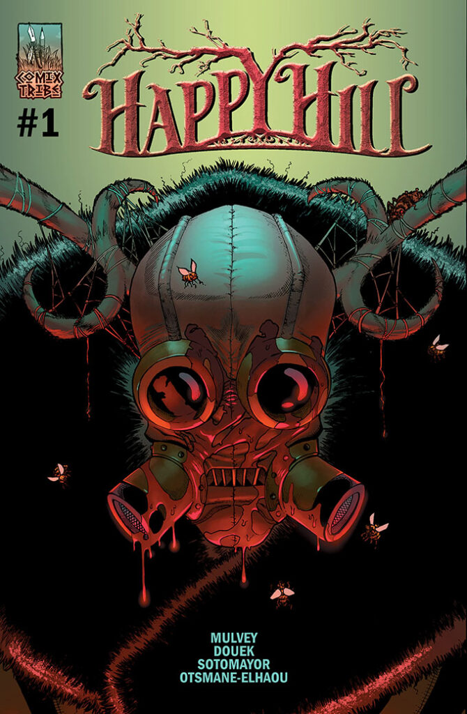
I was really excited to receive a review copy of Happy Hill as the premise sounded so interesting. I actually got to meet writer and artist Joe Mulvey at NYCC so that made me even happier to cover this book. Mulvey and Douek created a relatively engaging world that has a lot of layers to it. Please note that this book is definitely not one to be sharing with your kids as I would consider it so far to be thriller/horror and as such, it is rather graphic with its gore. The first few pages will let you know right away that this is not for anyone squeamish when it comes to blood and guts and eyeballs popping out. On that note, let’s continue.
The storyline was pretty good as I stated before, but it is a bit overplayed. Beautiful resort on a hill in the middle of nowhere that warns you not to wander to the outskirts of the property… I think we have heard that one before. However, Mulvey and Douek make it their own by adding in some unexpected plot points. While they did have some stereotypical characters for now (the slightly aggressive black girl and the white reporter guy trying to find an urban legend), the writers added the mark with a young, split family. The MacIntyre family is introduced to us with an adorable little girl and divorced parents. There also is the typical resort manager that seems to know more about the dangers in the woods than she is letting on… I’m hopeful that in the next issue, we will get to see all of these characters grow beyond their stereotypes.
The art team did a nice job of bringing the story to life. The contrast of having both white and black speech bubbles as well as the font style really helped not only make it easier to read sometimes, but also really enforce the genre of the book. I was honestly surprised when I saw there were black characters that they were drawn so well while the white characters were actually a little off, and unfortunately in comics, we usually see this the other way around. Not going to lie, Mr. MacIntyre was creepy as hell… but maybe that was the point? Mulvey and the team also did an excellent job at making the blood and guts really pop (pun intended).
Given that this is the first issue in the Happy Hill series, I really think that it was a good start. While there are some characters and plot points that seem a bit too common, I like that the creative team put their own spice into it in such a way that I think there is nowhere to go but up and it can really grow into an amazing series. Rating: 3/5
Anna
anna@comicattack.net


Pingback: Around the Tubes - Graphic Policy