 Ex Sanguine #1
Publisher: Dark horse
Writers: Tim Seeley & Joshua Scott Emmons
Artist: Tim Seeley
Colors: Dave Stewart
(mature read)
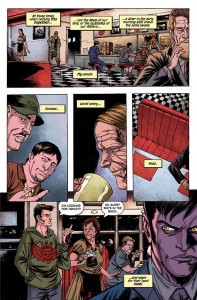
Most times, books that are gory and are littered with foul language are somewhat of a turn off, especially for non-horror readers. This one, however, had a slightly different twist to the current vampire scene in comics, and that, along with a strong story that makes you think, is a winning combination. The lead character, Saul Adams, a vampire, seems to be trying to live a life that is free of controversy, but when the FBI comes knocking at his door, things begin to spiral out of control. The next day, he stops at his neighborhood coffee shop and meets an intriguing young girl named Ashley. She’s harboring secrets of her own, though, and by the end of this issue, Saul is in hot water with the FBI, and Ashley looks to be more like Jason Voorhees than a sweet little waitress!
OK, there was a decent bit of hype surrounding this book, and that can sometimes deflate reviews. Not because the book isn’t good, mind you, but because it just doesn’t live up to the monumental hype. Give this book a chance, it lives up to the hype. Seeley and Emmons take a vampire story and tweak it slightly to give it its own feel. The waitress looking all sweet and innocent was a good bait and switch, maybe slightly cliché, but it worked nonetheless. The main character will hopefully be explored more, because it seems that his past will tell a great story, too. The first couple of pages showed a cryptic scene with a murder and a book containing what appears to be gibberish. This book seems quite important to someone we cannot see the face of, though, and important enough for them to murder somebody.

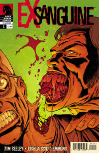
If you’ve seen Tim Seeley’s work before, you know what you’re gonna get. He’s good at several different areas. First, he draws his characters with a very realistic style, but when you need scary, he can do that, too. Take for instance Saul. He looks very unassuming, but when he bares his teeth, he looks absolutely vicious. The colors by Badilla really add to the work by Seeley, too. He has a good sense of when to really pour on the blood and bright colors, and when to keep it conventional. The cover by Seeley and veteran Dave Stewart was over the top, but that’s exactly what the issue was all about at times, and again, what makes it a must read. Rating 4/5
Billy Dunleavy
billy@comicattack.net

