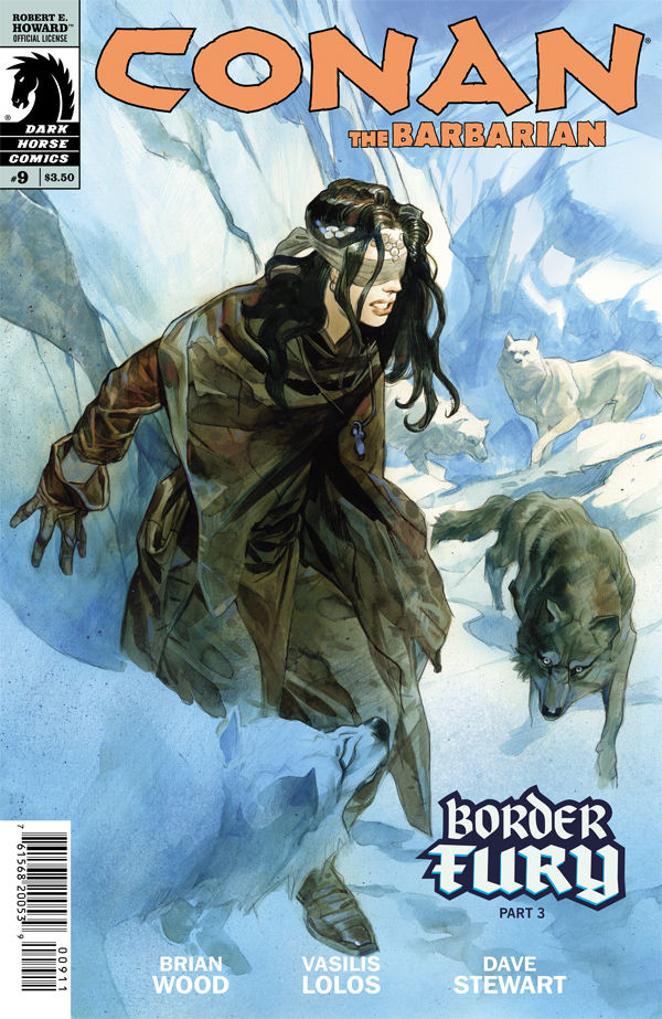
 Conan The Barbarian #9
Publisher: Dark Horse
Writer: Brian Wood
Artist: Vasilis Lolos (cover by Massimo Carnevale)
Colors: Dave Stewart
In this final issue of the story arc titled “Border Fury,” we see a helpless Bêlit, as she struggles with being snow blind. It’s a most unfortunate time for her to have lost her vision, as a pack of wolves are bearing down on her! She’s no chump, though, and she uses her skills to slay all of them, and quite easily, to be honest. She next finds Conan as he is being showered with arrows from afar. He’s stunned to see that blindness cannot even deter her heart. The two hide behind a large stone and make a game plan to thwart these cowards. She takes it upon herself to go out into the line of fire and question this enemy. At first it works, as she learns who their assailant is, but then he and his troops rain down arrows upon Conan and his lover. Conan knows this enemy from his youth, and we peer into the past to see their friendship that eventually turns into hatred, all thanks to Conan’s arrogance. Ten years have passed and Conan forgot about this past transgression, but his former friend, Maeldun, has not!
Brian Wood’s run on this title is like a steam roller! He picks up the pace with every issue and adds a new facet to this rich character that Howard created, and writers like Wood are a part of the reason that Howard’s work has stood the test of time. Conan looks strong, but also is showing a more sensitive side (not wimpy, just caring) under Wood’s supervision. That’s a tough thing to pull off, but he manages it quite well. The look into Conan’s past was also a refreshing aspect of this issue, and hopefully it isn’t the last one of these.

The art team of Vasili and Stewart does a more than adequate job. Characters look as they should, settings look rough and tumble, and that’s what you’d expect for the homeland of the barbarian named Conan! Dave Stewart is a constant in the Dark Horse universe that’s not only a tough standard for the other colorists to try and live up to, but more importantly a great example for them and every other colorist out there to want to attain that level of quality and consistency. The Carnevale cover looks very cool, and hopefully he’ll stay on for a while. The only thing about the cover that was puzzling was the wolves. They were white on the cover but black on the interior pages. Rating 4.5/5
Billy Dunleavy
billy@comicattack.net

