The Bequest #1
Publisher: Aftershock Comics
Story: Tim Seeley
Pencils: Freddie E. Williams II
Inks: Freddie E. Williams II
Colors: Jeremy Colwell
Letters: Marshall Dillon
Cover: Freddie E. Williams II and Jeremy Colwell
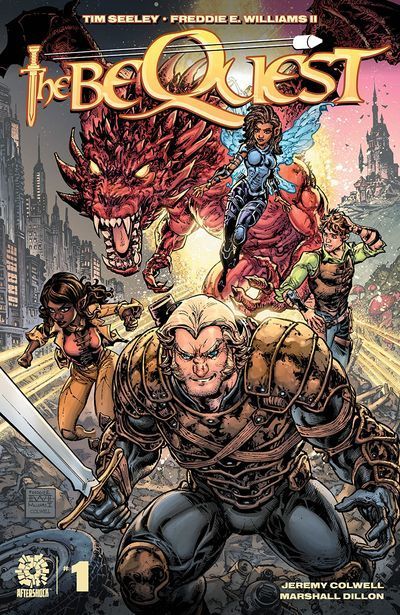
The start of a new fantasy series by writer Tim Seeley and artist Freddie Williams II, The Bequest has a lot of work to do in order to stand out from what is becoming a crowded field of fantasy-themed comics. Seeley does include a twist to the standard fantasy tale, although that twist can easily be divined simply by looking at the cover.
The biggest hurdle to overcome in any new series is getting the reader to care about the characters and Seeley has a lot of work to do in this first issue by introducing no fewer than nine main characters; although from the look of things, we won’t be seeing one of them after this issue. Williams II does a great job of giving each character a very individual look, which is made a bit easier since many of these are fantasy races like elves, dwarfs, and sprites, so typical characteristics of pointed ears, huge braided beards, and wings do some of the heavy lifting to distinguish the characters, but Williams II goes beyond this with great facial expression details, which are complemented by Colwell’s coloring adding a wide spectrum of skin tones for all the different characters.
The art style is a unique combination of being almost cartoon-like in aesthetic, but with a lot of detail, especially on armor and weapons. It’s an interesting art style and, one might think, intended to evoke nostalgia among older readers of the old 1983 Dungeons & Dragons cartoon.
That a campaign of Dungeons & Dragons is the inspiration for this comic is obvious, from the types of characters included and their powers, as well as the main characters all encountering a dragon in an underground environment (a “dungeon”) at the beginning of the story. Lest any doubt exist, Seeley includes actual character sheets in the back matter, with character classes, levels, ability scores, and even extra details like saving throws and attack matrices. Readers who are also tabletop role-players will recognize that Seeley prefers older versions of the game, given the types of tables he includes for each character sheet, which use different calculations than more modern versions of the game.
Aside from introducing the characters and attempting to make the reader care about them, the other main job of a first issue is to entice the reader into wanting to continue reading the second issue. In this, Seeley is less successful; while there is the requisite cliff-hanger ending, it seems to be introducing yet another (in D&D terms) “faction” to the story, but one that does not seem directly related to the main plot and seems rather to be included as a commentary on modern day race relations. Added on top of this is yet another character, fulfilling the “wise sage” role of a Gandalf or Obi Wan Kenobi type character, and the story begins to get too convoluted. It might have been served to break this initial issue into two parts and provided a bit more background about the characters involved on both sides of the conflict, so the appearance of a certain modern-day group at the end of the issue doesn’t come out of nowhere.
The world-building in this issue is very evocative and creative, with references to imaginative fantasy organizations, magic, and faiths that beg to be explored more in the fantasy world where the characters reside. However, given yet another twist added to the story, involving both time and planar travel, exploration of the fantasy world does not appear to be the main focus of the story.
The Bequest is fun and imaginative, with a whimsical artistic aesthetic and full of interesting and compelling characters, but the first issue just misses the mark of creating a sense of urgency to continue to the second issue.
Martin Thomas
martin@comicattack.net


Pingback: Around the Tubes | Graphic Policy
Fan of Freddie’s art so I’ll probably pick this up at some point. Loved his work on the TMNT/Batman books.