 UPDATE 8/4/2011: CONTEST WINNERS ANNOUNCED! Check below in the comments section for details!
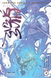
The fine folks of England’s leading comic book publisher, Com.X, are giving back to the ComicAttack.net community by offering a series of prizes in a contest coinciding with the release of their upcoming book, BlueSpear! Spear is the first in a trilogy of graphic novels based on the company’s highly successful OGN, Forty-Five45. Both titles are written by Andi Ewington, with Cosmo White providing the artwork in BlueSpear.
To enter the contest, leave a comment on this article (below) stating which of the following BlueSpear panels you like best! That’s it! The images were selected by Andi, Cosmo, and Com.X publisher Eddie Deighton, as their personal favorites, and we want to know which one stands out above the rest.
The prizes up for grabs are a signed BlueSpear print (shown at the bottom of this page), an ashcan copy of the book, a regular copy, and a BlueSpear poster! Three lucky winners will be selected at random from the comments below. One entry per person, and we can ship worldwide, so anyone and everyone can participate! Your chance to enter begins now and ends on Sunday, July 31st at 11:59 pm, Pacific Time. Winners will be announced in the comments section of this article on Tuesday, August 2nd. ComicAttack.net staff are not eligible to win.
Good luck and happy commenting!
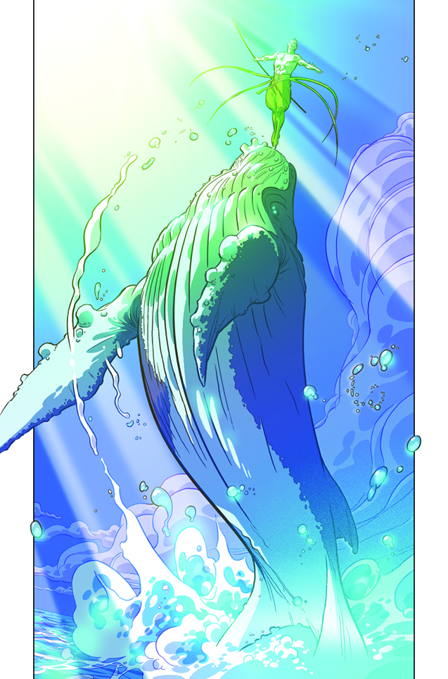
ANDI EWINGTON: For me this is THE iconic shot of the comic. It showcases perfectly what BlueSpear is about. The power that this image invokes is simply monumental and captures his link to the marine world. I remember the first time I saw this page; it left me grinning from ear-to-ear and I still get goosebumps whenever I see it.
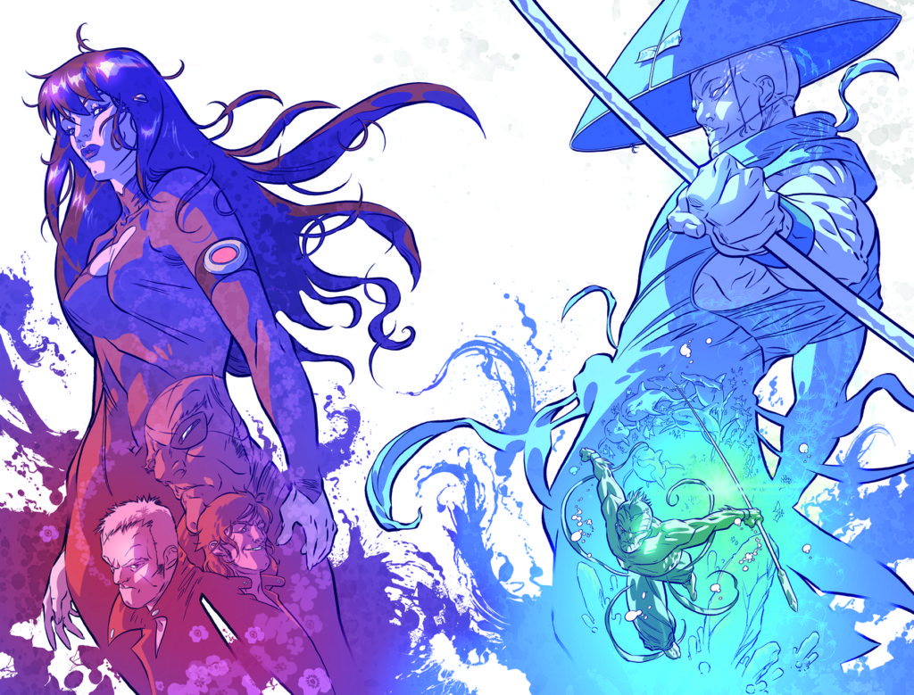
AE: I’m cheating a little here, but that cover is truly stunning! I love the whole Yin-Yang feel, with Lotus containing her antagonists on one side and BlueSpear and the Marine world on the other. Everything is balanced, from composition to colour hues. We had a lot of options for the cover design, but I’m so glad we went with this composition in the end.

AE: I know I’m only supposed to pick one particular panel, but these two really are one in my mind. It’s the first time we REALLY get to see a personal favourite of mine using their power; X is the ultimate anti-hero, he’s my Han Solo. You can’t help but like the guy, and the way he dispatches his enemies is so nasty it’s cool, and I love the way Cos got close and personal to show us just HOW nasty.
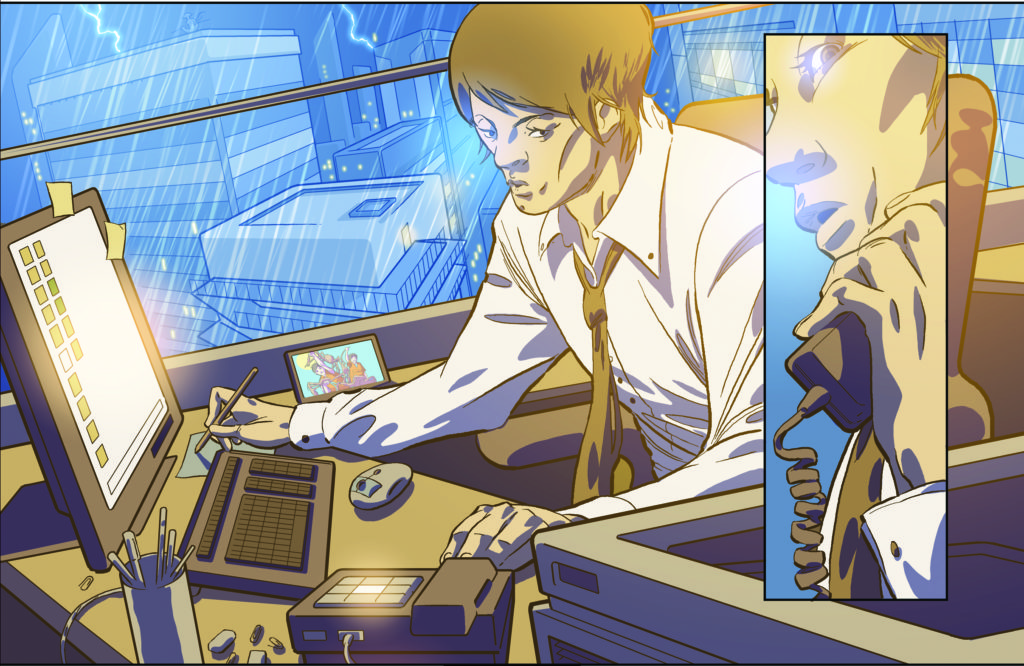
EDDIE DEIGHTON: I’ve gone for landscape panels for each of my choices. I love the detail Cosmo has applied. This is our first introduction to Akira (BlueSpear’s brother) in the book; he’s working at his desk, oblivious to BlueSpear sitting on the rooftop of the building opposite. For those that have read the original Forty-Five, you’ll notice that there is a photo in the picture frame on Akira’s desk showing him and his brother on that fateful holiday when Yuji was transformed into the hero that he is today.
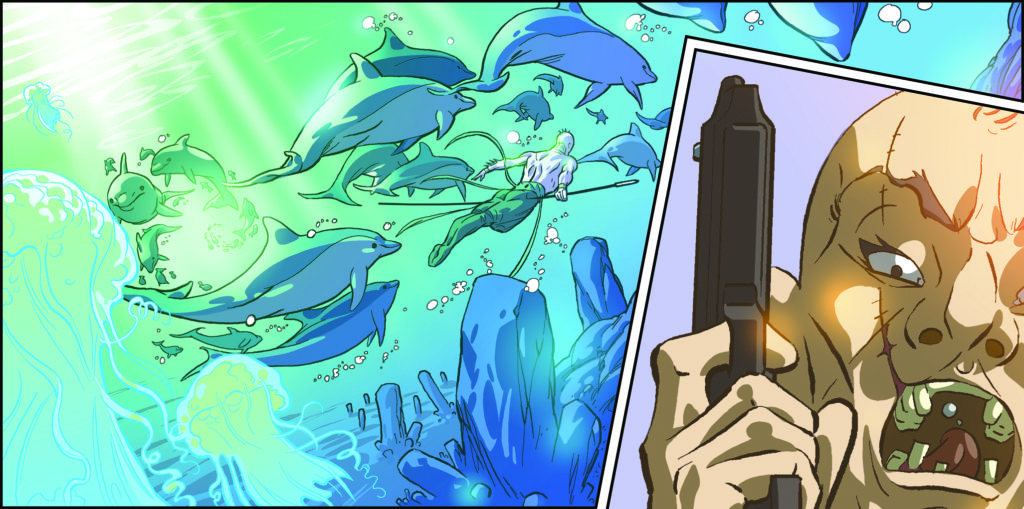
ED: It’s the left-hand side of the panel I like here; just the elegance and serenity thatCosmo has suggested with his art and colours, and I love the way BlueSpear integrates seamlessly with the other sea creatures.

ED: This panel says so much about the emotional depth of the main character’s story. Akira, on the right, upset in the knowledge that he and Yuji (BlueSpear) have to keep their family association a secret and they can never be close as brothers again,contrasted with the general public, adults and children alike, who openly idolise and embrace their hero. In turn, BlueSpear no longer feels anything for his brother and can only convey his emotions through protecting him, as he does every other member of the Tokyo population.
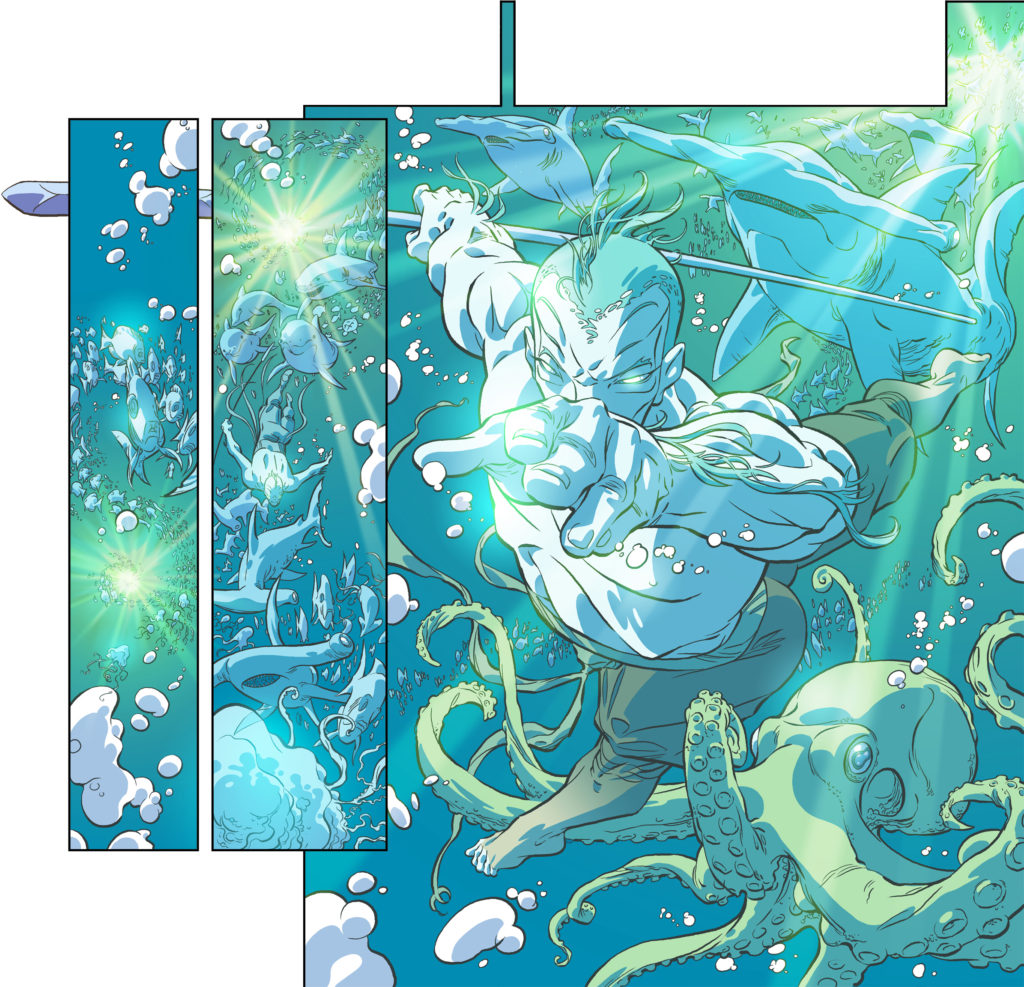
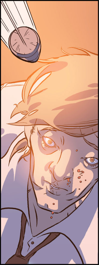
CW: This moment of frozen time, as a beaten Akira innocently gazes at his own doom, is a favourite of mine, as I really like games with bullet-time functions in them (Bloodrayne 1 being a favourite…); although I suppose if it’s a frozen moment of time, I shouldn’t have included speed lines. Curses.

CW: Not much going on in this panel, just a sense of space and emptiness, which is why I like it. It’s relatively tranquil, gives the story a moment to breathe, and X’s miserable expression just sets it off nicely. Why? What? I often feel like that.
—–
1st Place will win a signed BlueSpear print and a copy of the book, 2nd Place an ashcan copy of the book, and 3rd Place a BlueSpear poster! Check out the amazing print that is up for grabs:
Look for BlueSpear later this summer, and be sure to check out our review of Forty-Five45 and the Com.X archive!
Andy Liegl
andy@comicattack.net

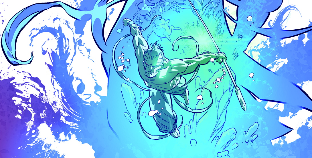
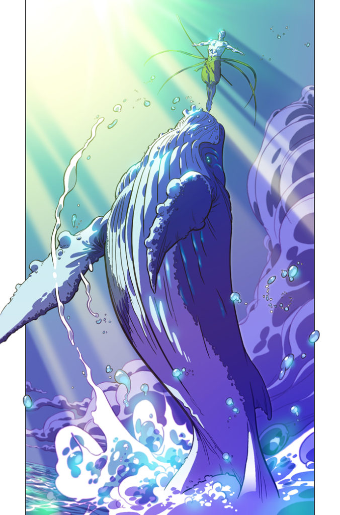
Andi 1 is my top panel. I love all things under the sea and that image is gorgeous.
Looking forward to this one, fellas!
Andi 1 is a fav of mine as well. It’s because of that pic that I practice balancing on humpback whales to this day! It’s great seeing X in on the action as he was one of the other characters from Forty-Five45 that I liked and wanted to know more about.
I particularly enjoyed Andi 2 and Andi 3, although all of the art is remarkable. They make me want to know more about the characters.
I have been waiting for this since Forty-Five was released. Looking forward to see more from the other characters from Forty-Five also.
Cosmo 1 is my favorite. It was a toss up with andi 1. There is a lot going on in Cosmo 1. The colors are awesome and I like the octopus too. It’s cool the way Blue Spear blends in with marine life, he just goes and joins the school and off he goes.
I love that first panel as well. Stunning work!
the Andi 1 is absolutely gorgeous. It is without a doubt my favorite one. The size ratio between the whale and the person is fantastic. The composition, the color, it all works perfectly.
I like the dude and the whale…
Cosmo number 1 is my favorite. The colors and light are amazing.
Cosmo 1
Because I’m a giant Aquaman nerd.
And this totally appeals to me.
So did some of the others, but I think I just had to go with this one.
And the detailing with the light shining through the surface of the water, and all the aquatic animals (like the hammerhead) swarming around him.
Just fantastic.
Andi 1
Andi 2. That pic is just pure badass!
whales turn me on
Cosmo 1. I love the progression, too. Progression in size, space, compositional elements… and emotion. Awesome panel sequence.
I’d have to say Andi 1. The whale bristles with power and the depiction of the man on it’s nose as it leaps from the water is epic!
[UPDATE: ComicAttack.net experienced a glitch from 12am July 4th-11:59pm July 4th. If you commented in that time, please replace your comments. That data is lost.]
Andi 2 by a mile! Definitely blows the others away.
I’m a huge fan of whales so Andi 1 is my favorite, its beautiful!
Andi 2 does it for me. I like Andi 1 a lot as well. Andi 2 though is one of those images I can look at for a long time and keep finding new things to like about it. I love the juxtaposition of the images!
I pick Andi 1. I’m an aspiring artist, so I really appreciate the color scheme in that panel – it works really well. I also love the lighting in it.
I love the underwater picture. So Cosmo 1.
I’m picking Eddie 3. I like how so much emotion is conveyed using their faces. I also like the man with the hat in the background, it gives the panel a mysterious and ominous feel. There’s a lot of detail in this panel that should not go unnoticed.
Andi 1 is my favorite, looking at it makes me want to read the comic. The panel seems like it’s a very pivotal moment in the comic. I love breath-taking panels like these. I’d love to win, my fingers are crossed.
The best to me is Eddie 3. The contrast between the peaceful dolphin imagery and the man with the gun is stunning, and I love the use of lighting and coloring for the ocean. Congrats to Com.x for always putting out these innovating comics. I’ve been reading/collecting their comics for nearly 5 years.
Andi 2 is my favorite, it stands out the most to me. I like how the smaller characters on the bottom blend into the two larger characters. The rest of the pictures are captivating as well. Looking at these pictures really motivates me to start my own comic book.
Andi 3. Wonderfully gory! Beautiful imagery in every panel. Great giveaway!
I love Andi 2, the coloring is absolutely gorgeous.
CONTEST WINNERS ANNOUNCED! Listed below are the winners. Please send your mailing address to andy@comicattack.net no later than 8/25/11 so your prizes can be mailed out. If you do not reply by this time, your prize may be re-drawn. Thanks for playing!
FIRST: Keith
SECOND: Carter
THIRD: Jerry
Here is a screen grab of the winner’s comments to eradicate any confusion:
http://imgur.com/a/iy5q3
Congrats Keith, Carter, & Jerry. If you’re this lucky maybe it’s a good time to get a lottery ticket!!