On May 19th of this year (2011, when this column was written) we lost one of the best painters of our generation. Jeffrey Catherine Jones was an incredibly prolific painter and comic artist with an uncanny sense of composition, among many other amazing traits. This installment, we look at the artist’s underground comic, Spasm.
 Spasm: 1973
Published by Last Gasp Eco Funnies

Jeffrey Jones is or should be well known to all Ink Stains readers (and comic fans, and fans of great art in general). Starting in the late sixties, Jones was producing gorgeous and sometimes singular art seemingly right out of the box. You will find his work in many Ink Stains columns and hopefully many more in the future. For now, I am focusing on his underground comic, Spasm. Though not a fanzine, per se, I feel it fits well enough within many of the higher quality art zines that he played a big part in.
This nifty little collection of stories shows Jones at his most loose. Most of the stories look as if they were done quickly, without worrying about perfectly feathered lines or incredibly detailed backgrounds. Some may think these are mere wisps of stories, but, in my opinion, Jones’s quick sketches are better than ninety percent of the finished work in comics and some of the illustration world. Lately, much of the illustration world is littered with faux naive scratchings and jaded, ironic work with little feeling. Jones can be called many things, but unfeeling is not one of them.

 Jeffrey Jones is probably most known for his gorgeous renditions of full figured women, usually with very little clothing on. However, if you look at his website (urls will be given at the end of the article) you will see many evocative landscapes amidst the beautiful babes, dinosaurs, and flights of fantasy. Late in life, Jones seemed to be more interested in painting the wonders of nature all around him than filling the bookshelves with paperback book covers (something he did with gusto in the 1970s). When following his fanzine work, I was always taken with his command of the human figure, and especially the out of the ordinary contortions and positions he could put his characters in, such as the dying spaceman to the left. Jones himself posed much of the time for illustrations such as this and many of his paintings that would come later. This illustration is one of a few stand alone drawings in this comic, so let’s talk about the stories, shall we?
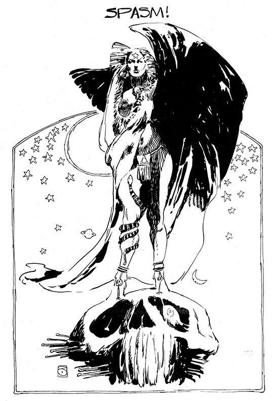
The cover of Spasm (seen at top), as Patrick Hill tells me (and he would know; he is probably the go-to person for knowledge on the career of Jeffrey Jones), is a rejected cover for the Dragonriders of Pern, a very well known entry in a fantasy saga by Anne McCaffrey. I have a feeling the very average looking dragon rider might not have been heroic looking enough for the editors, but that is just my opinion.
 After another full page illustration (seen above the spaceman), Jeff launches into a two-page story called Co-incidence. Done in a sparse and sketchy style, the story is much like his Idyll work, simple and somewhat whimsical. Some may see this story as merely an excuse to practice some figure drawing. But, when you can draw figures as good as this, I say, so what? After this, we get one of the best stories in the comic, Spirit of ’76, a few pages seen below. I have a feeling the printing, combined with my scans, do not do justice to the soft gradations of watercolor used in this story. But enough jabbering; you be the judge.


 You can see how seemingly effortlessly Jones was able to render naturalistic poses, even in children; a hard thing to pull off.
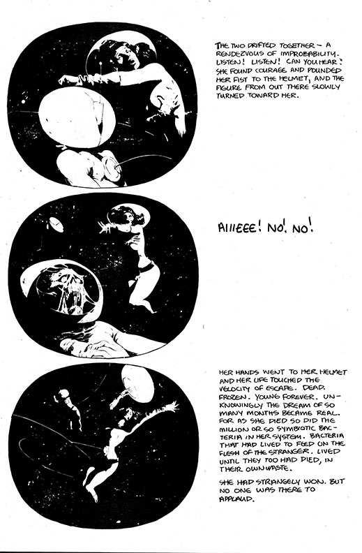
The following story, Saved, is told in blocks of type and art within ovals of black. Perhaps this was meant to echo the prison/safety of the female astronaut’s suit, or maybe contrast with the vast emptiness of space…or both. Jones combines his influence of the old EC comics with his own still and small observations, giving us a Jones/EC twist ending, as well. I think you can also see a possible influence from his friend, contemporary, and Studio mate Berni Wrightston in the rendering of the dead astronaut’s face (and the dying spaceman near the beginning of this installment). Below is a page from that story.
Next, we are treated to The Enemy. Now, I will not pretend to totally understand this story. Maybe you can read it and get back to me? There are several instances where I had some unanswered questions; questions like, “How did he get there?” and, “Why did she throw the book through the window?” But despite those questions and some sloppy inking here and there, a few panels stand out for being beautifully composed. Composition was always a very strong component of Jones’s work. Possibly his best. Whether individual comic panels or large paintings, Jones was almost always able to arrange the objects on the surface in a very visually pleasing way. This story has a few panels that are drawn really well and also lead the eye where he wanted it to go. See a page below.

If you are missing Jones’s  incredibly beautiful renditions of women, then you should be happy with the next story, Luce. This story features two women on a hillside, both with wings, one very attached to her chairs. Like much of Jones’s sequential work, there are metaphors and allegories masquerading as simple objects and actions. And also like much of the artist’s stories, the characters are beautifully rendered amidst designs where the artist intelligently utilized negative spaces. See for yourself.

 From the light and airy open spaces of Luce, we are plunged into the black of space with Deja Vu. This story has some of Jones’s favorite subjects…spacemen and trees. And he is darn good at trees! The story mirrors the title cleverly as well.
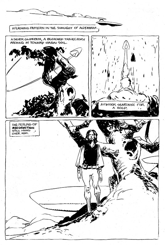

 The composition of that last panel on the first page and the second panel of the second page just boggle my mind. To take all those various elements and compose them so perfectly seems like a mysterious gift to me, though I assume it was a product of many years of learning.
Next, one of many stories and paintings exploring the different ages of women, the frailty of the human condition, and the things we cling to as human beings. Below you see a few pages from The Bridge.
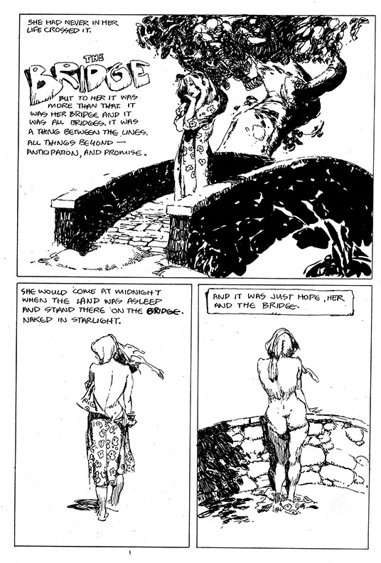
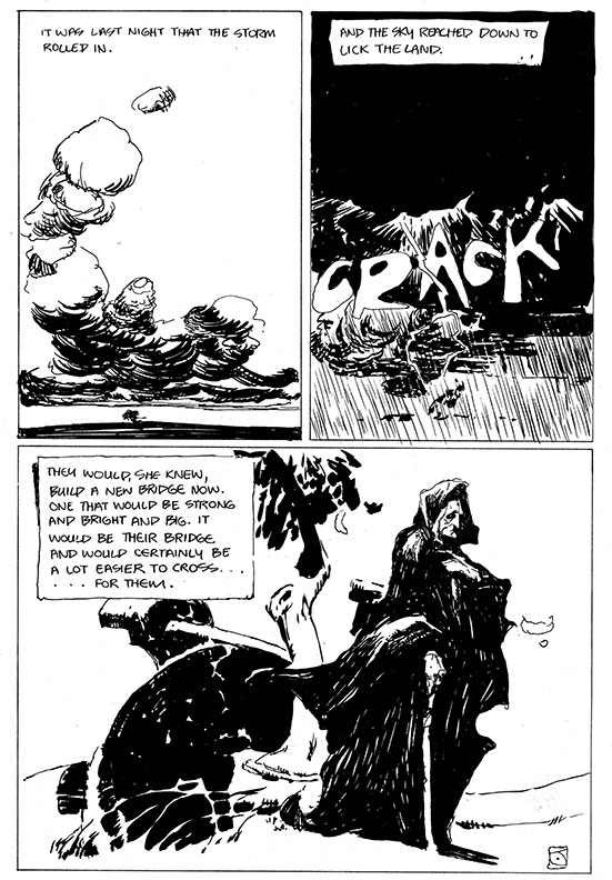
I don’t know of many artists/writers (especially in comics) that focus so much on how easily broken we humans can become, and how fragile we can be. Many of the heroic figures in his paintings are normally proportioned figures, as are most of his renditions of the female figure.
After this quiet tale, we move on to Guarantee, possibly a morality play on the ethics of the police, or at least those in power. See below.
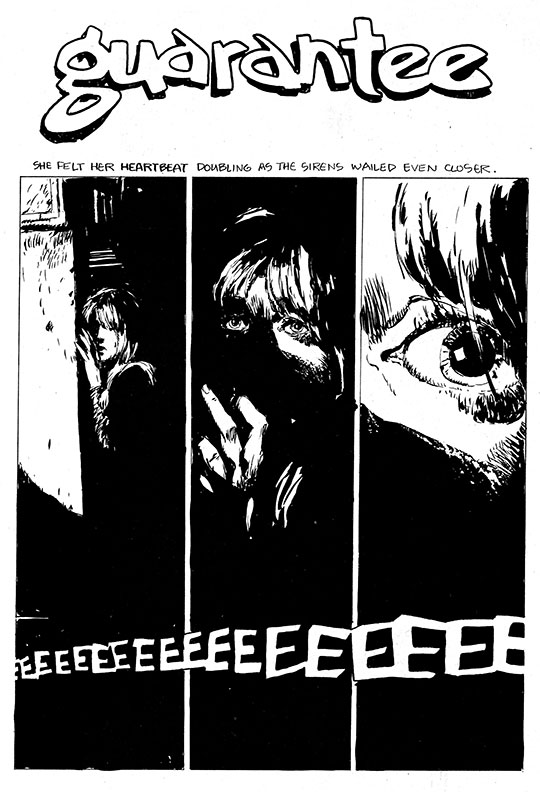
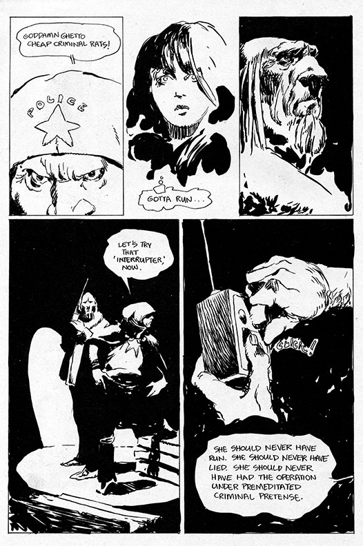

 As you can see below, more open space is utilized in the last story of the book, coincidentally the last stage (to some) of life, that being Death. Another seemingly simple meditation on a very weighty subject, it is contrasted by the thin line weights and quick, almost gesture-drawing style.

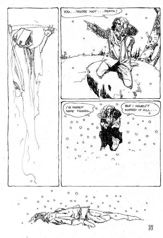
Below you can see reference photos shot by Jeff of buddy and fellow artist Ronn Sutton, shot for both Death and Deja Vu, grabbed from a post on Facebook from Ronn, who elaborates below.

In 1972/’73 I’d spend periodic weekends at Jeff’s. He shot all the reference for these two stories at once. Afterwards we went upstairs and developed & printed them in his darkroom. He was drawing shortly afterwards. Both stories were drawn “size as”. Jeff had a false-start on page one of “Deja Vu” and started over. He gave me the first version, and a bunch of the photos too, obviously.
There is another full-page illustration, and a beautiful and enigmatic back cover (seen below).

I feel lucky that I was able to speak to Jeffrey a few times about his site , asking various questions and offering advice. He was usually succinct and prompt. About a year ago, he started posting very frequently on Facebook. It was truly a joy to see all the sketches and other works we might not have seen otherwise. Jeffrey seemed to really be enjoying himself on Facebook, interacting with his fans and friends. Posts were very frequent, many times just posting funny photos he found on the ol’ interweb. I wish I could ask him questions now about Spasm…but that can’t happen. It was such a terrible surprise to hear of his passing. There were so many good things happening…a new book from Desperado press, a new film documentary on Jones called Better Things by the positive-vibe tornado of Maria Carbado. So much was happening…but now…he’s gone. It was a real shock. I can’t say I had a personal relationship with Jeffrey Jones…but I have loved his art for over 30 years. For a truly touching personal account of Jones’s life, read George Pratt’s eulogy of sorts here. It is truly worth seeing.
There are many places you can see Jeff’s work. The website, the existing books, all the comics, the fanzines, the paperbacks, and more. He was so prolific, especially early in his career. I thought I had seen most of it, but things I somehow missed seem to materialize daily. Download the pdf!
I have painted many portraits of fellow artists, but I wanted to do something to honor Jeff, which you see below…hopefully I did him justice.
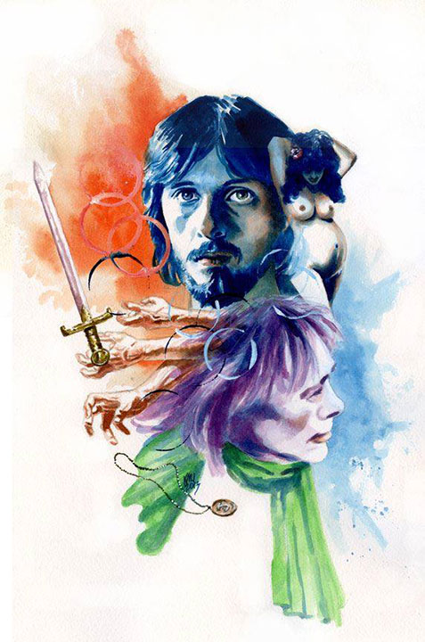
I would like to thank Patrick Hill for a few observations and facts (and hopefully, for a few fanzines in the future). I would also like to thank Maria Carbado for her input. Also, thanks to Ronn Sutton for letting me share those photos and his thoughts. But most of all, of course…I have to thank Jeffrey. He may have been too frail to survive this earth, but his art will live on forever.
Ken Meyer Jr.
kenmeyerjr@yahoo.com



By the way, if you are on FB, try to friend Patrick Hill, he has such a great gallery of Jones work, much of it seldom seen, very early, etc…including lots of photos). Patrick’s pic is a black and white of a handsome galoot with a goatee, if that helps.
Thanks for another great post Ken. The ‘zine and the links just make me want to immerse myself in Jones work.
One cavil – the both pdf links are to the first half of Spasm, there’s nothing to get us to the 2nd part.
Great post… JCJ was always one of the best, The 70’s fanzine / underground scene seems so far away these days… I think I’m getting old 🙁
It’s good to see that all these mags aren’t forgotten ..
Best,Graham.
I will fix that link right away! Thanks to both of you for reading!
I have a soft spot for “Spasm” because I modeled for all the characters in both “Death” and “Deja Vu” back in late 1972 or early ’73. Jeff shot all the reference photos in B&W in the Woodstock NY house he shared with Vaughn Bode’ and we immediately developed them in his darkroom. Jeff drew those two stories the same size as they were published. He had a sort of false start on “Deja Vu”, originally planning to draw it in B&W ink and then add gray tones with magic markers but he didn’t like how the first page-and-a-1/4 turned out, so he gave me the originals and started over again. I still have a selection of the photos I posed for.