 Horizon #13
Publisher: Image
Writer: Brandon Thomas
Artist: Juan Gedeon
Colorist: Mike Spicer
Cover: Jason Howard
Horizon recently dropped a serious reveal and Thomas is riding that momentum into this issue here! I’m not going to go into spoiler territory just in case you missed out but Thomas continues to explore that reveal here. However we only get a small dose of that as Lincoln has returned and once again steals the show. As far as new villains go he’s one of the best and his unassuming look is what makes him even more scarier. Sure it’s a testament to how well he’s being written but as the pieces fall into place Thomas makes sure to keep the reader on their toes and guessing. We also get to see more of Lucy (and where she got her other arm) and together with Lincoln they make one devastating team as shown during one of the action sequences. When the action slows down, Thomas keeps events tense and suspenseful with some sharp dialogue and excellent character development as things take on a more espionage/spy thriller feel. It’s very smart and will have you not trusting anyone or knowing exactly where allegiances lie.
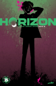
Horizon’s visuals from Gedeon and Spicer continue to give this book it’s own unique feel and look that helps it stand out from the rest. From the alien tech and character designs of the Valians to even more familiar settings on Earth everything syncs and moves quite well. Counselor Ryttell has a crazy design that seems like a cross between a post-apocalyptic biker and regal dignitary all in one. Lucy is another who always stands out because of her huge alien arm but you’ll be more impressed with the ripping off of heads during the fight scenes. Which continue to hit the right beats and pick up the momentum of the story at the perfect time. Gedeon’s art seems to focus more on what you need to see in each panel so at times the details in the backgrounds are sparse but your eye is drawn to what’s important. There’s an opening sequence with young Batten attempting to get a tracker on Counselor Ryttell that illustrates this point. There is one panel that tends to stick out because it looks a bit off to me. Something off-panel has caught Lincoln’s attention but the look of Lincoln himself doesn’t resemble the style in the previous panels. This may be due to the heavier lines used and shadows on his face but it was a bit off putting. And Jason Howard gets another round of applause for this cover which looks like it’s the continuation of the one used for Horizon #6!
Horizon has been a game changer since the first issue and continues to excel and entertain! Thirteen issues later and what fans have been asking and at times demanding from a comic creative team is right here for your enjoyment! So you should probably get to reading Horizon and see if it’s the one for you!
Infinite Speech
infinitespeech@comicattack.net

