What?! Another batch of X-Title books so soon? Well, last week’s were a bit late due to Infinite Speech attempting to recover from reading a certain X-Force title. Let’s just say it didn’t agree with him. But now we’re back to deliver our batch of X-Title reviews for your mutant loving pleasure! Unless you’re not a mutant lover, and in that case you’re probably spending too much time going to your Purifiers meeting than reading this. So, for those that are mutant lovin’ and proud, sit back as The Comic Book Clergyman, Spider-Man Geek & Infinite Speech return for your All-New Uncanny X-Piles!
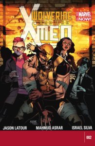 Wolverine and the X-Men #2
Writer: Jason Latour
Artist: Mahmud Asrar
Last issue left us with the highly recognizable Phoenix emblem appearing on everyone’s cell phones and tablets from some mysterious entity. Now, Latour reveals those responsible and adds a new player in the game in the form of the Phoenix Corporation. Who are they? What do they want? Do they offer good health care and dental benefits? Well, we do get a brief explanation of who but as to what they want was a nice surprise and kudos to Latour for the classic bait and switch twist in the story.
As strong as this issue is it really does prove that it’s probably time for Logan to go away for a while. Everything he does in this issue screams “predictable” louder than Banshee at karaoke night. From the argument with Storm to his course of action afterwards. It’s actually every panel where he’s not included is where the story is more entertaining and a bit stronger. There’s an exceptionally tense moment between Idie and Armor and even Quentin contemplating his next move that make for great moments during the story. This is no slight to Latour’s story but just an observation that hopefully someone else sees and we get less Wolverine and more character development of the students.
Wolverine and the X-Men is a solid looking book and I’d like to thank Asrar if possible for still drawing Wolverine’s claws popping out of the back of his hand instead of in between his fingers like in the films. This seems to have been a “thing” for artists to do ever since the X-Men movies started coming out. As far as the rest of the issue it’s just some nice and fluid storytelling that does the narrative justice. There’s a fight between an Askani warrior and Wolverine that could have gone on a bit longer but for the sake of the story it’s understandable. Hopefully this means that at some point these two will go at it again considering the what’s at stake here and Asrar will make it look just as good.
Unlike Jeff, the renumbering craze is a bit lost on me as it seems as if a new reader could just jump into Wolverine and the X-Men now just fine. There’s a great recap of events and Latour makes this feel more like a continuous arc in the previous installment than an all new title. Which despite some misses was a much needed breath of fresh air for the X-Men franchise. Hopefully Latour keeps that going by giving us more of the supporting characters and maybe a bit less Wolverine. Nonetheless he’s delivered quality storytelling so far with Asrar doing the same with the artwork. Now let’s hope there’s a big payoff at the end of this thing! – IS
Rating: 7/10
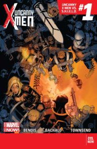
Let me first say that I think Marvel’s numbering is actually not such a bad idea. I think it’s a good idea to let people know when a new arc is starting. I would suggest that Marvel take it one step further and start marketing these as story arcs, so that this could really be solicited as Uncanny X-Men Vs. SHIELD #1 but on the cover in a corner they could put Vol. 3 No. 19, or Vol. 1 No. 583. That way, it appeals to new readers, but for those old-school fans that like classic numbering, it works as well. But enough of that.
HOLY GOLDBALLS-LOVIN’ MOTHER OF GOD THIS ISSUE WAS FANTASTIC!
Bendis is on a roll. The guy deserves every bit of praise and hype he gets. His take on the X-Men has been excellent so far. The few missteps in this series hasn’t really had to do with him so much. When left to his own devices and when paired with one of his go-to artists like Chris Bachalo, the guy is unstoppable.
This issue has everything I need in an X-Men comic: great drama, character development, humor, action, intensity, and story progression. Not to mention the absolutely killer art by Bachalo, who is just perfect. The stuff that got me the most was the scene with Mystique, Sabretooth, and Dazzler. I had wondered what happened to Dazzler since Mystique took her place at SHIELD. The answer to that is horrifying and wonderful. And if drawn by anyone but Bachalo, it wouldn’t have come off as either.
I’m loving this team of new mutants paired with the old guard. Eva’s secret of what happened to her when she disappeared a few issues ago is a fun mystery for them to dangle for us. Benjamin, Christopher, the Stepfords, and most especially Fabio, aka Goldballs, are just a fantastic pairing of characters. I’m glad that Bendis is completely dropping Hijack from the cast, as his engagement with SHIELD looks promising. The Sentinel plot also continues to be a great overarching mystery, one that is pitting the X-Men against SHIELD against one another, while a third party sits back and watches the fireworks.
There’s just nothing wrong with this issue at all, and I’ll break your gold balls if you say otherwise. -JJ
Rating: 10/10
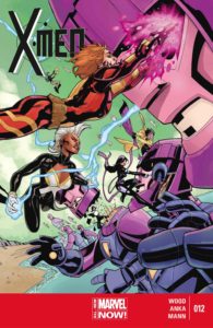 X-Men #12
Writer: Brian Wood
Artist: Kris Anka
The issue opens with a quick three page rundown of what’s happened thus far. Paired with the recap page, the reader is brought up to speed in an efficient manner before being ushered into this issue’s main adventure with a spotlight shining brightly on a half-page panel of Madelyne Pryor. Kris Anka seems to have focused a good chunk of his energy on the new Maddie’s grand entrance because she looks absolutely fantastic. Her makeover is much more conducive to her imminent position within the Sisterhood than her more former and rather provocative Goblyn Queen outfit.
Unfortunately though, the rest of Anka’s work in here leaves much to be desired. Nothing takes me out of a story more than an inconsistent level of artwork. When you have a cast of characters mostly comprised of the same gender, you have to make sure the reader can tell them apart and also be able to easily recognize them in those close-up moments. In a lot of cases, each character’s own face looked different from panel to panel.
But if we look at Kris Anka’s work from a purely visual storytelling standpoint, he nailed it. When taking into consideration that he only had 15 pages to tell the story, his panel sequences work and carry great impact, especially the scenes involving Monet who also seems to have been hitting the gym as of late. She’s lookin’ jacked!
It was fun seeing M exact her revenge on Amora for what she did to her in a previous issue. If there’s one super heroine you do not want to piss off, it’s Monet St-Croix. Wood seems to have a good handle on her and makes her fun to read. She’s a rather complex character that has always struggled to fit in within a team. She’s a multi-racial aristocrat, a Muslim and a mutant with a whole gamut of powers. She has many unresolved personal and family issues. She’s grown fundamentally angry and bitter. As unpleasant as she sounds, I think she’s a good fit for this team of X-Men and harbors much potential in the hands of a capable writer. So far, so good Brian.
The issue caps off with a five pager following a separate adventure involving Jubilee and some of the Jean Grey School’s student fighting off a trio of Sentinels. The artwork is handled by Clay Mann who is an artist that I hate to love. This is an artist with mucho talent, but could really benefit from being paired with an inker other than his twin brother, Seth. Clay’s pencils are strong, but they cry out for bolder inks.
The bottom line for the main story of this issue is that even though the artwork isn’t consistent overall, much reading enjoyment can still be had within the pages of X-Men #12. The reader gets to see the X-Ladies kick a whole whack of Sisterhood butt as well as witness the impactful return of an old foe that is sure to be a major thorn in the side of the X-Men in future stories. The backup story showcases an impressive display of Quentin Quire’s power. – SMG
Rating: 7/10
What did you think about this week’s X-books? Let us know below! You can check out more X-Piles right here!
infinitespeech@comicattack.net – @InfiniteSpeech
jeff@comicattack.net – @FrJeffJackson
spidermangeek@comicattack.net – @SpidermanGeek



You know how we used to know a new arc started before the renumbering, Jeff? We just opened the book and read the title which usually included a “pt 1” in the title lol